Hey, my friends, I feel like it’s been a while! I thought it would make sense to create a series of posts about how to create your brand color palette and choose your website font pairings. I realized, after chatting with a few people, that the biggest struggle when diving into a template (or new brand) is simply not being able to narrow down their color palette. So, today we are chatting all about it!
Now, let’s start with a few questions:
The questions below are just a small sampling of what kind of questions I ask my branding clients, but this should help you get a start on how to find your brand colors.
1. Off the top of your head, what is your ideal color palette (4-6 colors)?
This is just for you to reference as we move forward, I want to see if what you have in your head currently will start to align as we go through the post.
2. What 3 adjectives describe your brand?
Ex: sophisticated, ethereal, modern, minimal, warm, relaxed, whimsical, calm, earthy, elegant, etc.. (feel free to google more too).
3. What 3 Values describe your brand?
Ex: stability, mindfulness, dependability, comfort, affection, ambition, balance, grace, etc
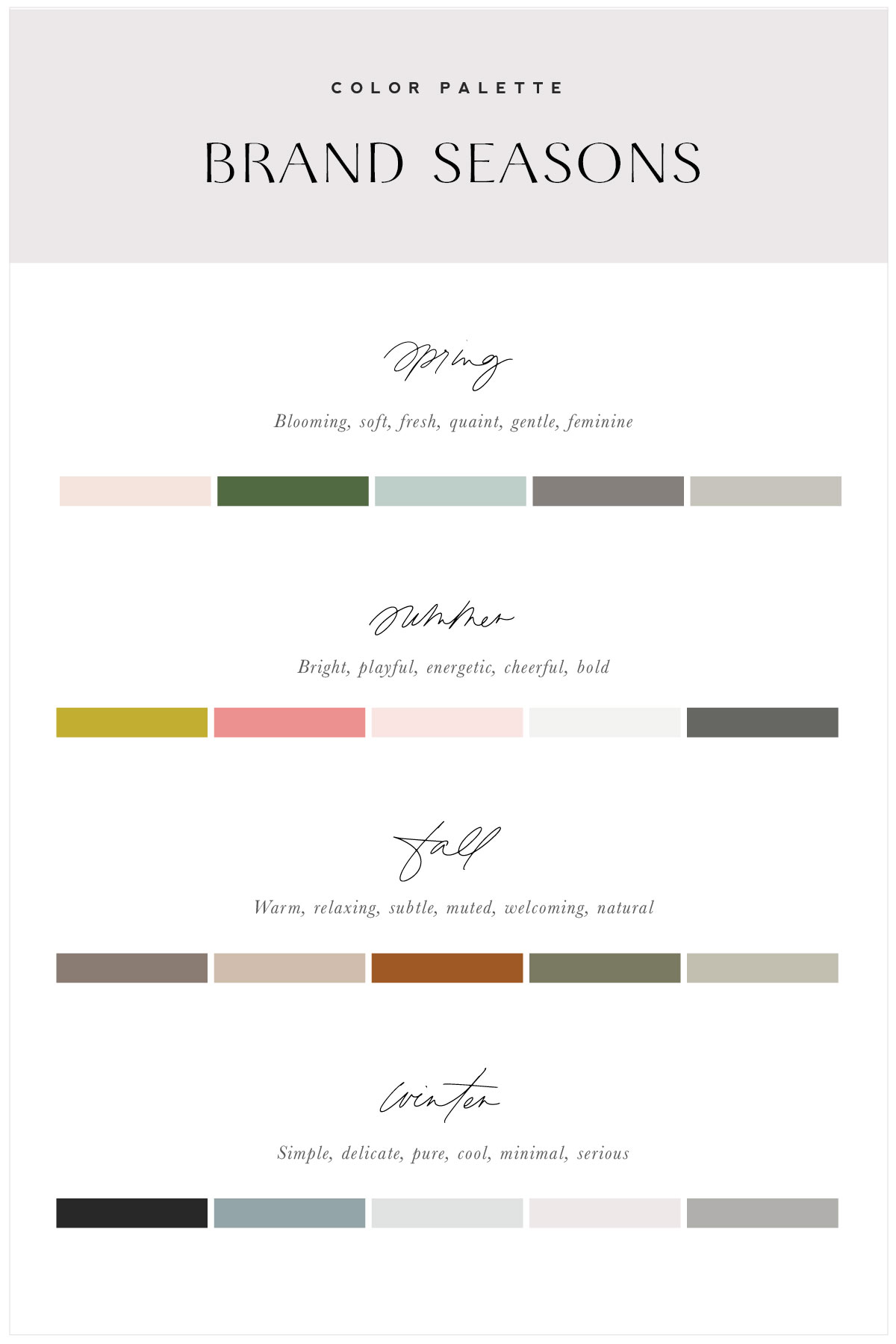
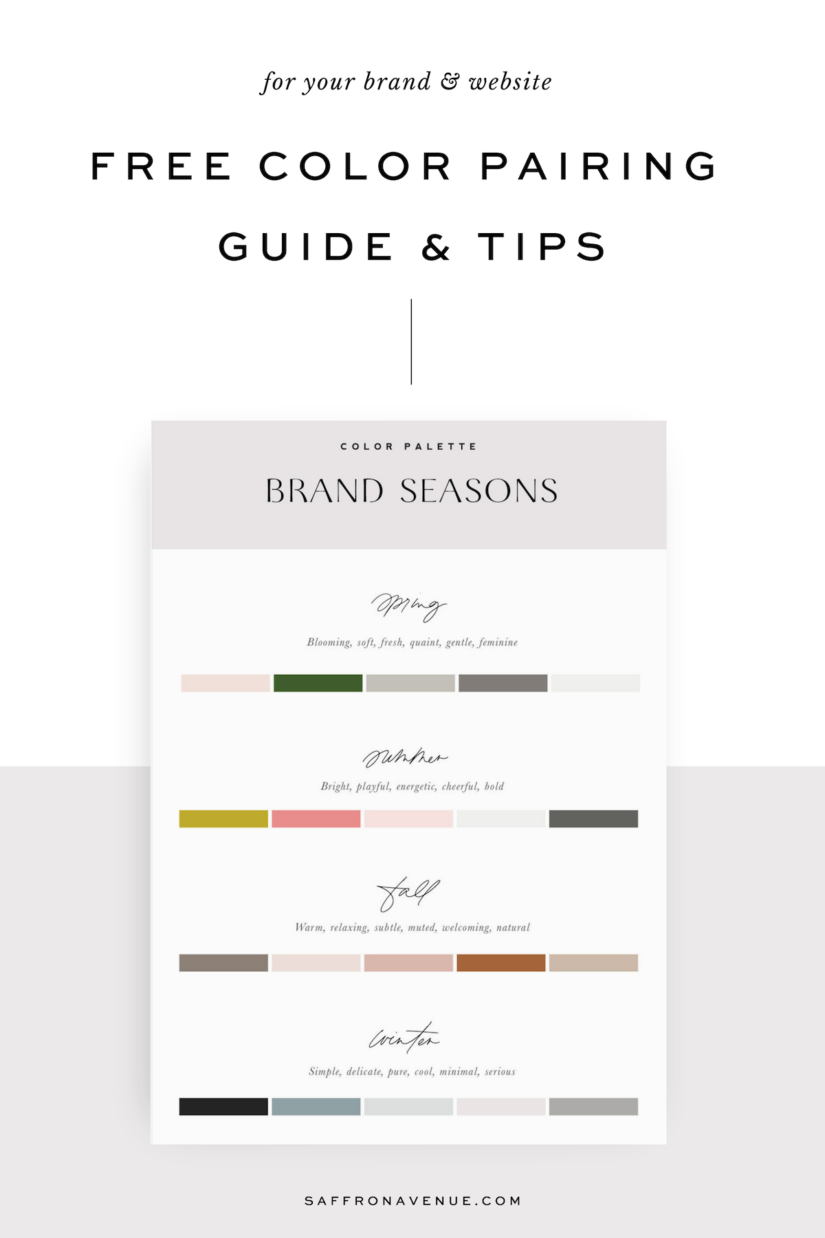
4. If your brand were a Season, what would it be?
See below and it can definitely be a mix of a couple seasons too!
5. If your brand could go shopping anywhere (unlimited budget) where would it shop?
This would be for clothes, office decor, accessories, office supplies, etc. Think about your idea client here (not just where you like to shop). Ex: Crate & Barrel, Kendra Scott, Magnolia, Madewell, etc.
6. From your selection above, what descriptive words come to mind when you look at those brands?
Example: Magnolia feels organic, textured, natural. Madewell feel simplistic, minimal, neutral. Kendra Scott is bold, creative, playful. ETc..
7. What does your ideal client/customer look like?
Describe who they are (career, location, clothing, hobbies, books they read, instagrams they follow, style of their home, etc).
8. What do you want your client/visitor/customer to feel when they see your brand and website?
This is your ‘brand essence’ and what kind of emotion you want your brand to provide people.
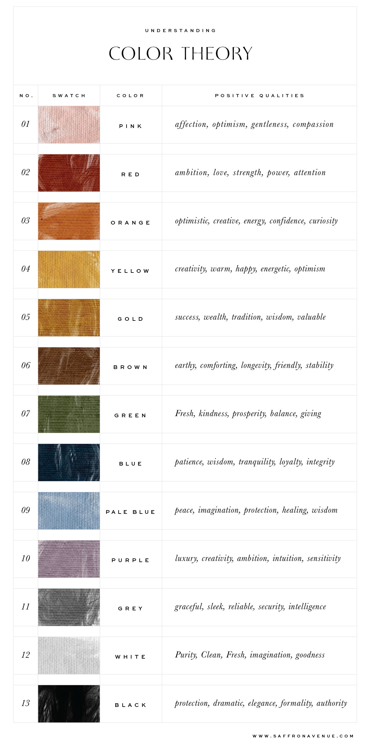
Using Color Theory
Now that you’ve answered a few questions, let’s dive into color theory. As we know, color can play a huge part in emotions and buying. You’ll notice a ton of fast food restaurants use red and yellow, a lot of natural products use brown and green, and so on.
So, as you read through the colors below (with their positive qualities) I recommend that you start to look back on those 8 questions I asked previously and see if the colors you originally chose with your color palette start to align with the meaning behind the color. P.S. they don’t all have to match exactly, but they should start to align with your adjectives, essence, and values.
Do the original 4-6 colors you wrote make sense?
From above, are the qualities within each color beginning to blend with the questions you wrote previously? Overall, we want to make sure that the palette you choose starts to represent your adjectives, values, your season, and your brand essence (on how people feel when seeing your brand).
For example: If my color palette is navy blue, muted pale blue, light grey, charcoal, and white, but my season is Summer and my adjectives are ‘Cheerful, Bold, Creative’ and the shops I chose were Kate spade, Jonathan Adler, and Kendra Scott..it wouldn’t quite make sense with the color palette.
Create Your Brand Color Palette
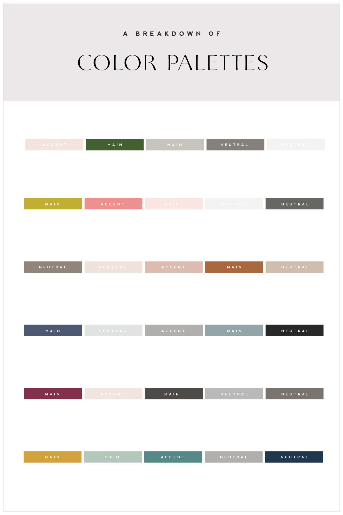
Now, for a super important part when finalizing and narrowing down your color palette is understanding your the color palette FORMULA. This is basically the formula I use when building out a clients brand and how to properly use it throughout their brand pieces, website, and so on.
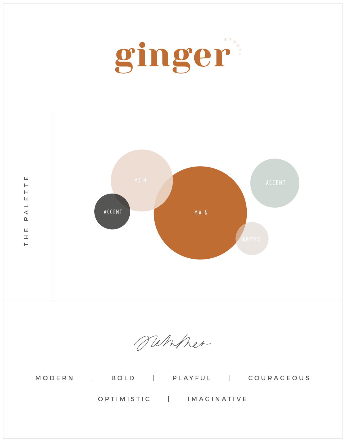
1-2 MAIN COLORS | 1-3 NEUTRAL COLORS | 1-2 ACCENT COLORS
THE MAIN COLORS: These are simply the main colors that represent your brand. It should be your go-to when choosing color for your site details, print materials, etc. For me, I have that dusty grey/lavender and then a charcoal grey. This is used for backgrounds on my site, for stationery pieces, the color of my nails or shirt in my photos, etc.
THE NEUTRAL COLORS: These are the colors that help pull it all together, this can be the color used for text, maybe it’s a soft creme to add warmth to the brand, a pale grey, etc. Typically used for patterns/textures with subtle elements, maybe it’s the type of paper used for printing, maybe it’s the type of filter used on images, etc.
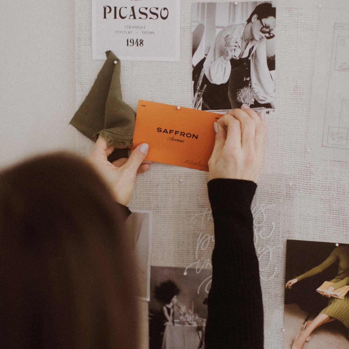
THE ACCENT COLORS: These are the colors that will compliment your main colors. For me I have a dirty saffron color and a lighter pale lavender shade that I used very sparingly, but can be used for buttons (to accent), maybe it’s a pop of color in my brand photos, maybe it’s a heading text, etc. They shouldn’t be confused with the main colors but complimenting them.
– See how it’s used in the template! –
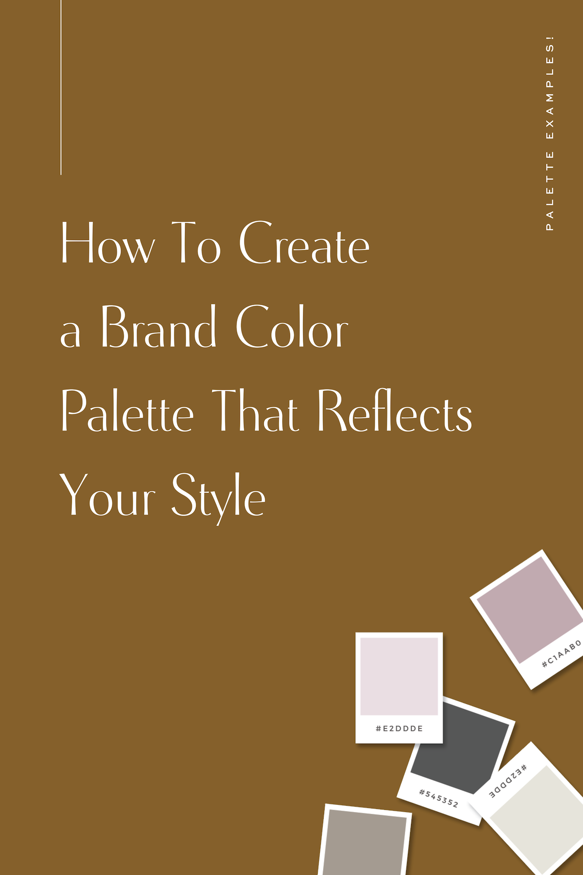
Color Palette Examples
With all of that being said I thought I would pull a couple of palette examples together for you to see how it works! If you take a peek at my templates HERE too, you’ll probably get an idea of how I use color palettes and pairings (main/accent) throughout the site.
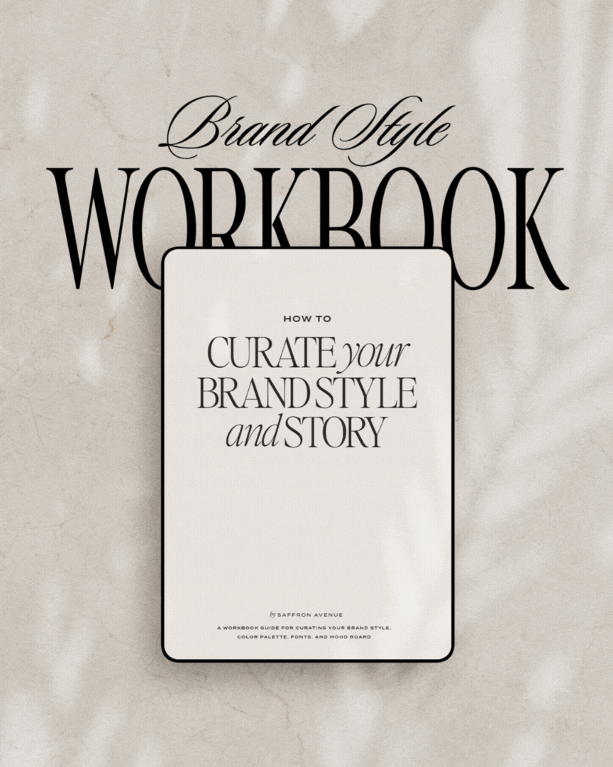
The Brand Style Workbook
Your step-by-step guide to help you create a color palette and mood board!
Yes, yes…if you are STILL struggling trying to figure out what your color palette and style are, you are in luck! I created a brand new workbook that will walk you through the exact steps I take for my clients when creating their color palettes and mood boards.
Let’s Recap
Were you able to align your adjectives, essence, ideal client profile, values, etc with your ‘brand season’, your color palette, and color theory? Were you able to narrow down how each color will play a part in your brand (main/neutral/accent)? This should be a good start on how to create your brand color palette and hope I’ve helped you just a bit and feel free to check out the other blog posts about branding below!
– 8 Things To Do Before Creating a Website –
– The Importance of Brand Photography –
– How to Use SEO on Your Website –
– How To Use Your Brand Elements –
What’s next…
Are you launching a new business or a rebrand? I cannot recommend Showit highly enough! So much so, that I use it myself AND I’ve even created some stylish templates for you too! Completely customize and make edits with your own brand colors and images. (yup, no developer needed!) And since I love a cohesive brand across all platforms, I’ve created matching social media templates and stationery too!
If you click on my affiliates/products/advertisers links, I may receive a tiny commission. P.S. the products that I share are the ones I believe in.


Hi Angela,
Thank you for sharing! I really enjoyed this post! It’s more that just pleasing to the eye. I’m a florist in Singapore and I often have trouble explaining colour to my clients. The Breakdown of Colour Palettes chart you put up is extremely useful in discussions with my brides. Love your blog!
Oh my goodness, I took a peek at your work and it’s GORGEOUS!! And yes, I didn’t even think of it in that way, but this could be super helpful for brides too!
GREAT post Angela! So helpful and love seeing the theory behind each color and the strategy of using each when building a brand. You are just the best!! xx – Shanna
Awe, thank you so much for reading it, friend!
I really love this!! Great way to think of how to actually break down a palette into how to apply it! This is a totally random question, but you’re using Showit, right? Can I ask how you created those button at the bottom of your blog post? Is that just css inside your actual blog post content? K, brb, gotta read the rest of your blog now! :)
Thank you (and I hope it helps)! And yes, showit..but that is a little chunk of code. BUT, the new WordPress Gutenberg update as custom buttons you can pop in!
This a really brilliant and creative ways to do brainstorming. Thanks
Hello,
This was a really helpful article. And so generous of you to provide a step by step guide like this.
It is really helpful especially for people who are just starting, like myself.
Thank you!
That’s awesome to hear! I hope it helps!!
Hi Angela
Thank you for SO MUCH inspiration :)
I work in online marketing but have a crush on beautiful designs and especially fonts, what is the font called that you have used for the business card that says: NOAM
Thank you and have a great day
Best Line
Hi Angela :)
Thank you so much for this blog post. It was super helpful and easy for me to understand!! I was wondering if you would share what font “ginger” is? I love it! Thank you again!
Color palette creation is one of my favorite things to do. SO much more goes into it than most people think (as you’ve pointed out)! You’ve done an excellent job touching on how important the thought-process behind choosing colors goes. Thanks for the great post!
Thank you Dana! I do love that process too!!
I strongly disagree with your interpretation of summer and spring brand. Your spring is what I believe to be summer and what you call summer is definitely spring!