
1. Choosing the Right Colors
I cannot tell you how much I hear “I just have no idea WHERE TO START!” when it comes to choosing brand colors and fonts for your business. It’s the main struggle so many of us deal with when choosing colors and I get it. With so many options available, it’s easy to get overwhelmed and end up with a palette that doesn’t accurately represent your brand.
3 tips for choosing your color palette
Understand your brand’s personality & values
What do you want your brand to convey? Are you serious and professional, or fun and playful? Are you bold and energetic or have a calm and sophisticated feel? For example, if your brand is focused on eco-friendliness and sustainability, you might choose natural, earthy tones.
Use the Psychology of Color
As you know, colors have psychological effects and can influence people’s perceptions and emotions. For example, blue is often associated with trust, reliability, and professionalism, while yellow can convey optimism and happiness. Understanding the meanings associated with different colors, and choosing colors that align with your brand’s personality above.
Creating balance
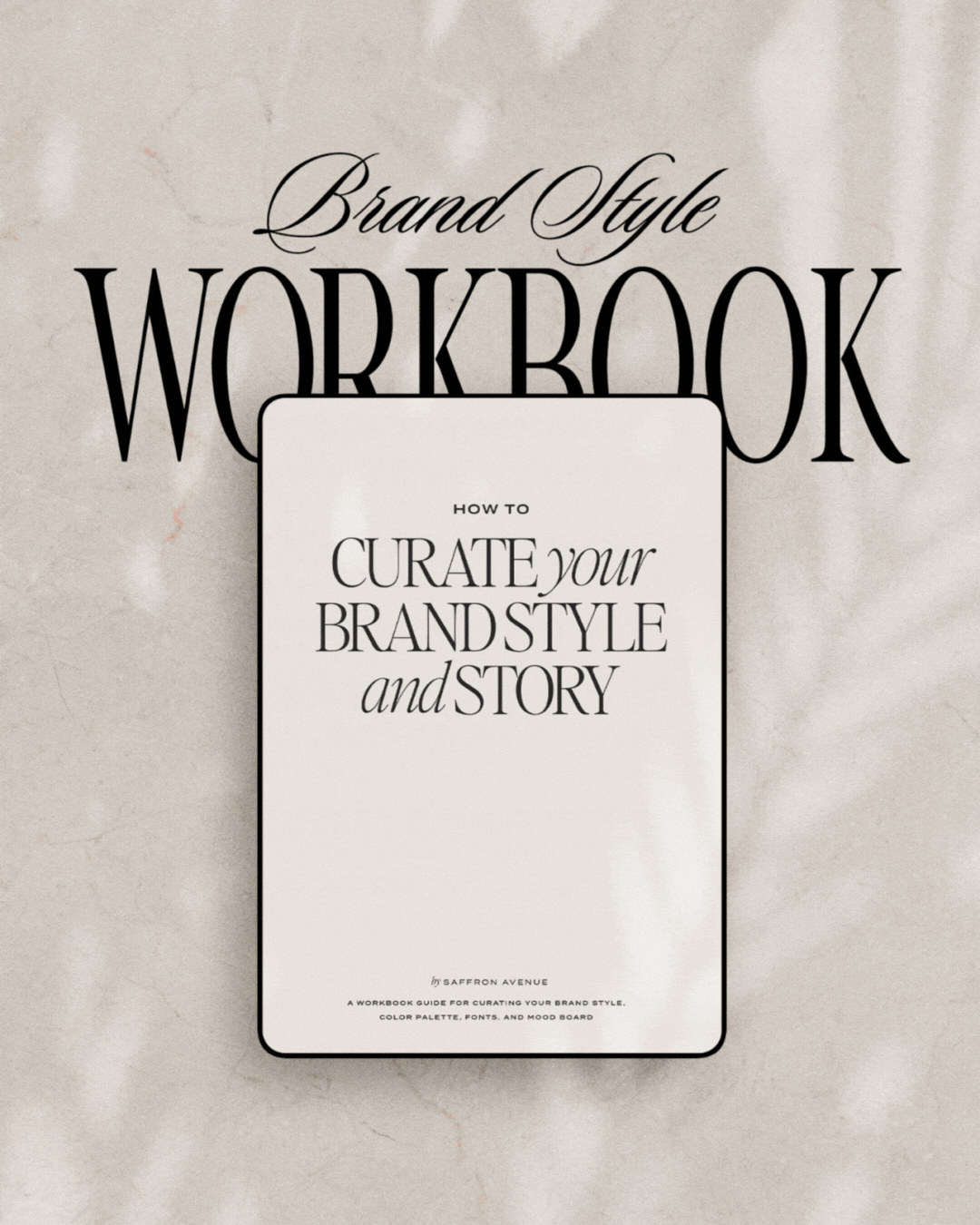
When creating a brand color palette make sure the combination of colors works well together. I recommend using a mix of primary, secondary, and accent colors (P.S. I have a formula in my Brand Style Workbook HERE). Having too many colors will make it harder for you to have cohesion and brand consistency.
P.S. You can signup for the free training video that breaks it down! Sign up below!
2. Choosing the Right Fonts
Choosing the right fonts is just as important as choosing the right colors. Your fonts should be easy to read, reflect your brand’s personality, and align with your values/adjectives. Here are some tips for choosing the right fonts:
Limit your font choices
Stick to two or three fonts to keep your branding consistent. There should be a hierarchy (primary, secondary, accent, etc). – Yup, I go through all of this in the Workbook too :)
Think about your brand’s personality
Just like with colors, your fonts should reflect your brand’s personality. Are you traditional and professional, or modern and edgy? The font itself can make the brand feel completely different!
-➝ P.S. this is still a very popular BLOG POST if you get stuck! Or peek at my fun font posts HERE.
3. Creating Consistency & Sticking with it!
Once you’ve created your color palette and picked your fonts you have to keep it consistent throughout your brand. Ie: on your website, in your print pieces, on your social graphics, etc. P.S. AND no changing it every few months! As hard as that is (another struggle), I urge you to try to stick with it.
3 ways to create brand consistency
Finalize the palette codes
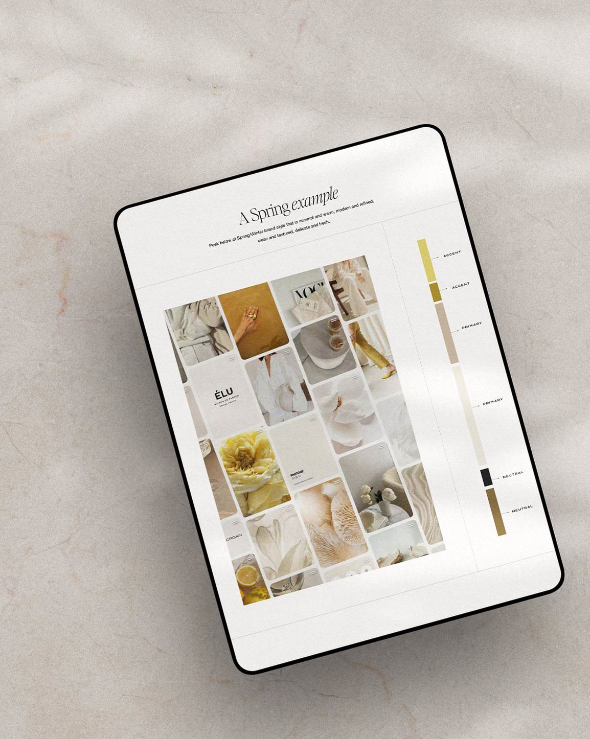
In my Brand Style Workbook I have example seasonal palettes to use with HEX codes. You can also use a color generator to make sure you note your Web HEX, RGB, CMYK (as different usage requires different codes).
Create a brand style guide
This is the perfect guideline to use as a reference for your brand. (p.s. My Brand Workbook includes a free template ;) This should include your logo, logo variations, font usage, and color palette codes.
Update your brand
Make a list of all the places you use your colors/fonts. Example: Create your brand kit on Canva with the new fonts/colors (and update any social templates), update your website, reprint your stationery, update your email signature, your email newsletter, etc! I know creating a color palette and choosing fonts can be a challenge for so many of us and that’s why I had to create my Brand Workbook, the EXACT process, questions, and steps I use for my own custom clients.


Absolutely love your resources! You are so organized, clear, creative, and helpful!! I am still wading my way through the entire rainbow of color choices but your seasons really helped me hone in on autumn as my brand’s season. The good thing is that even though I still have way too many choices, they at least all relate to each other!! I am very grateful for your brand style & story guide– especially the parts on color and fonts, my two biggest challenges always!!!! Your visuals are so beautiful and your sense of style amazes me!
Awww, this means so much to me! I know colors can be tough, but you are very close!!