As we know, we are not all designers, and even though website templates are the best thing ever, it can be hard NOT to make some mistakes when customizing your website and knowing if you are doing something wrong. Although I do my best to make my Website Templates easy to understand (with all the tutorials), I wanted to share a few common mistakes when DIYing or customizing your own website.
Choosing the Wrong Platform:
There are SO many platforms out there and choosing the “wrong one” can not only feel discouraging, but limit your design, functionality, and scalability. I actually created a blog post that goes over a lot of the top platforms with the pros/cons and comparisons. I personally always recommend thinking long-term (ie: do you plan to blog a lot, have an e-commerce shop, etc). –
→ ACTION STEP ←
I go over the pros & cons of some of the most popular website platforms in the linked post below!
Trying to Do Too Much
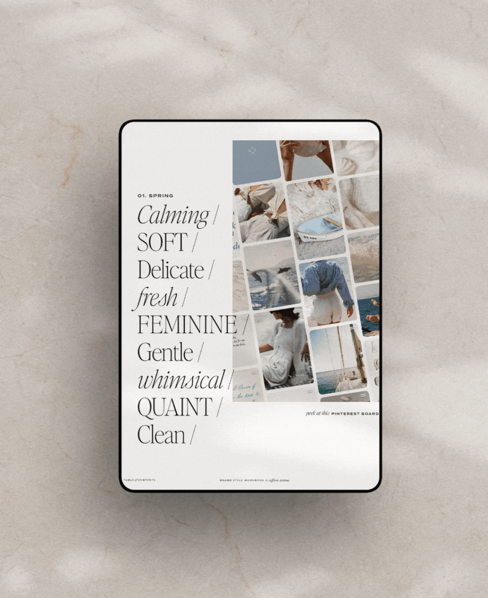
Honestly, try to keep it simple! Don’t go overboard with design elements (ie: stick to only 2-3 fonts and colors), don’t use a lot of animation/video, and try not to create messy layouts (white space is key)!By doing too much you can overwhelm your visitors and make your website difficult to navigate. Keep the design simple, clean, and user-friendly. Focus on readability, easy navigation, and clear calls to action.
→ ACTION STEP ←
You can use my Brand Style Workbook to help you narrow your palette and fonts. That way you have a clear idea of how to use specific colors ;)
Overloading with Content
Have a clear plan (and goal) for each page..and keep it simple! Some website templates might have a lot of ‘content’ sections on a page, but that doesn’t mean you have to use it all (that’s the beauty of Showit templates ;) – Try not to give the reader too many options and keep your message clear (ie: what you do and how you can help them). And DO NOT FORGET to add a call-to-action button on each page.
→ ACTION STEP ←
You can take my Free 5-Day Content Plan Email Course to get started!
Neglecting the Mobile Design
I will always highly encourage peeking at your analytics to see how many of your site users are on desktop vs. mobile. Because, as you know, mobile is starting to become VERY important. So, not making sure your site is easy to navigate, clean, user-friendly, and easily takes them from page to page (with those call-to-actions) is key. P.S. ACTION STEP: Hop into your site right now and check the following:
- Is your top navigation bar/hamburger menu easy to click (not delayed or hidden)?
- Does your logo click on your homepage?
- If you have a long scroll page, is your navigation sticking to the top? If not, do you have a ‘back to top’ button available?
- Do you have enough white space between content sections (don’t cram too much in)!
- Do you have a call-to-action at the bottom of each page leading them elsewhere?
- If you have a pop-up, does it fit the screen AND can you easily access the ‘X’
- Does your contact form work 🙂
- If you are a business with a location/area, is that somewhere on the homepage & footer?
Not Utilizing SEO
Search engine optimization (SEO) is so dang important for driving organic traffic to your website. Ignoring SEO, such as optimizing page titles, meta descriptions, headings, naming images, and using keywords, can make it challenging for your site to rank well in search engine results.
Choosing the Wrong Images
If you can, definitely try to do a small brand shoot! Even if it’s one hour at a studio, you’ll be amazed at how many images you could use. If not, try to keep stock images consistent..which means spending quite a bit of time searching for them (trust me, I do it weekly for my semi-custom brands ;)
- Unsplash: I typically go here first and search by color or even style (ie: Moody library or Cafe)
- Pexels: They have video and great free stock too. Try to find photos in your brand palette (ie: 2-3 colors).
- Kaboompics: Not as many to choose from, but a great source too!
- Editorial Stock Images: This is a membership site, but they definitely have stylish images, and the benefit of membership, less people will be using them.
- Élevae formally known as Social Squares: They recently added videos and have SO many photos to choose from.
Not Using Website Analytics
I know, it might not seem that important..but, without tracking and analyzing website data, you miss out on your visitor behavior, conversion rates, and where exactly they are coming from! Google has updated to GA4 which is definitely more confusing, BUT, even if you do not use the analytics right now, you should add this to your list to do. You never know when you start a new freebie or test a new social platform if it’s worth it..unless you look at your analytics ;)
So, if you notice you have made a few of these mistakes, I encourage you to invest some time and effort into fixing them in the next month or so. You would be surprised how many people might hop on your site and leave quickly!

If you click on my affiliates/products/advertisers links, I may receive a tiny commission. P.S. the products that I share are the ones I believe in.


