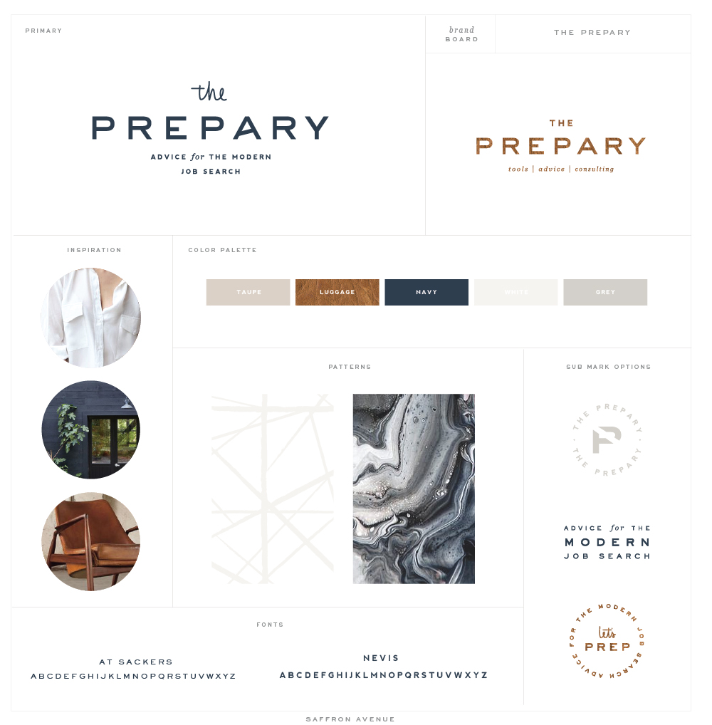
Woo hoo, I’m so happy to share this recent logo and website launch for the lovely Jaime over at The Prepary! For her project we wanted to make sure that the entire brand and website was visually appealing, welcoming, clean, and neutral (aka: not overly feminine). It started with the beautiful color palette brand board with the navy, cream, marble, and luggage brown as well as an updated logo (with a slight cursive/feminine font paired with a modern font).
As we started on the website we incorporated her colors and patterns throughout but still keeping it modern, clean and consistent. Her biggest focus on the site design was ease of use for the end user (her potential clients), so placing specific graphics and call-to-action items were done with lots of thought and precision. I couldn’t be happier with the turnout! Make sure to take a peek here to see the full site!





I absolutely love this brand – so smart and clean. Great job!
Hi, what happened with your WordPress themes, any news?
Still working on them!! I’m still waiting on some testers to give feedback to do an update before releasing! BUT, I can say they will be launch before SUmmer!!
I love the geometric line pattern you used as a background. Do you mind me asking if you purchased this pattern from an online marketplace or if you drew it yourself? I’m looking for something similar for my own rebrand and I just love it!
I created it on my own ;)
Ah! Of course. :) Do you sell things like this? Elements, backgrounds, etc.
Only with my branding packages ;)