It’s no surprise that color plays a huge role in branding. But what about accent colors? How can you best use accent colors while “sprinkling them in lightly”? As you may know, primary colors set the foundational tone for a brand’s image, but it’s the accent colors that add depth and attention. Accent colors, when used strategically, can accentuate the brand story, highlight your personality, and make the brand even more memorable and resonant with your target audience.
Choosing the Right Accent Colors
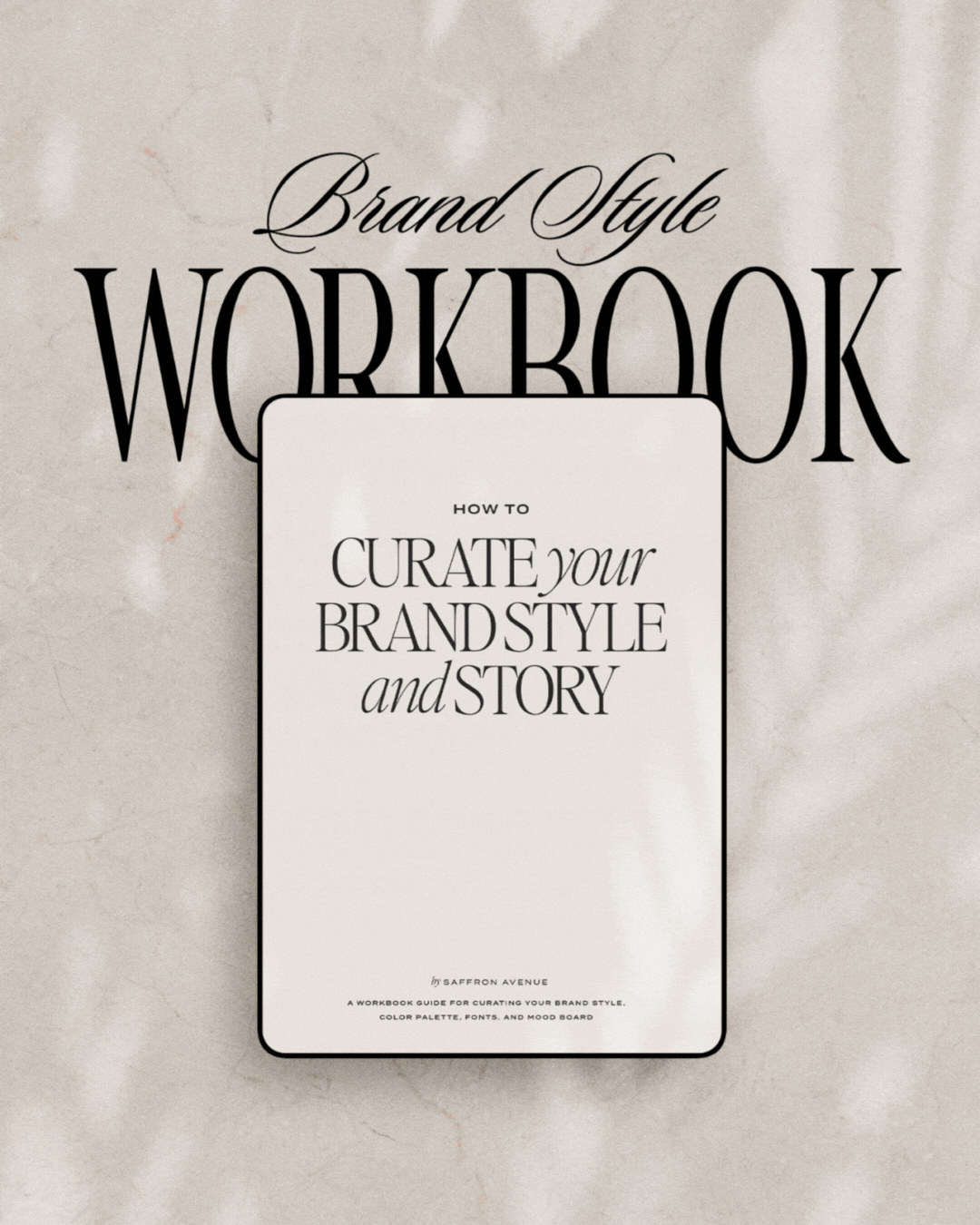
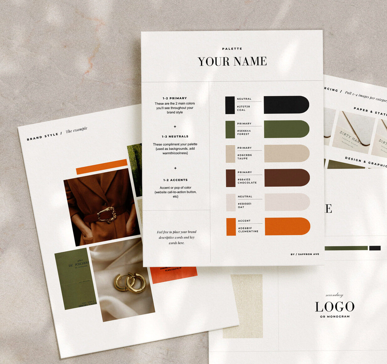
Choosing the right accent colors must be grounded in understanding your brand identity. It’s not just about aesthetics; it’s about aligning with the brand’s core values and messaging. P.S. is something I dive into in my Brand Style Workbook HERE. (The same process and homework I use for my own custom and semi-custom brands)!
Accent colors should complement the primary ones, creating a harmonious palette, but still adding a layer of interest to the color palette.
And remember, all colors evoke a feeling. While yellow can invoke originality and happiness, blue might soothe and invoke trust. Therefore, the choice of accent colors is pivotal in conveying the brand’s ethos and personality. I recommend taking a peek at what colors your competitors are doing, that way you can make sure to stand out from them yet still align with your core values ;)
How to Use Brand Accents Colors
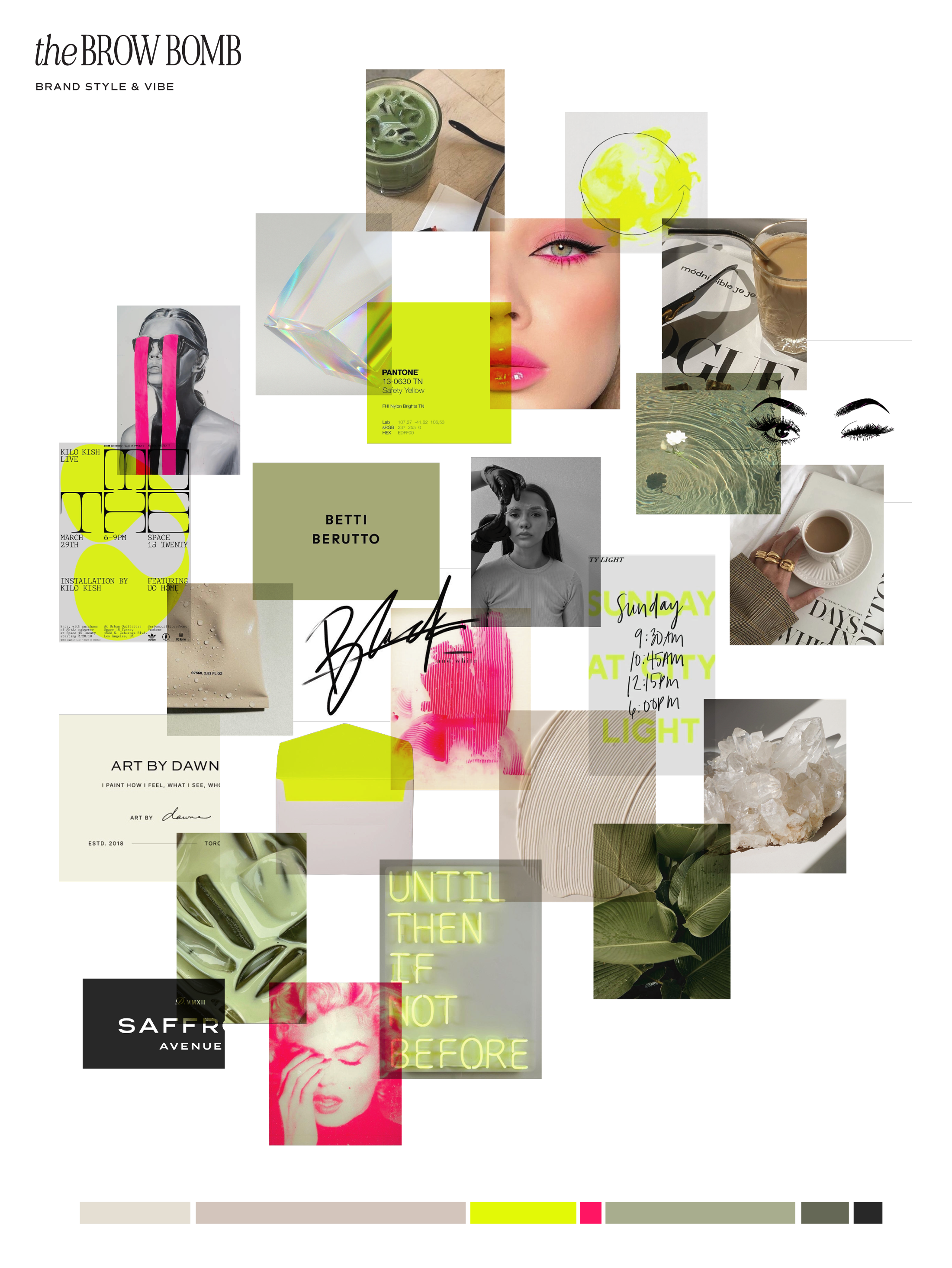
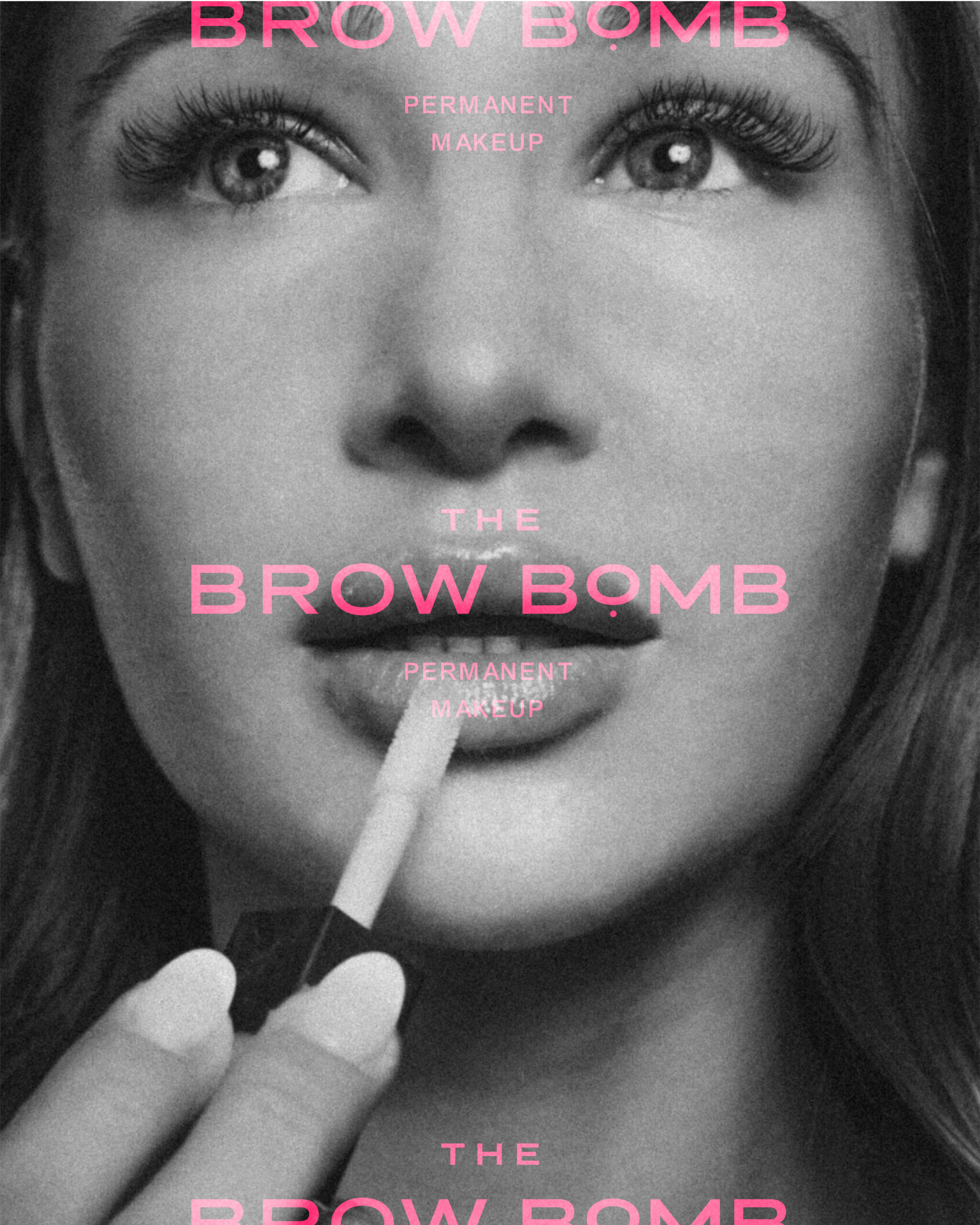
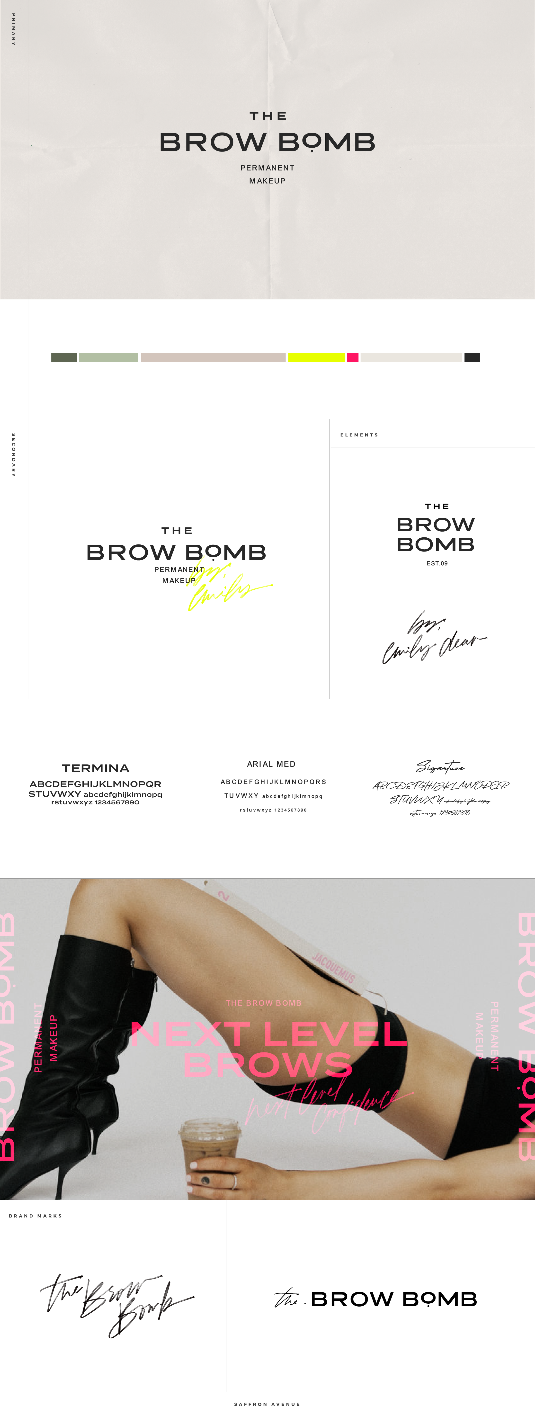
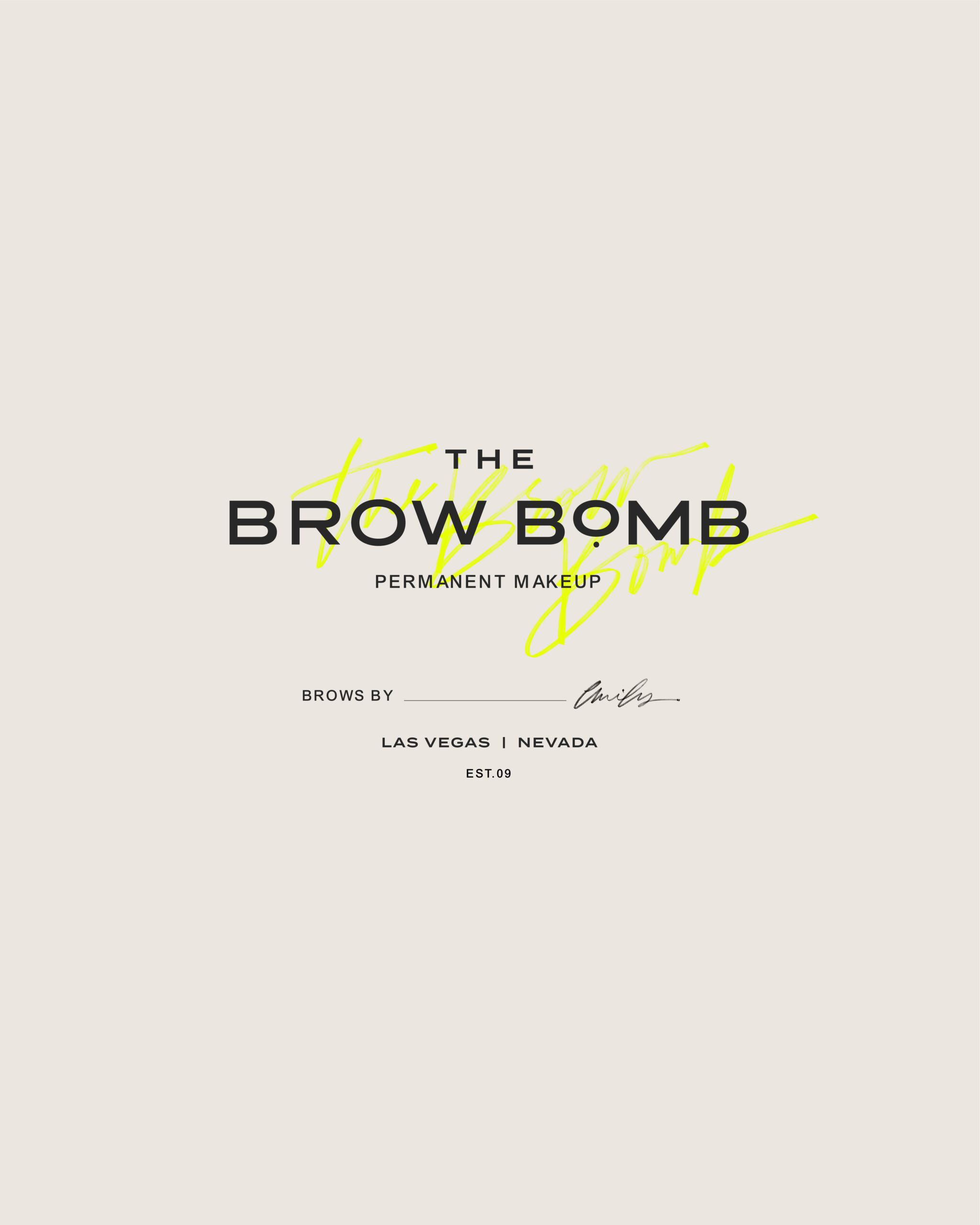
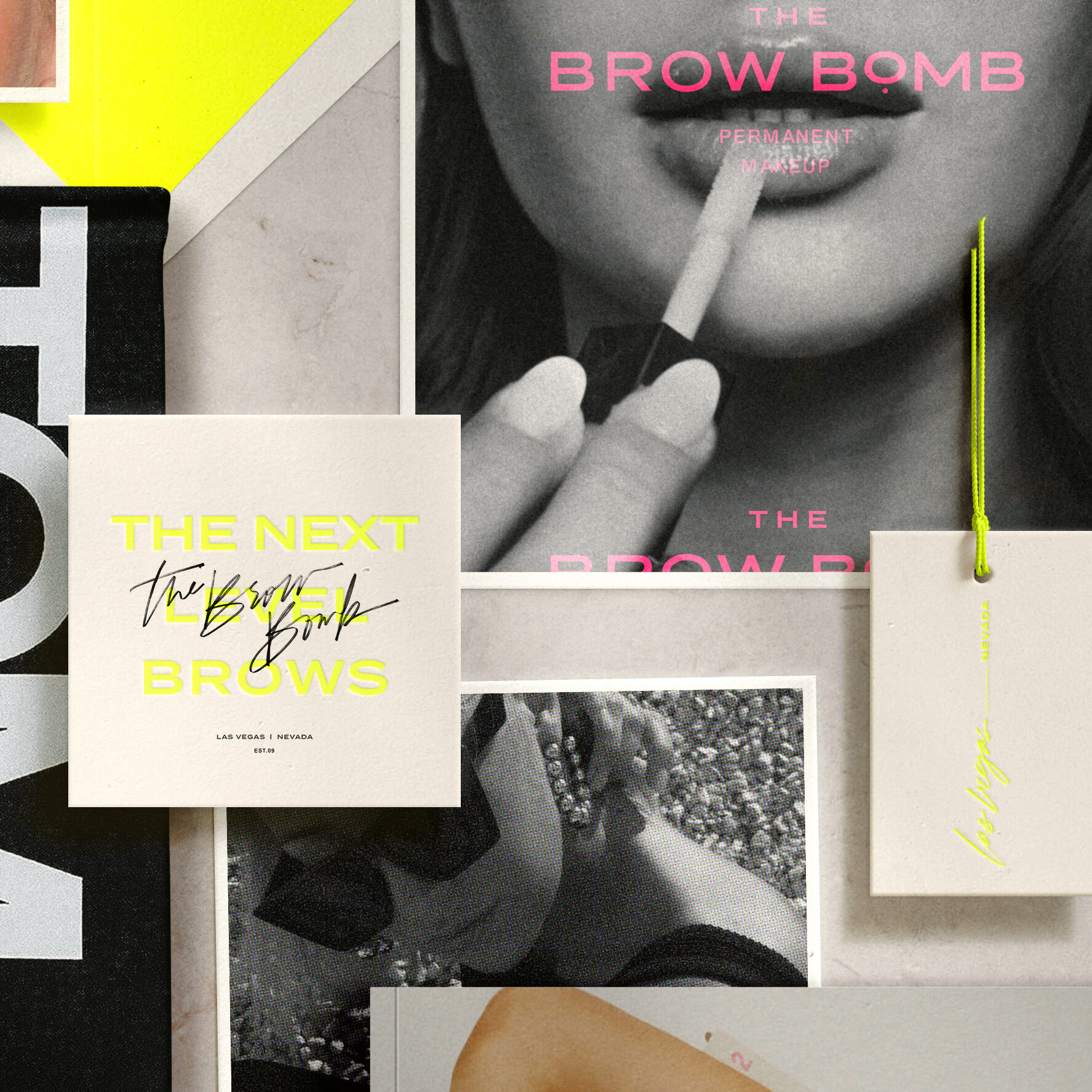
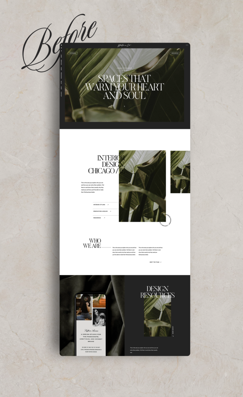
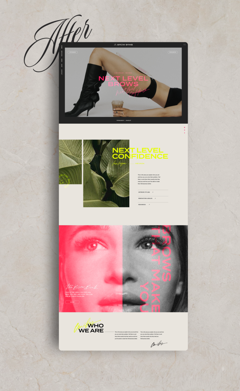
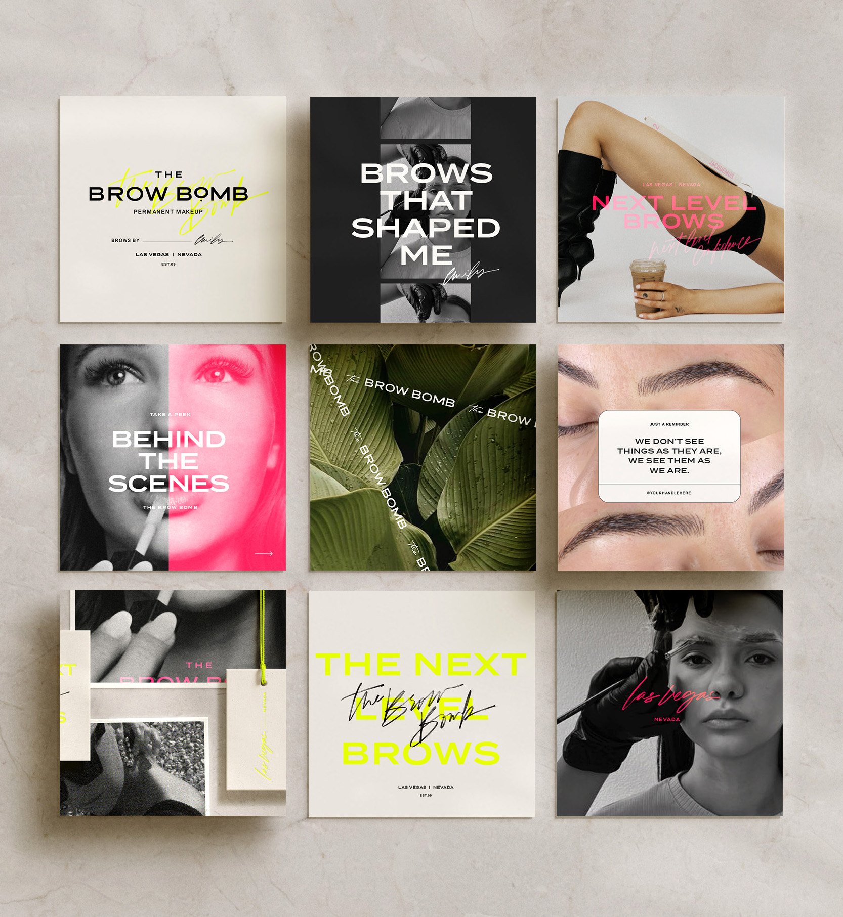
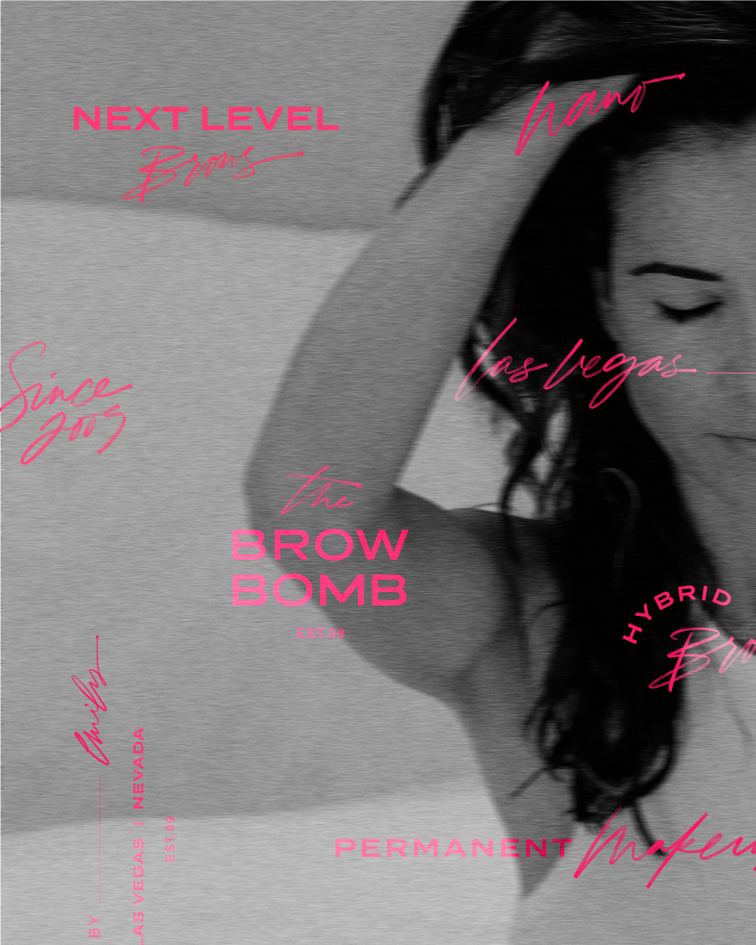
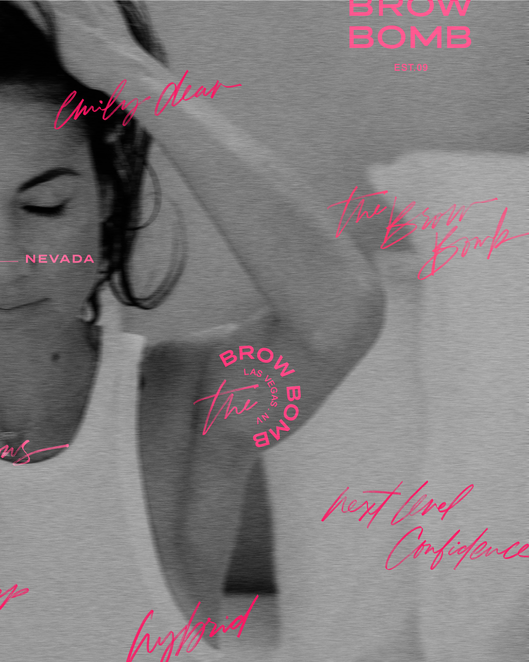
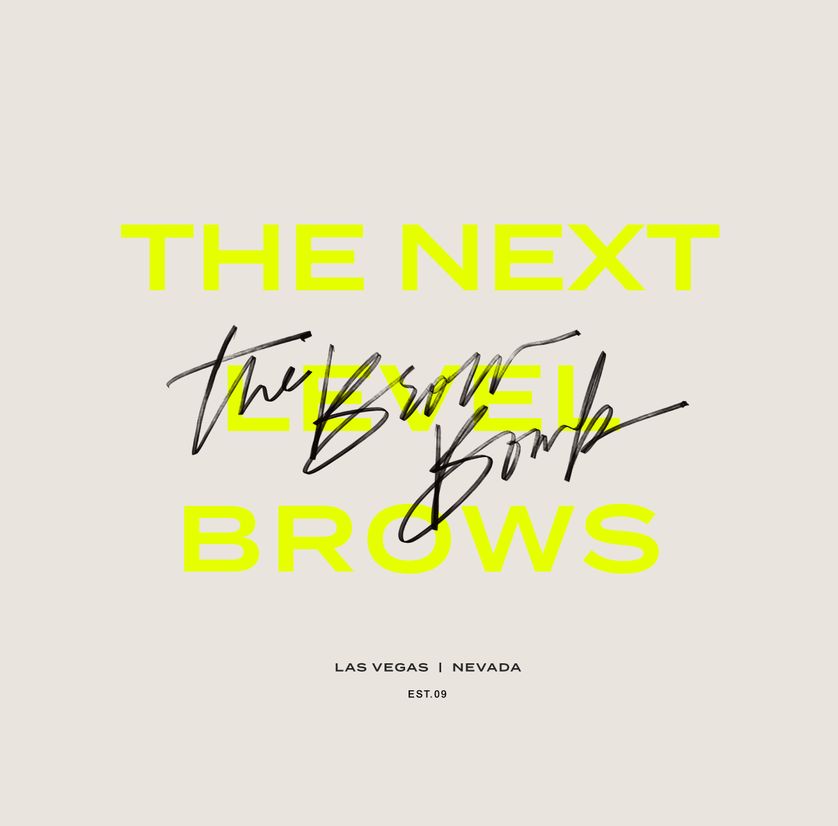
I’m going to use a recent semi-custom transformation as an example of how to use your brand accent colors. Emily from The Brow Bomb wanted to make sure her brand stood out amongst her competition, which typically has neutral/boho vibes. So, with that, we opted for those neutral colors but added in neons for the accent.
Accent Colors in Print Marketing
Print marketing, though traditional, is far from boring, and accent colors can bring it to life! Be it business cards, stationery, or even packaging materials like boxes and tags, a hint of the accent color can make them pop. The choice of paper color, envelope liners, or even foils can reflect the brand’s personality, making every tangible touchpoint a memorable interaction.
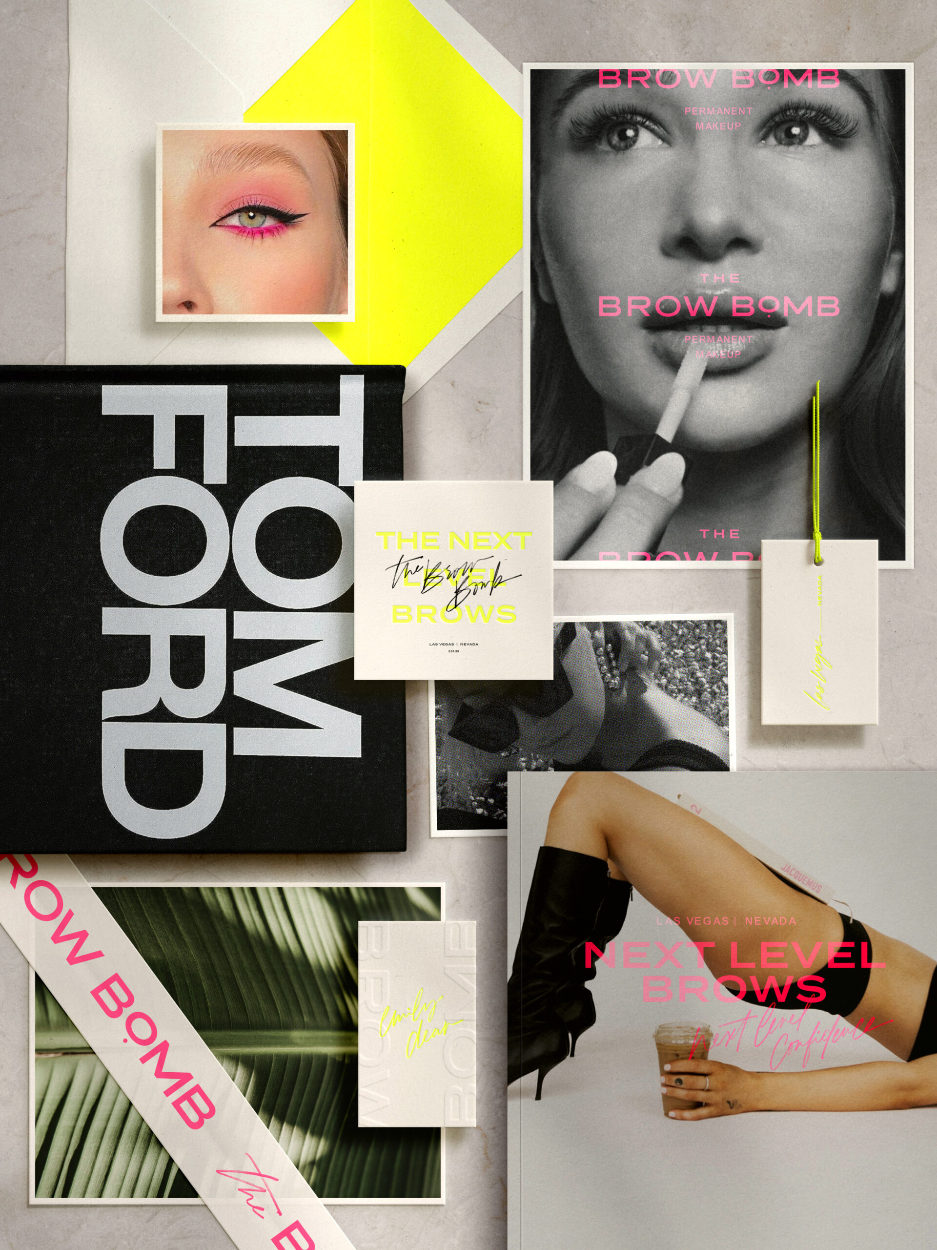
You can see how an envelope liner, letterpress ink, and even a tag string can help pull in the accent color without feeling overwhelming
Using accent colors in Web Design
The digital world loves accent colors too, especially on your website! Think about the buttons you hover over or the call-to-action text. Using the right accent can make those elements pop and guide people through your site. Not only that but adding the perfect pop of color to a website background or brand elements will help your website stand out and align with your brand.
Here’s an example of how to use pops of color with my customizable Palma Showit website template.
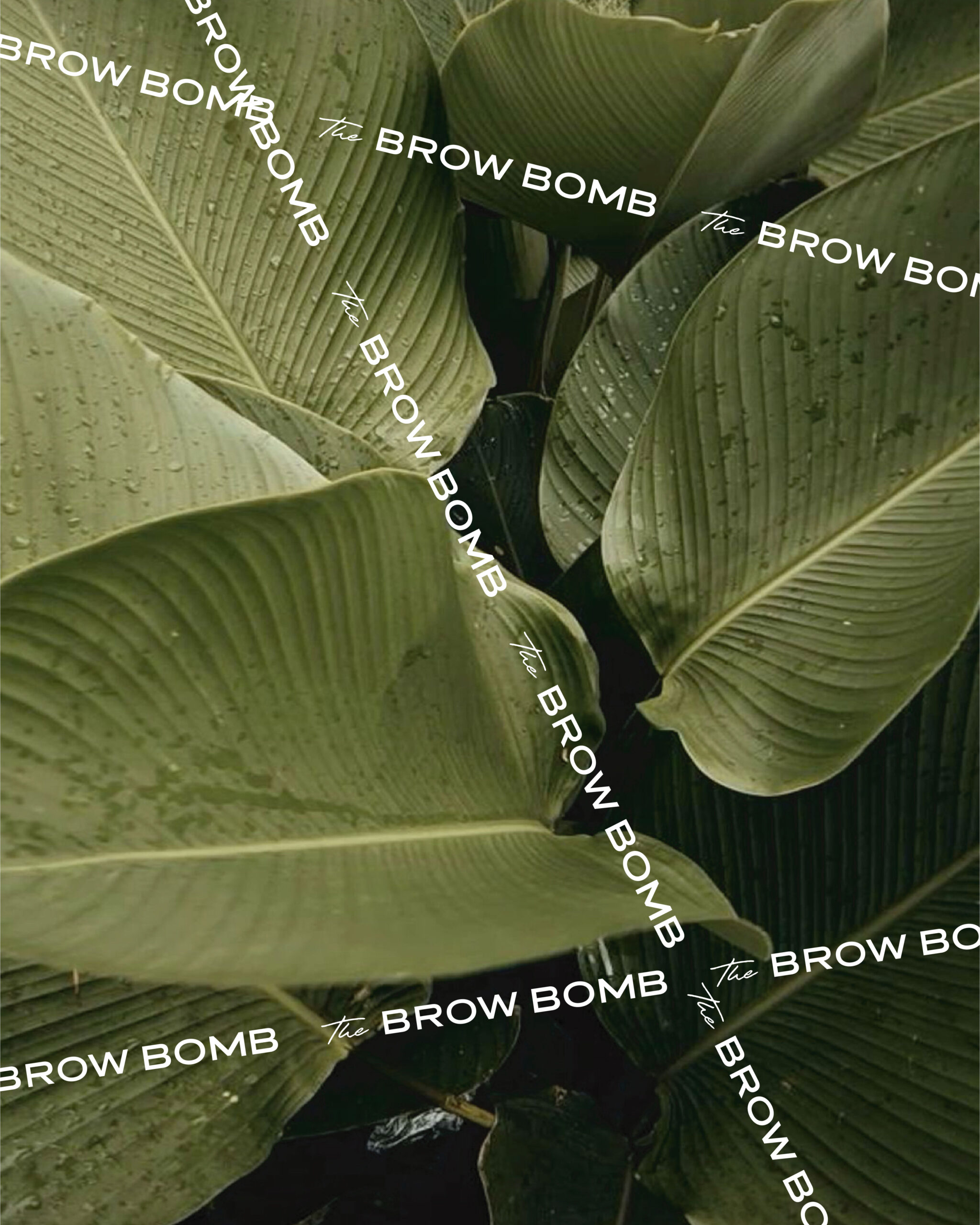
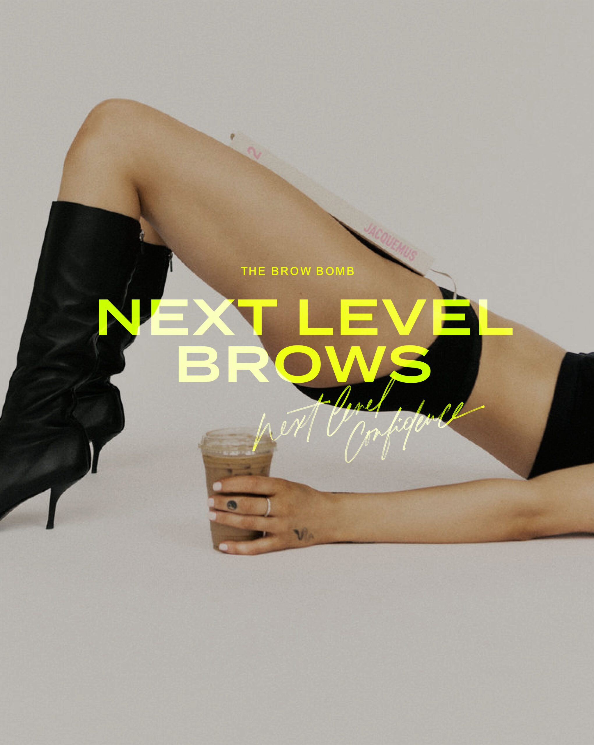
Incorporating Accent Colors in Images and Social Media
Visual content, especially on social platforms like Instagram, can significantly benefit from the use of accent colors. Imagine a social media graphic that uses a splash of accent color for the background, text, or even an overlay. It not only captures attention but also ensures that the brand remains top of mind across platforms.
Maintaining Consistency
With great accent color power comes great responsibility. It’s essential to maintain consistency with accent colors. Establishing brand guidelines, knowing the precise color codes, and periodically reviewing and updating materials ensures that the brand image remains unified and strong.
Accent colors are more than just fun pops of color. They’re strategic decisions that can enhance brand recall, set the brand mood, and create a lasting impression.
So, whether you’re a creative entrepreneur or a designer, don’t shy away from experimenting with accent colors! After all, a well-implemented color strategy could be the game-changer your brand needs..and one that can help you stand out amongst the crowd ;)
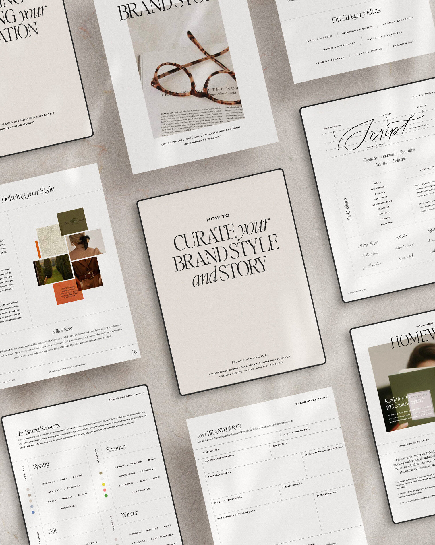
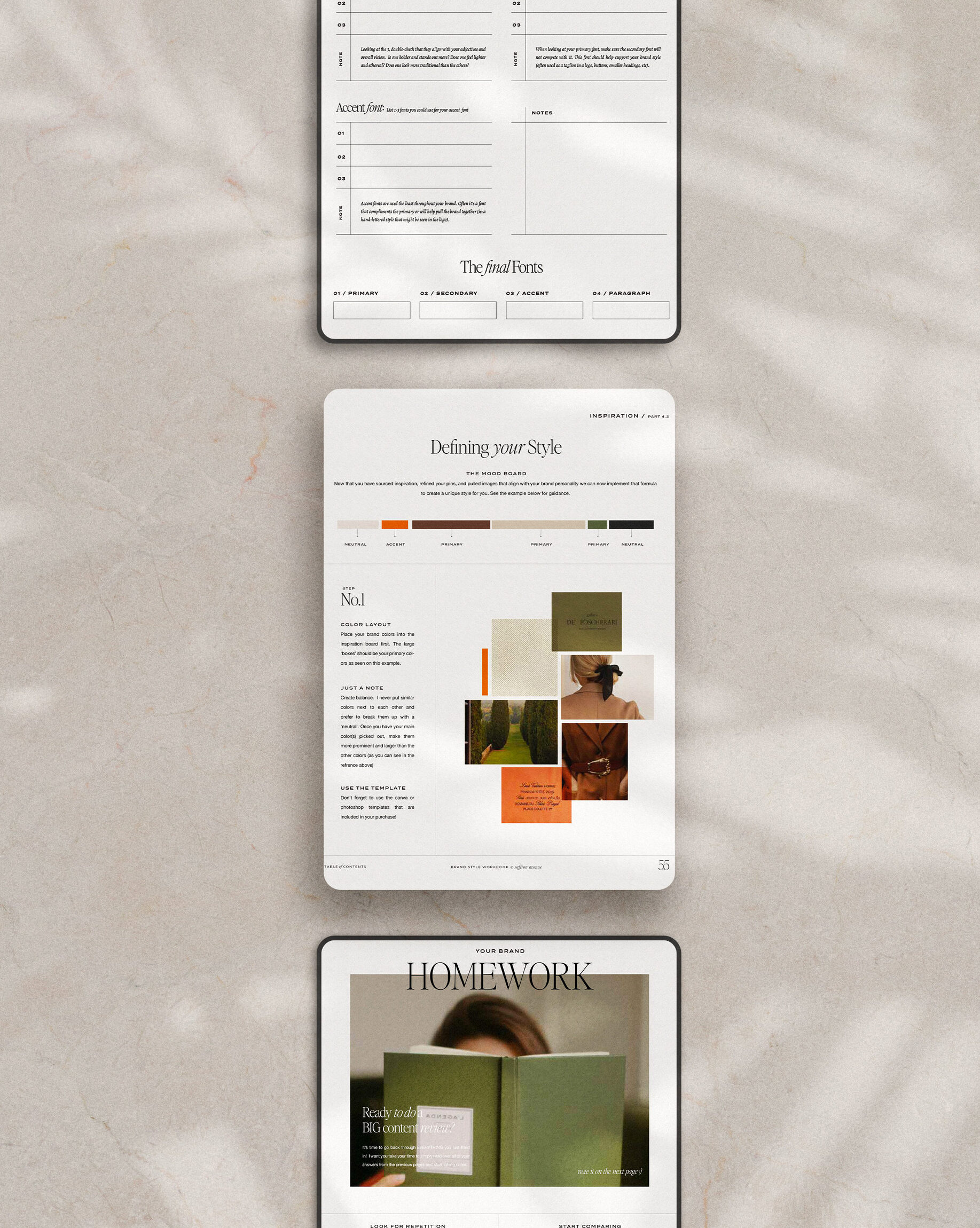
Learn how to create your own inspiration board and color palette!
If you click on my affiliates/products/advertisers links, I may receive a tiny commission. P.S. the products that I share are the ones I believe in.


Hey Angela, where on your website can I get access or purchase the Signature script font used on the Brow Bomb Brand?
That’s my custom lettering ;)