I’ll keep this pretty short and quick, but I wanted to start a newer ‘series’ (we’ll see how long I last with it ;) about fonts. I realize how many customers and clients of mine simply do not know how to best pair fonts or use fonts in their brand. So, enter some example font and type hierarchy.
What’s the difference between font & typeface?
A Typeface
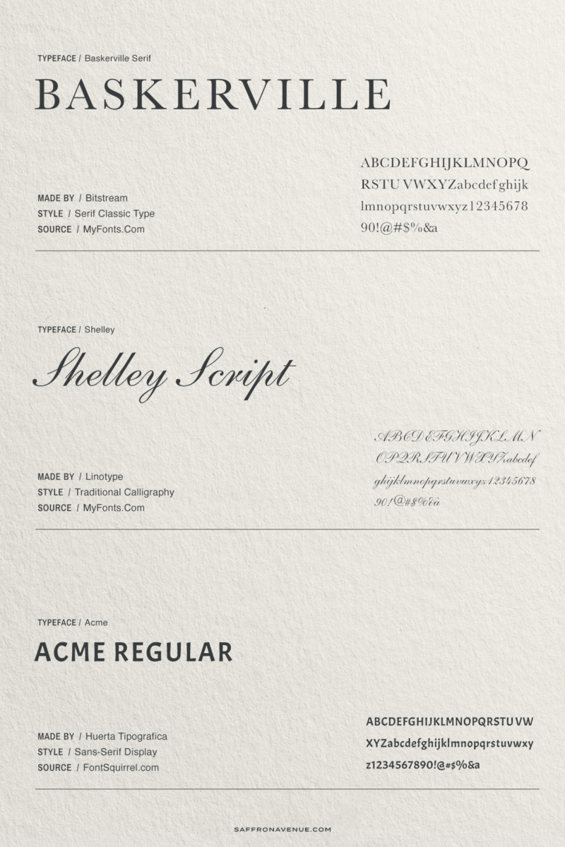
A typeface is a particular set of glyphs or sorts (an alphabet and its corresponding accessories such as numerals and punctuation) that share a common design. For example, Helvetica, Baskerville, Arial, etc are some well-known typefaces. via: CobanHards.Com
A Font
A font is a particular set of glyphs within a typeface. So, if you were to go with the Helvetica typeface, a 12-point bold Helvetica is a font. The same goes for a 10-point bold Helvetica, they are different ‘fonts’, but the same typeface.
So, a typeface is an overall style and family and the font is a specific variation of it (size, weight, etc).
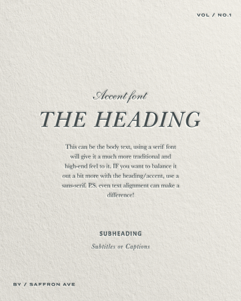
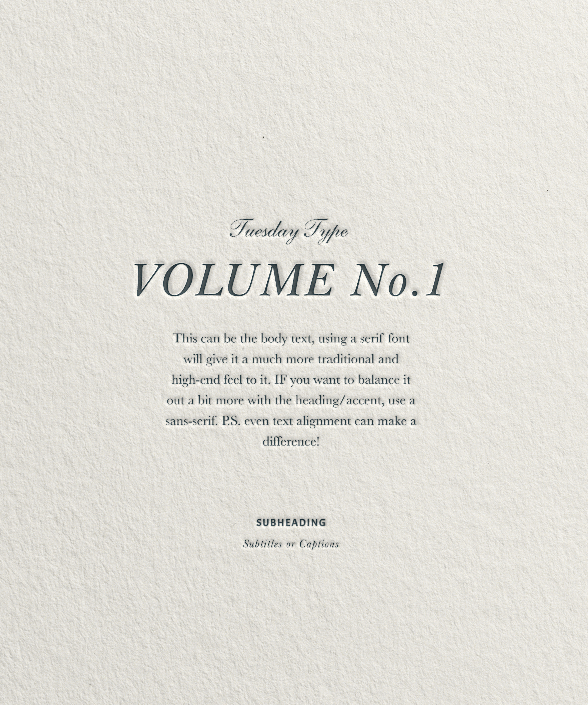
A classic font pairing
There is nothing better than a classic Serif paired with a traditional script. Baskerville (and Didot) are one of the most classic serif typefaces out there. They can be paired with fonts to feel more traditional or more modern (ie: pairing with a sans-serif or hand-lettering).
In this font pairing example, I used Baskerville (with some letter-spacing), Shelley Script as an accent, Baskerville for paragraphs, Acme Regular for the Subheading (or buttons), and Baskerville italic for subtitles and captions.
Together, they create a beautiful font stack and font hierarchy that is perfect for a more traditional and classic brand.
If you click on my affiliates/products/advertisers links, I may receive a tiny commission. P.S. the products that I share are the ones I believe in.


