
Alrighty, in PART 1 HERE I dove into all the many font types, styles, and traits. In Part 2 today, I’m going to show you how to choose fonts that will attract your ideal client or customer. That means, I created actual examples (using my Website Templates HERE) on how changing the fonts and colors within your website (and brand) can make a drastic change in your overall look and style. Which, in turn, can help attract that ideal client or customer!
So, by now you should have gone through the previous couple blog posts so you are able to choose font pairings that will represent your style.
1. FIND YOUR COLOR PALETTE HERE
2. FIND YOUR FONTS HERE
The Next Step:
-
It’s time to narrow down the list of fonts you pulled from Part 01 and pick THREE total (4 max).
-
Make sure you are choosing fonts that compliment one another. AKA: Not choosing a high contrast (bold serif) and then pairing it with a chunky slab serif, but instead choose a sans-serif that won’t steal the primary’s show ;)
-
With the 3-4 fonts you narrow down, choose the following:
PRIMARY FONT
This is your main ‘brand’ font. Typically it’s seen in your logo and what you will most likely use for your heading 1 (ref. Ginger Template below). This can be used as all UPPERCASE, maybe it’s Italicized, maybe it has more S P A C I N G, or maybe it’s just Normal.
SECONDARY FONT
This is the font that will complement the Primary font (and what I normally use for Heading 2 or 3). I tend to do a font that won’t compete with the primary too much. AKA: If using a Serif Uppercase for Primary you can pair it with italic lowercase version (as it’s different enough) or an uppercase sans-serif to compliment.
– READ HERE FOR FONT PAIRING EXAMPLES –
ACCENT FONT
This font is what I like to set all the calligraphy and lettering fonts as..the accent. It’s not always recommended that you use these fonts for a lot of headings because they can be difficult to read at times. So, if your logo is in calligraphy, you can use a calligraphy font as an accent to pull it together. You’ll notice in my brand, the handwriting script is my accent, and you only see it used sparingly. You’ll notice, even as an accent, it still connects to my brand and pulls it together when sprinkled here and there..without it feeling too busy.
Paragraph
This is a crucial one actually..because just changing your overall paragraph text from serif to a sans-serif can give a completely different vibe (From classic to modern). I recommend using a style of your primary or second font. AKA: if your Primary is serif, your secondary is uppercase sans-serif, your paragraph can be either the serif or sans serif.
– Peek Here For Help Choosing too –
THE EXAMPLES
Because I’m visual, I’m going to show you a few examples with the Website Templates I have and how much they can actually change when using the fonts that align with your style.
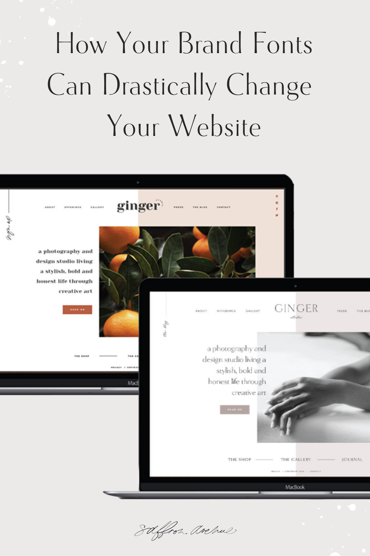
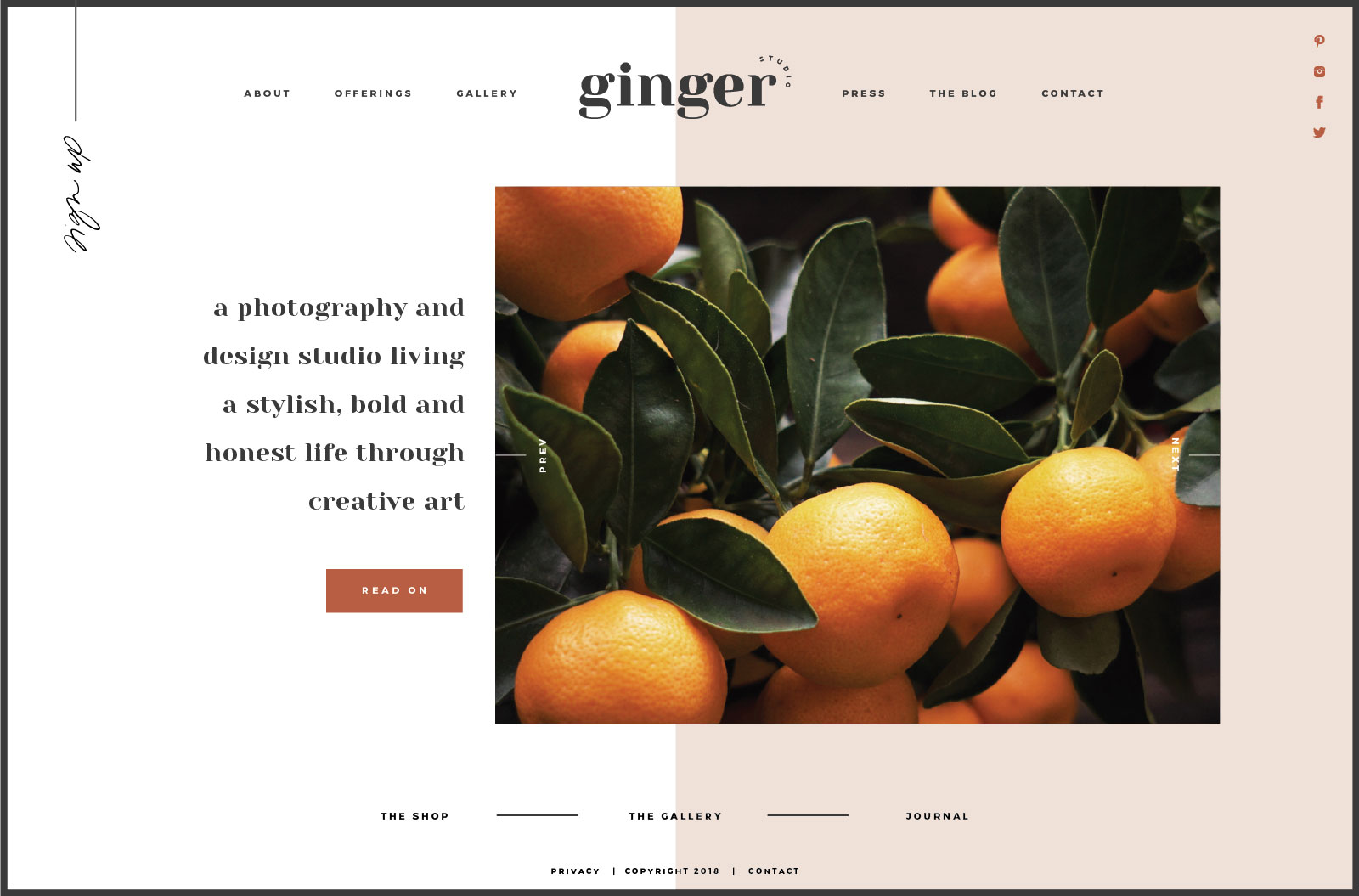
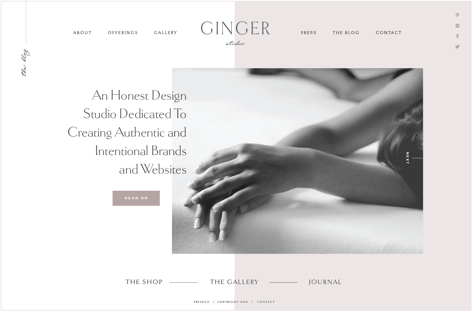
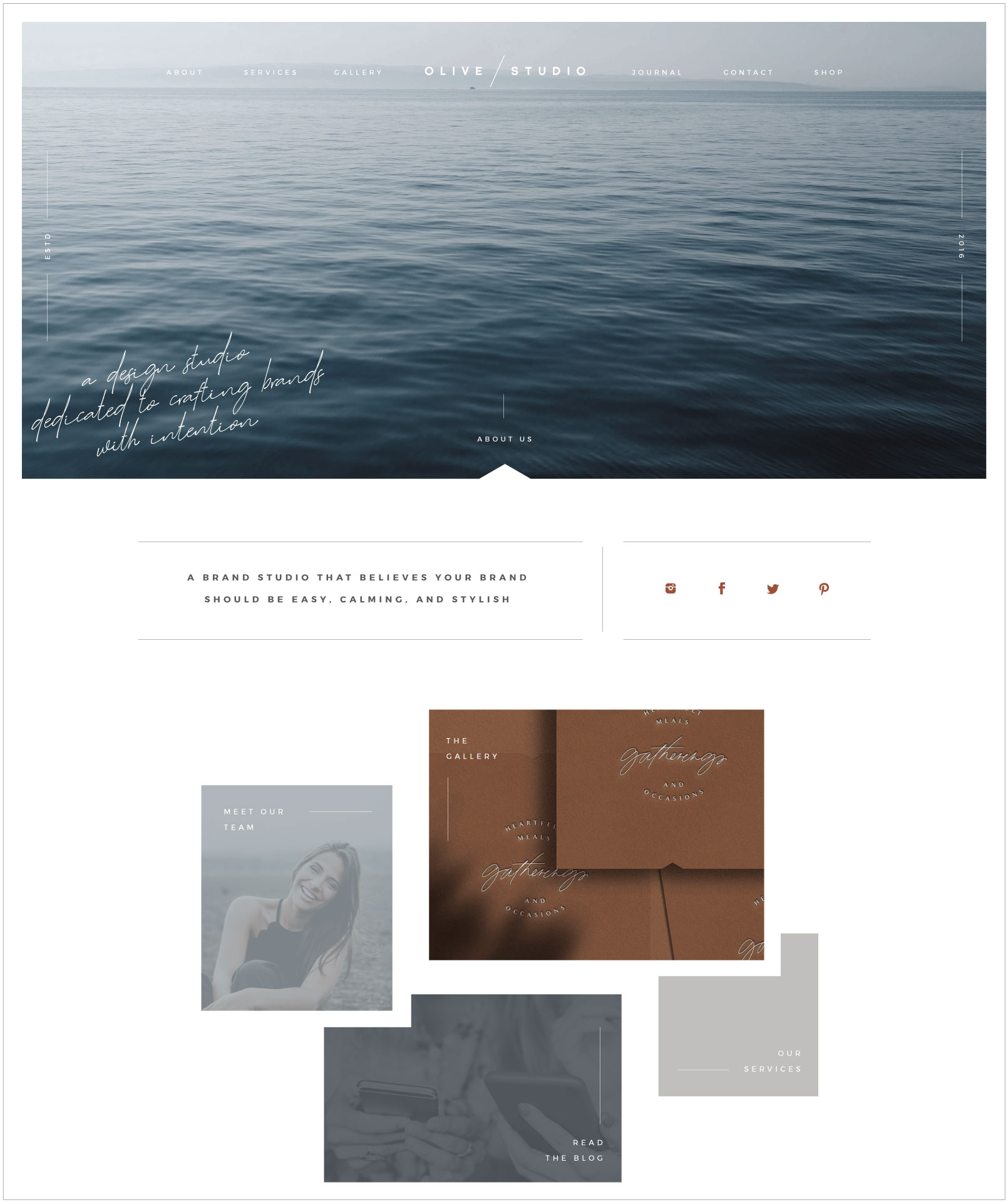
Ginger Template
This WEBSITE TEMPLATE is using a High Contrast font (Yeseva One) which is bold and unique, but it’s also lowercase to make it feel more playful and fun. It’s paired with a sans-serif font to add balance, but to also feel more modern and clean. You’ll see the season is Summer and those ‘descriptive’ words start to align perfectly.
Variation One: Summer
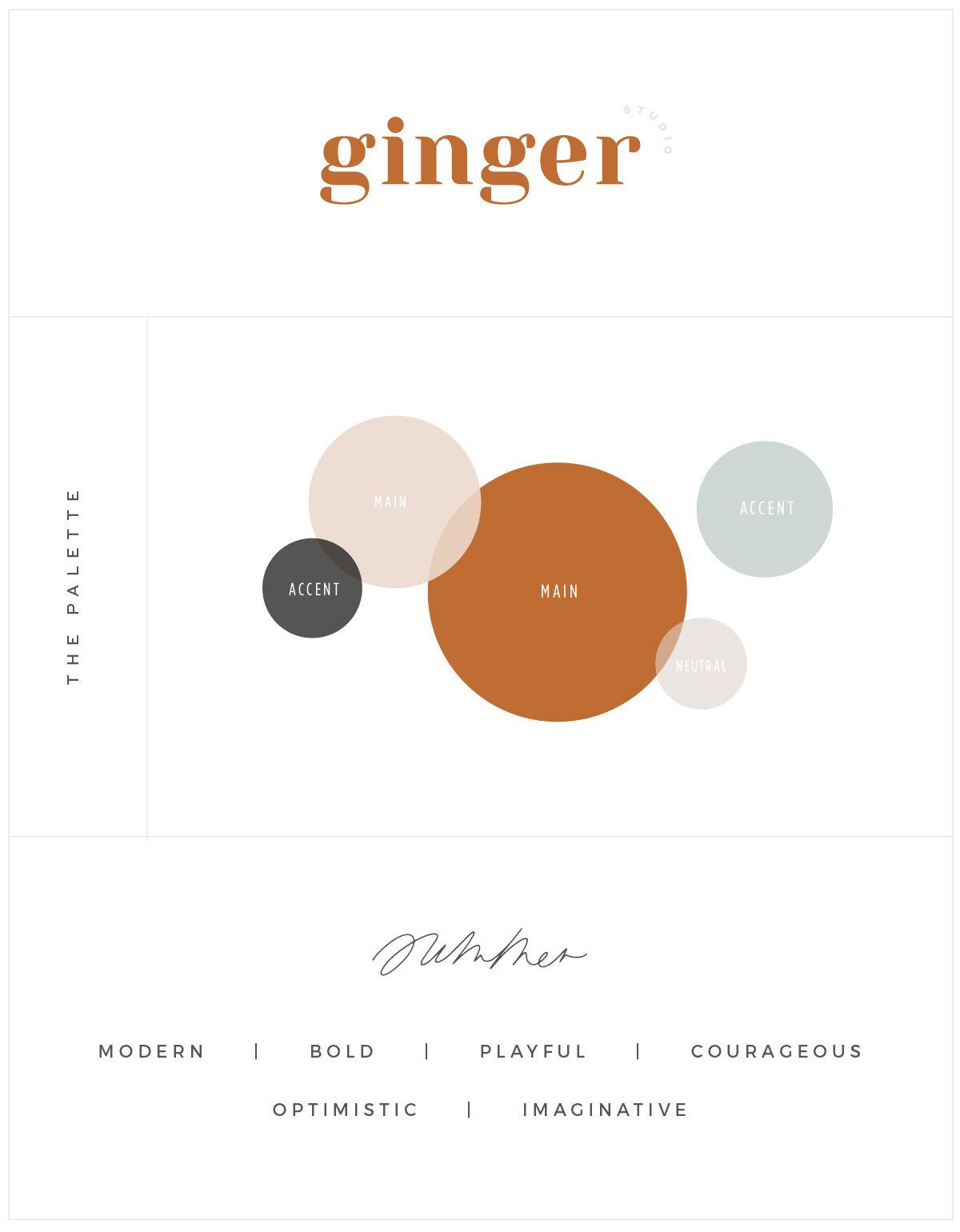
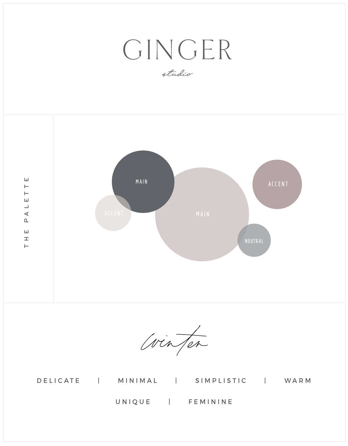
Variation Two : Spring/Winter
Oh, how different this can be! I changed the fonts to Goldenbook Light which is a low contrast font and more delicate and simple, yet a serif that is sophisticated and warm. It’s paired with a script to make it feel a bit more feminine and unique, especially when pairing it with a more neutral winter (a hint of spring) template that tends to be more minimal and ethereal.
P.S You’ll notice that I used Goldenbook as both all UPPERCASE for heading 2 and Normal for heading 1 (and then a sans-serif for the 3rd option).
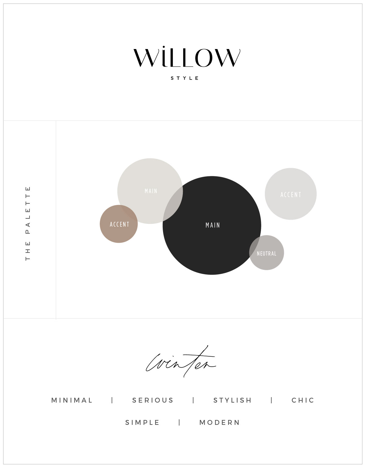
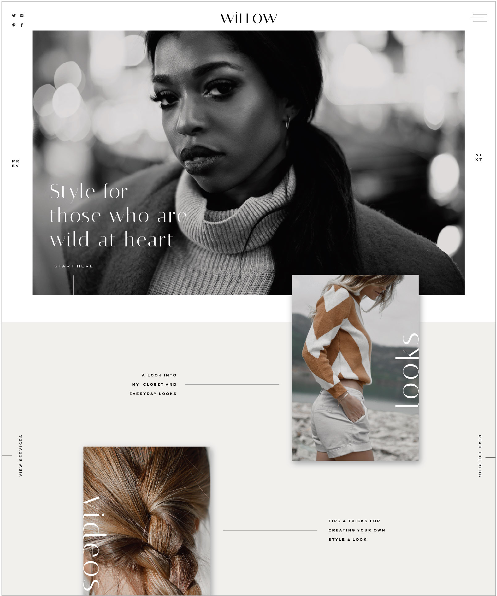
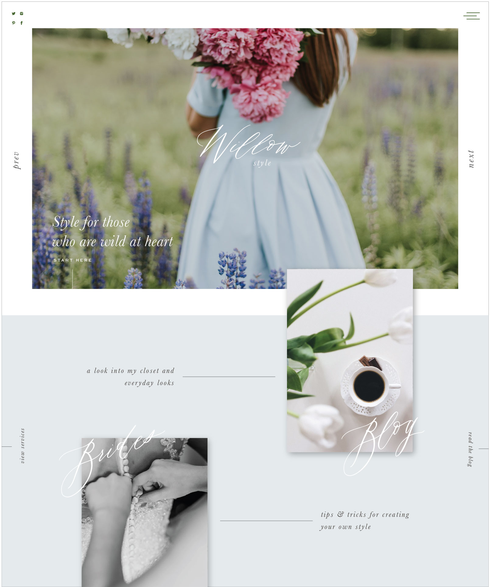
Willow Example
This template HERE is a very stylish, modern, and neutral template. It uses Italiana which is very sleek, stylish, and modern and paired with Montserrat which is a bit bolder, chic, and modern. So overall this brand and font pairing is much more minimal and serious like the Winter brand season.
variation one: winter
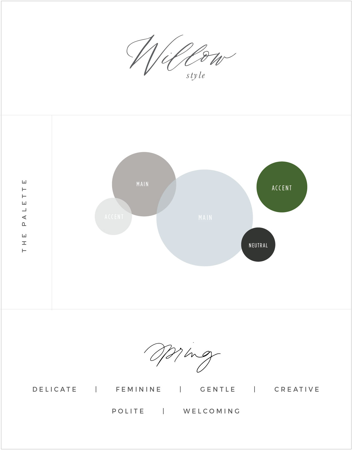
variation two: spring
If we switch up the fonts to include a Script (for the logo and any accent font) which is creative, feminine, and unique. Add a secondary logo which is an Italic Serif to feel more sophisticated, mature, and polite. Because I don’t recommend using Script for headings I also include a simple sans serif to make it feel a bit clean and modern (a good complement to the script and serif).
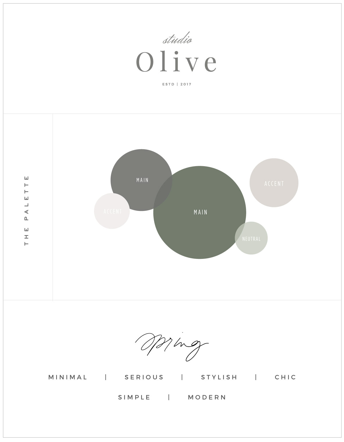
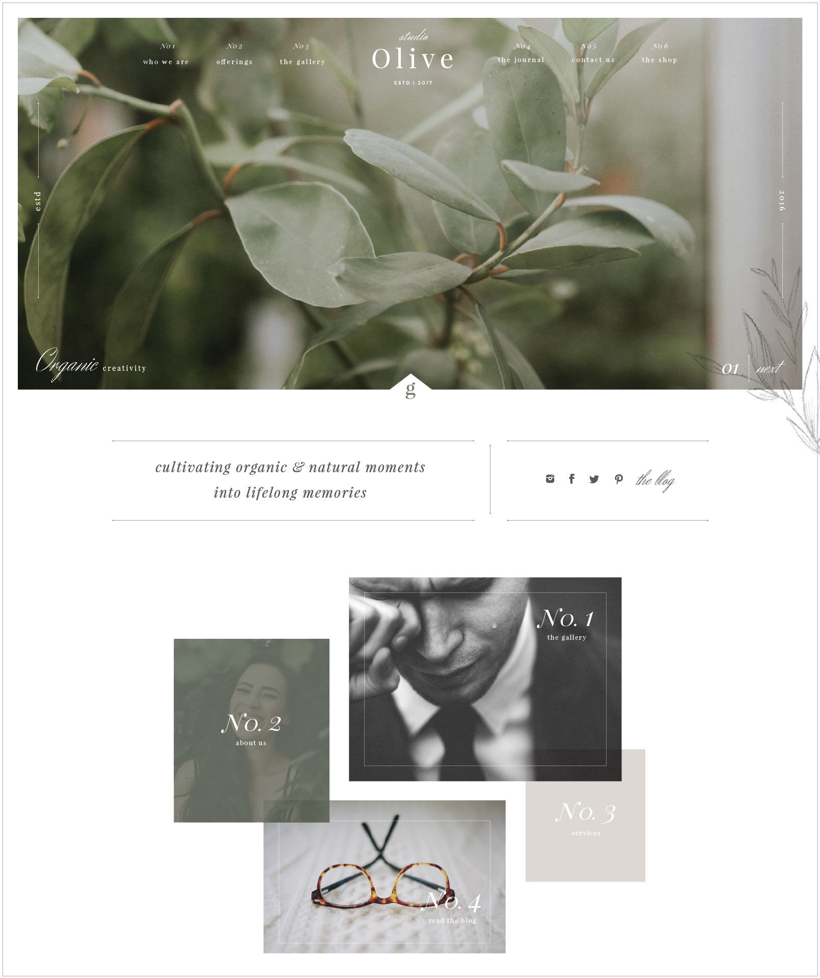
Olive Example
This template HERE is more “Spring” inspired and feels very delicate, dainty, detailed, and creative. It uses Playfair Display but in both lowercase and italic versions to feel less formal, but inviting and timeless. It’s also paired with a script Herr Von Muellerhoff which is very feminine and a bit classic. Just like I did with the Willow above, I paired it with a regular/thin Montserrat serif to compliment the detail of the others.
Variation One: Spring
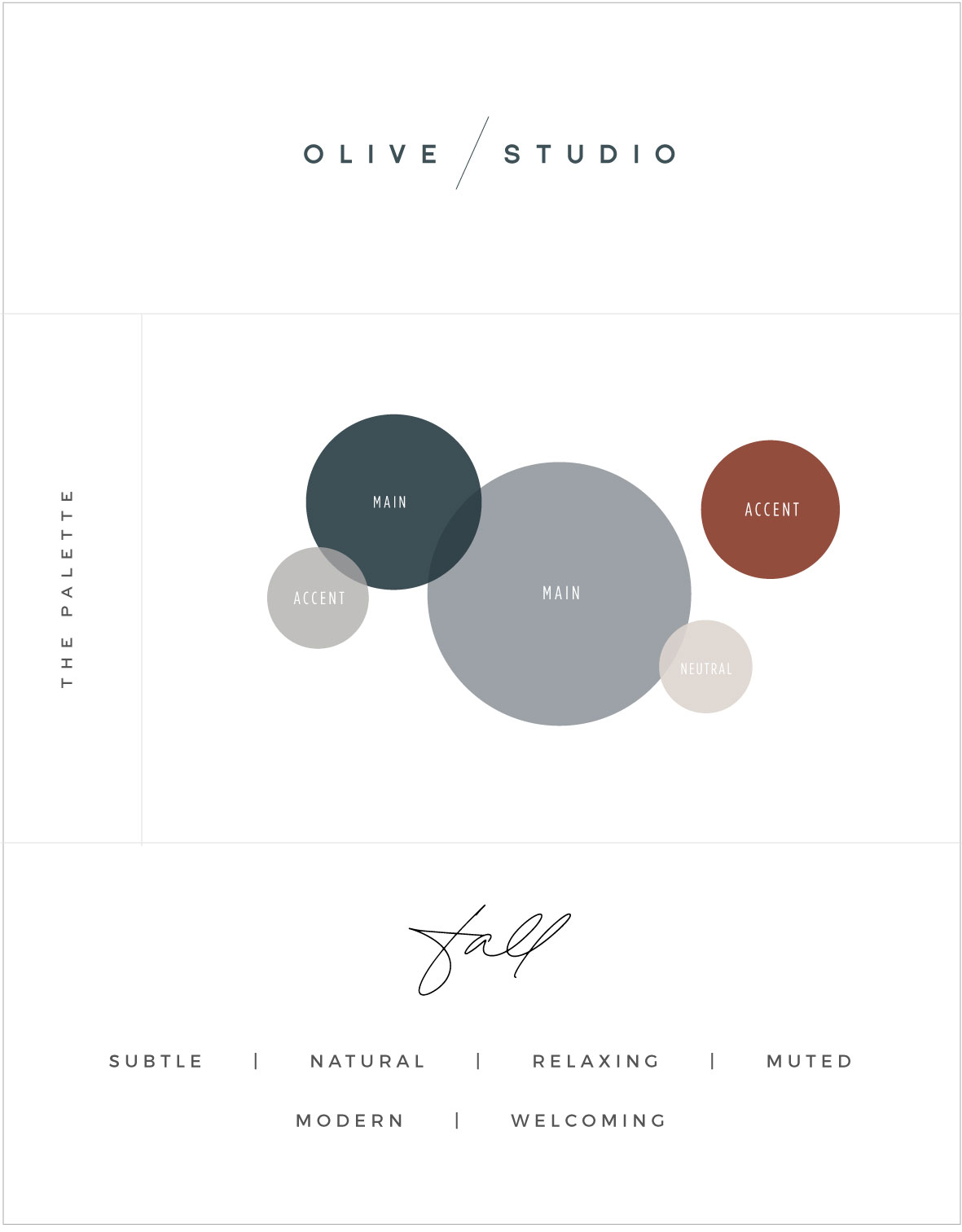
Variation Two: Fall
For this change up I wanted it to feel a bit more masculine, natural, modern yet still welcoming. With that I used SC Florence Black for the logo (and for the headings) which is very modern, clean, and minimal. BUT, to warm it up I added in a more hand-written font (suddenly script) to give it a more feminine touch to feel more welcoming!
TRY THE NEW BRAND WORKBOOK!
Post Recap
So, by the end of this post I truly hope you were able to narrow down your overall brand style, color palette, and font pairings! If you want to peek at some other resources take a look below!
– SHOP CUSTOMIZABLE BRAND TEMPLATES –
– THE IMPORTANCE OF BRAND PHOTOGRAPHY –
– FAVORITE FONTS OF THE MONTH –


Amazing post! How and where do you draw your inspiration from? Do you use Pinterest or some physical mood boards? How do you stay so creative and keep your creative juices flowing?