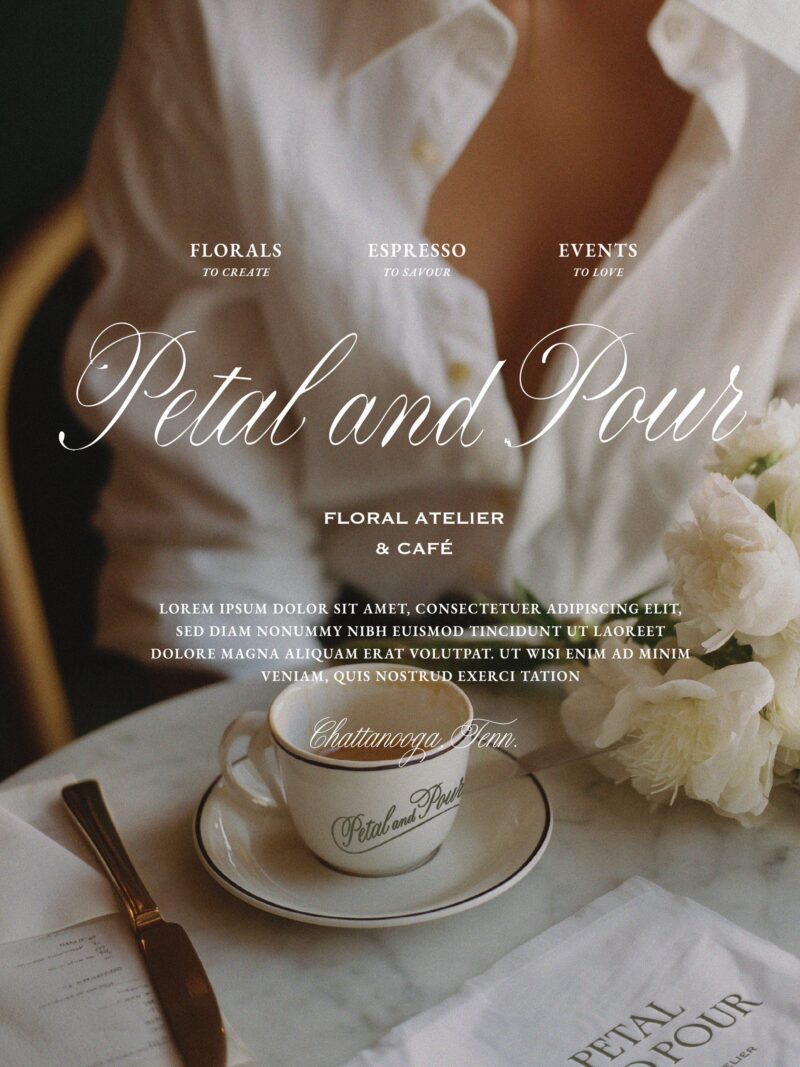
A brand for a florist or café should look like the experience of walking in. For Petal & Pour, a floral atelier and café in Chattanooga, Tennessee, that meant a French-inspired identity built around daily rituals, a building with a past, and two clear archetypes, instead of a pretty palette chosen first. Strategy set the direction, and the color, lettering and details followed from it.
I have been updating my portfolio, and this project is one I keep coming back to. Here is how the thinking worked, step by step.
What should a floral and café brand actually be selling?
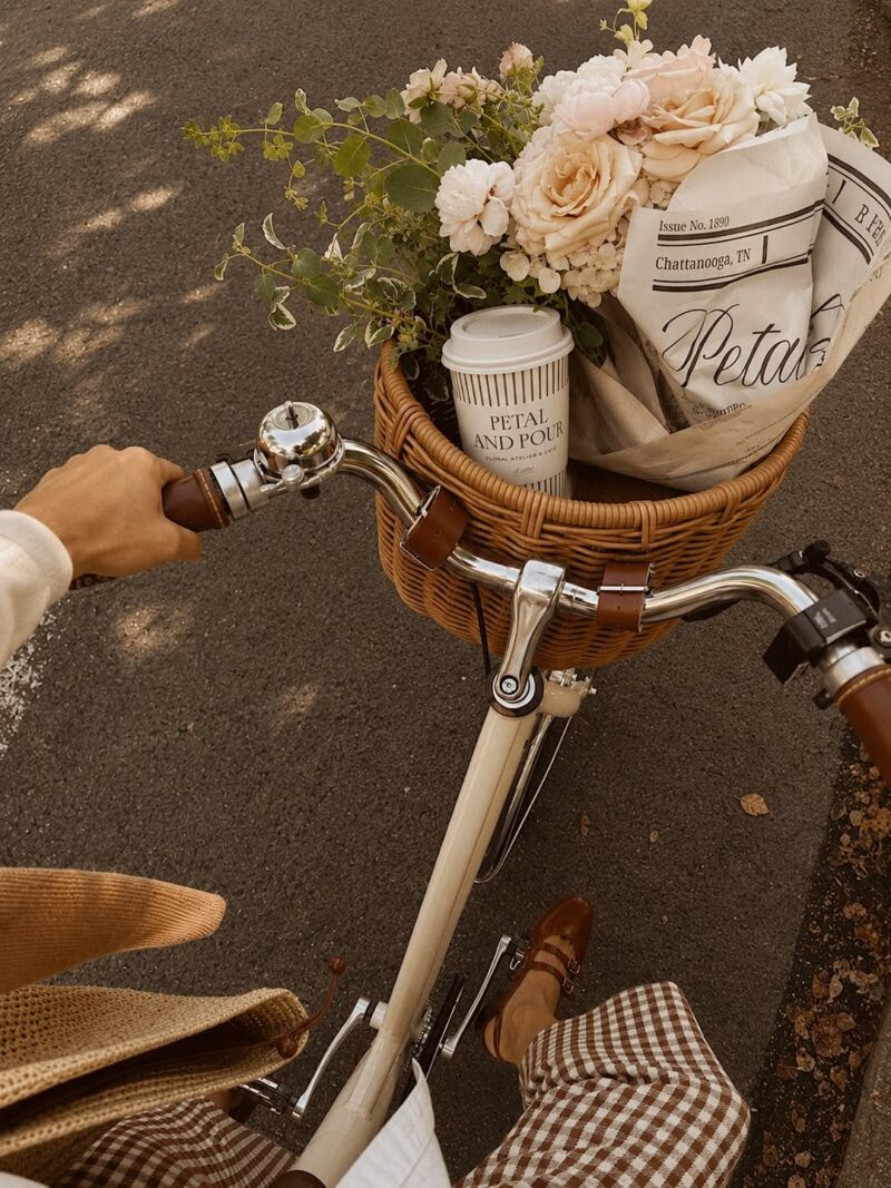
Petal & Pour sells flowers and coffee, but the brand could not stop at that. The goal was to turn both into small daily rituals, where a guest feels seen, restored and connected. So every design decision had to answer one question: does this make someone feel like they have stepped into a ritual, or does it just look nice?
If you run a shop, studio or café, this is the first thing I would settle before touching a logo. Write down the feeling a guest should leave with. Then test every design choice against it.
How do you find a brand story in a building?
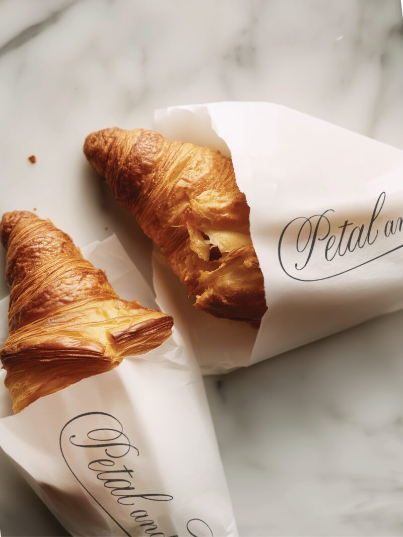
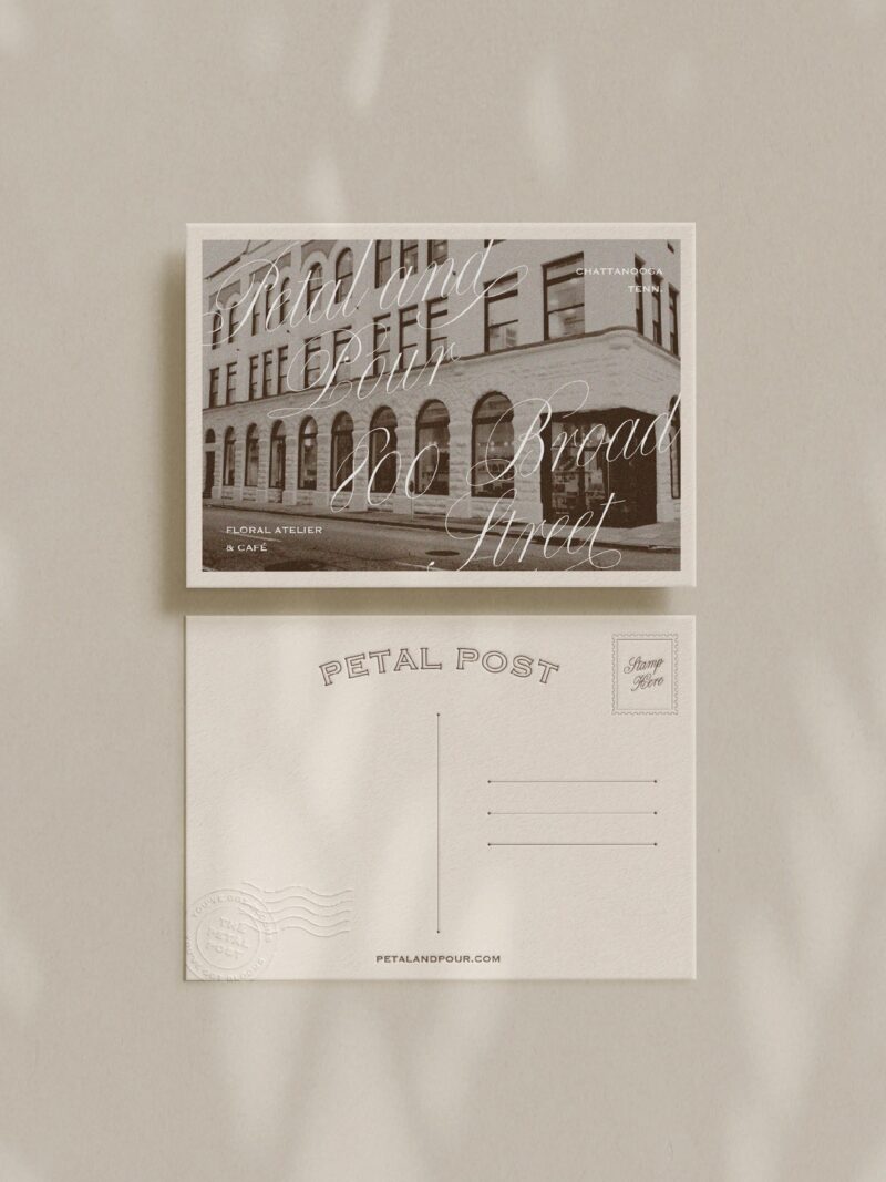
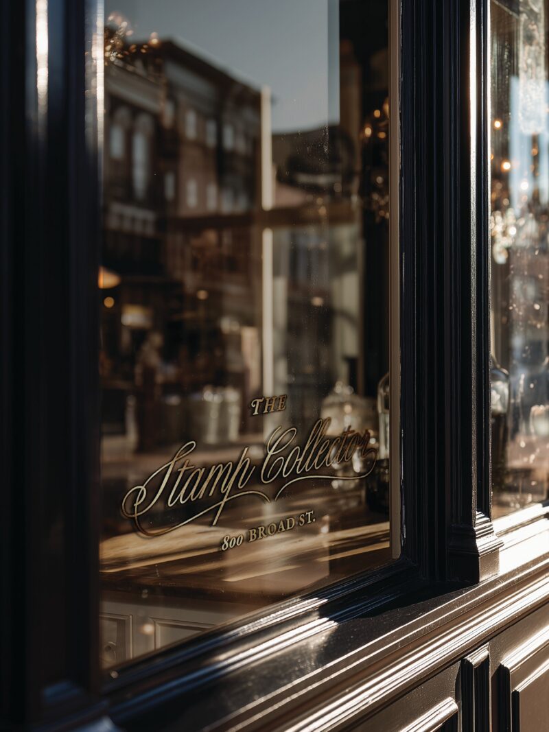
This is the part I love most. The space Petal & Pour moved into used to belong to a stamp collector. That detail became a feature of the brand we call The Stamp Collector. It shows up in etched window signage, wax seals, a blind-embossed monogram and postmark details on the stationery.
It is the same approach I use with every client. I hunt for the small, true details from a place or a person’s history and turn them into design elements. When a detail is real, it does not feel like decoration.

Which brand archetypes fit a floral atelier and café?
We blended two. The Lover brings intimacy and sensory richness, which suits flowers, coffee and pastry. The Creator turns ideas into tangible, beautiful things, which suits an atelier where guests choose their own stems and ribbons, try a workshop, or sip a latte while a bouquet is made for them.
Choosing archetypes up front keeps the look consistent. It tells you what to say yes to, and what to leave out.
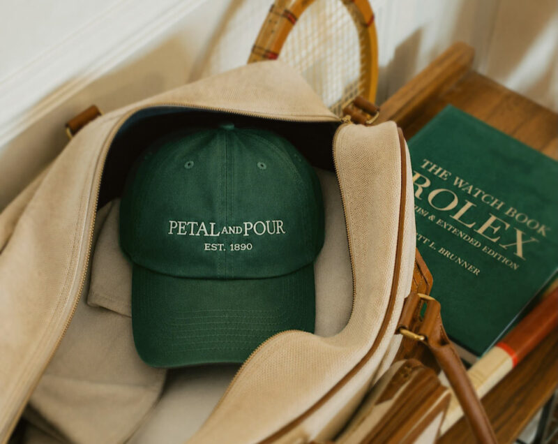

How do you make a brand feel like a place you stumble upon in Europe?
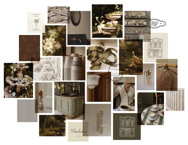
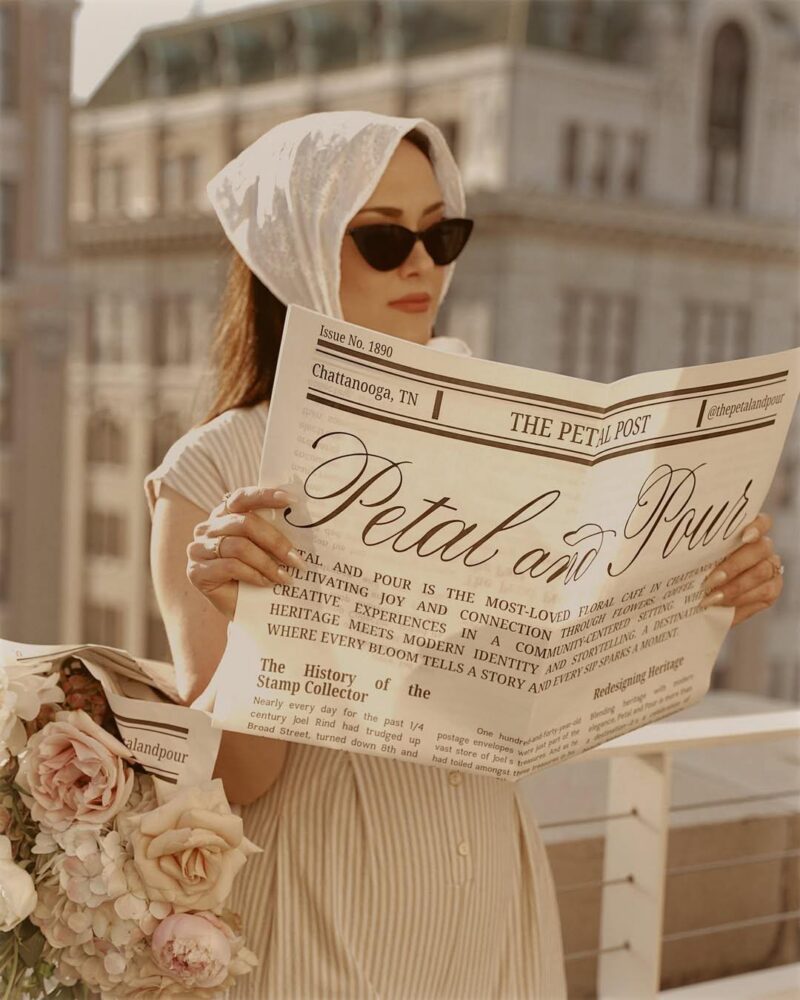
The feeling I wanted was a mother and daughter on a Sunday morning thinking, “This feels like the kind of place you stumble upon in Europe and never forget.” That is a high bar, and it is a useful one. It pushed us toward heritage details used with restraint, such as pinstripes, botanical etchings and aged brass, instead of anything loud.
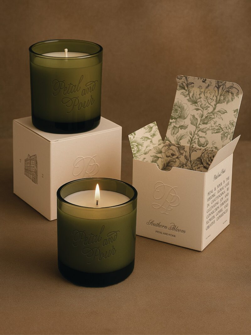
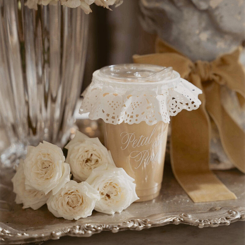
You can see the full set of logos, stationery, packaging and signage in the full Petal & Pour case study, and you can follow the shop on Instagram at @thepetalandpour.

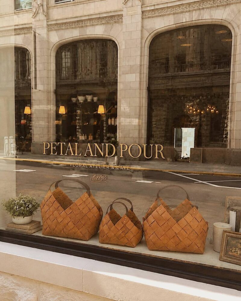
What should you do before choosing colors and fonts?
Start with the story, the ritual and the people you want to welcome. Colors, type and illustration come after. A palette picked first usually ends up looking like everyone else’s, while a palette that grows out of a real detail looks like yours.
If you want a brand built this way, with your own history and details turned into custom illustration, lettering and pattern, that is exactly what the Custom Brand Experience is for. Brands start at $15k, and the page walks through what is included.

If you click on my affiliates/products/advertisers links, I may receive a tiny commission. P.S. the products that I share are the ones I believe in.