I have to say, I’m actually pretty proud that I have yet to miss a month of my favorite fonts series! I think it might be a fan favorite, so I’ll do my best to bring it to you monthly ;) Okay, so this month I was feeling a bit more art-deco inspired and pulled a current favorite (Brilon) and then an old fav (Florence) So, check out below my Favorite Fonts of the Month : Volume 05!
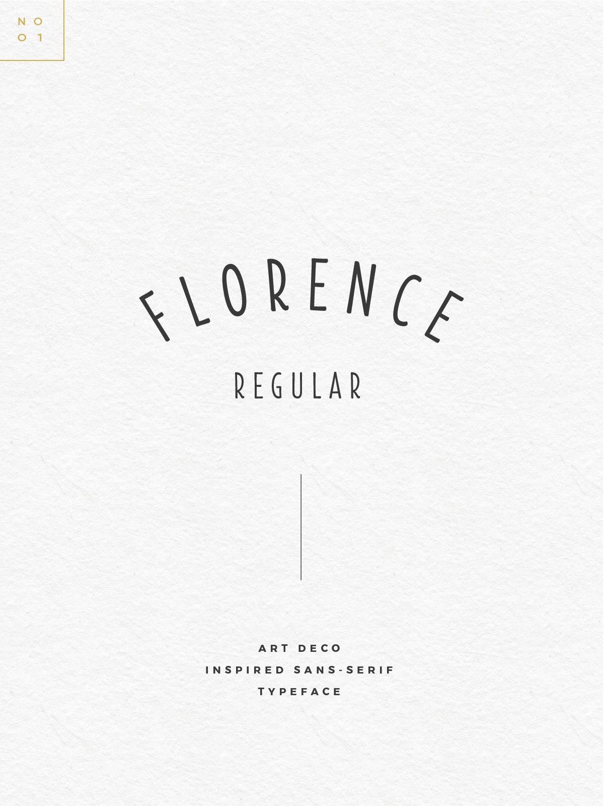
FLORENCE
Friends, this little font here is sooo old, but I still do love it. You’ve probably seen it in a few logos (like this one) when using its playful swashes and glyphs. BUT, I personally just love the simplistic lettering style (especially that ‘R’). It’s still pretty modern but has that subtle play on art-deco.
– SEE THE FONT HERE –
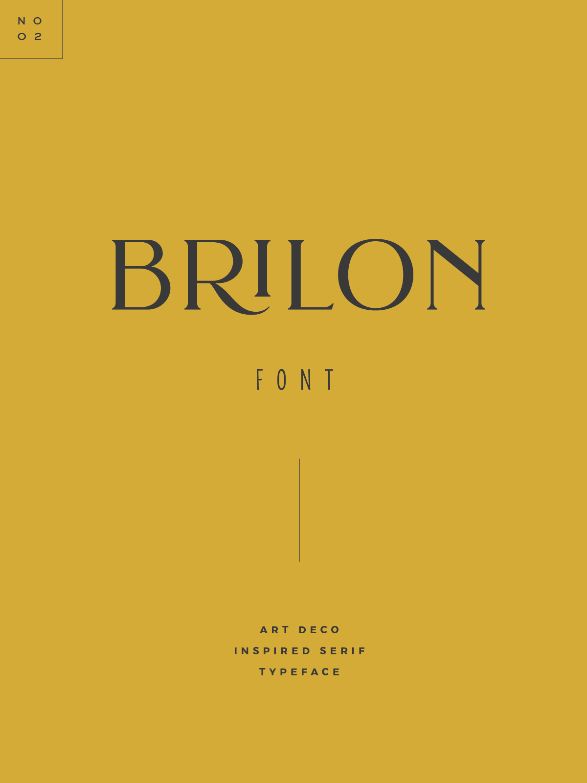
BRILON
Let’s just take a moment to appreciate the detail of this typeface and how transformative it is! If you take a peek at the full font in the link below you’ll see how much fun you can have with it (and doll it up). It has that beautiful art-deco vibe, but can also be very timeless or very playful. With 17 special ligatures and 18 stylistic alternates..you literally can’t go wrong!
– SEE THE FONT HERE –
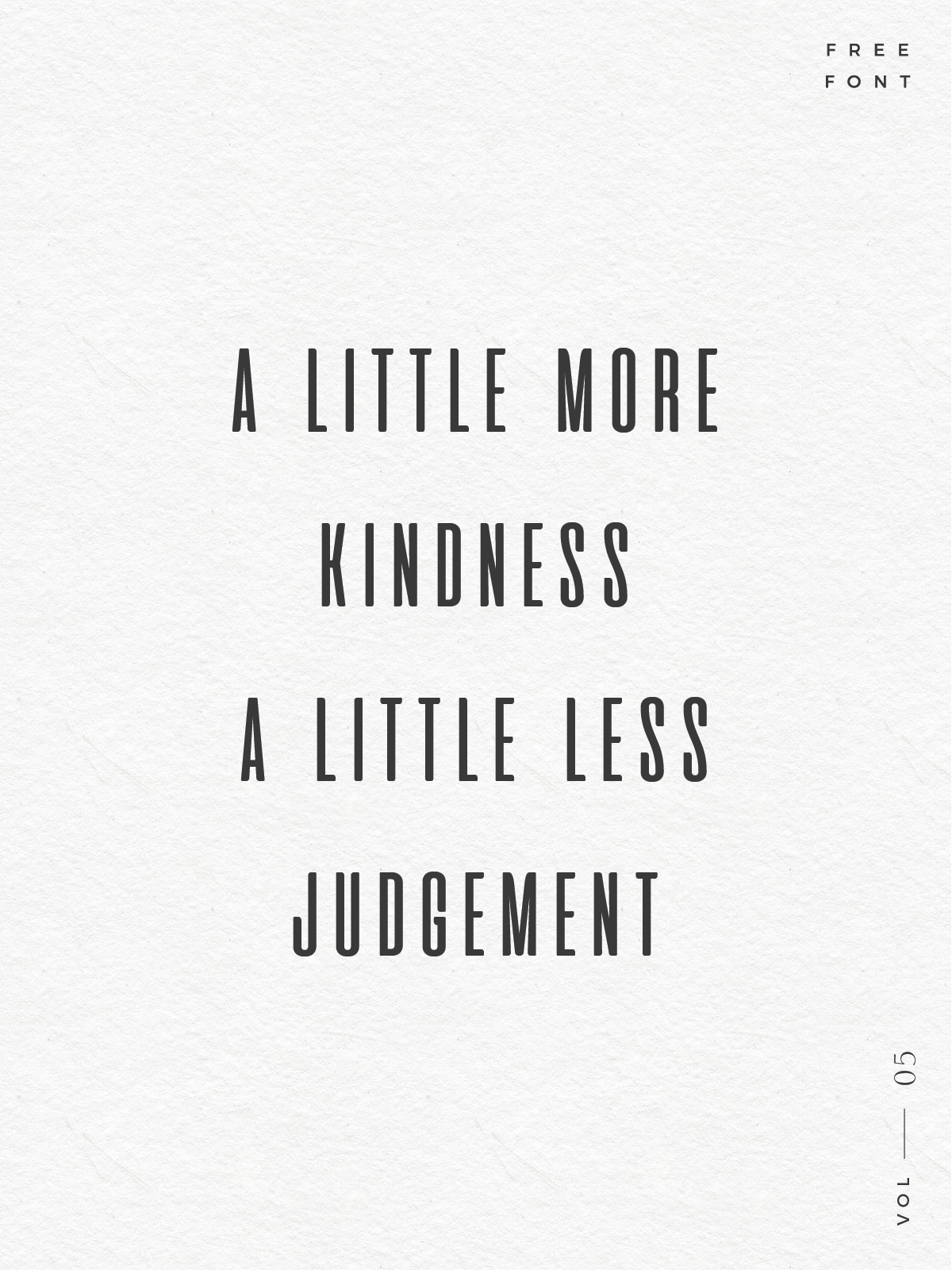
FREE FONT
Not sure why, but as you can tell I’ve also been into quite a few more skinny/tall fonts and then I found this fun little one called Aliens and Cows…which is pretty sweet :)
— GET IT HERE! —

Oh lord. I always stay away from DaFont because I get too overwhelmed! These are so good!
Ha, I usually head to font squirrel first, but randomly was checking out daFont! It’s like forever21, overwhelming..but you just might search long enough and find something you like ;)
What fonts do you use with your branding? They are a stunning set!
Cotoris and then my hand-writing!