Okay, I think we need to have a quick chat about fonts, typefaces, calligraphy, and hand-lettering today. Now, I don’t think it’s completely imperative for you to know this, but I do think it’s important to understand the differences and of course get a better idea of font pairings and how to use them in your brand. Below I’m going to break down their differences, type styles, font pairings, and what I recommend for your brand.
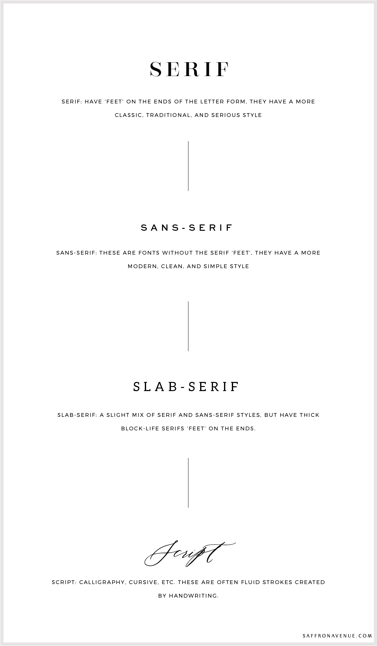
TYPEFACE
A typeface is the actual design. It is the overall look of the characters (shape/style). Each typeface could also have difference typefaces, bold, italic, etc.. that make up the typeface family.
SCRIPT
Calligraphy or script is different than lettering: To simplify it, calligraphy is writing in a single pass of the pen or tool. It can have glyphs (in some typefaces) and is typically more fluid than hand-lettering.
FONT
A font, on the other hand, is a set of digital/printable characters in a specific style and size of the typeface. For example, Helvetica is the typeface family, Helvetica Italic is the typeface, and Helvetica italic 10pt is the font.
LETTERING
Lettering (hand-lettering), like calligraphy, is an art..but the art of drawing letters. It is usually created with individually designed letters that create a whole, so a specific combination of letterforms to create a unique word.
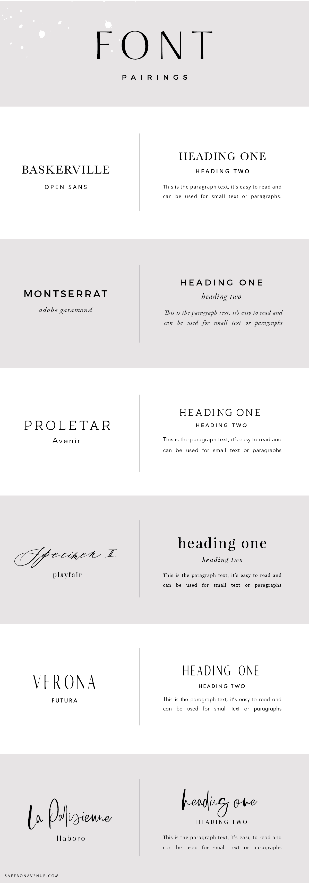
THE STYLES
As you can see below, when pairing your fonts together try to stick with combining two together. The more styles you use in your branding, the busier and messier it could look.
FONT PAIRINGS
Here comes the fun stuff…where you should really be listening! ;) When it comes to your brand, using set font pairings is very important. Not only for keeping it clean and consistent, but it will help establish the style of your brand (as different typefaces embody different vibes and feelings).
TIP 01
You’ll see on the majority of my past work (HERE) I rarely ever use more than 2 styles within my logos. So when creating a full brand, I really only like two use 2-3 max unless one typeface is more creative/unique (like calligraphy or hand-lettering). It get’s quite messy when you introduce too many.
TIP 02
Try to differentiate your styles. So, if you use an uppercase serif for your primary font, don’t use a similar serif for your secondary. If so, make sure it’s not uppercase and possibly italicized to look different.
TIP 03
When I use a calligraphy or hand-lettering within a logo I sometimes will pull three font variations to use that align with the overall style. The reason why is because I don’t typically recommend using scripts for main headings as it’s often a bit harder to read if using on a blog, etc. Instead, use that script style for call-to-action headings and specific words. Because of that, I will pull in two font pairings that align and can be used along with the brand. For example: my logo has some hand-lettering in it, but I only use that hand-written style as a pop of detail throughout.
TIP 04
Feel free to use ‘letter-spacing’ to help achieve a unique look between your font pairings. I’m a letter-spacing connoisseur and couldn’t love it more.
TIP 05
Take a peek at google fonts when thinking about designing and using for your website. You can even use FontPair.Co to help you out!
GET THESE FONTS:
BASKERVILLE . OPEN SANS . MONTSERRAT . ADOBE GARAMOND . PROLETAR SLAB . AVENIR . SPECIMEN II . PLAYFAIR . VERONA . FUTURA . LA PARISIENNE . HABORO
If you click on my affiliates/products/advertisers links, I may receive a tiny commission. P.S. the products that I share are the ones I believe in.


oh this was a good breakdown! Thanks for sharing!
Awe, thank you! I’m excited to be posting more and more about branding!
[…] https://saffronavenue.com/blog/logo-branding/brand-font-pairings/ […]
What would you think of pairing Verona with Montserrat?
Of course! I love montserrat!
Would you mind sharing the fonts you use as an example under “The Styles”?
I believe it’s Encoprata, Sweet Sans, Aleo, and Rare Bird Specimen II!
[…] Saffron Avenue share 6 font combinations you should try in this infographic. […]
[…] with some font pairings for your […]