It’s 10:40pm the night before my launch…and to be honest, I can’t believe it’s finally here. So much time, energy, revisions, late nights, and early mornings were spent to make this day happen. So, it’s great to officially say hello to the new Saffron Avenue – A Creative Brand and Design Studio!
Here’s the thing (and why I’m getting all sentimental), I first started mapping out the flow, organization, design back in 2016..yep 2016. It was a couple days after the blueprint retreat and I made it my goal to launch a new site by April 2017. Well…I’m only a year late. And guess what, I’ve literally dedicated hours each month to it since then. Oofta!
I’m a perfectionist, and I know that “done is better than perfect”…but when it came to this, I literally wanted to do what I could to make it right. So, this was a journey, a marathon, and simply something I’m finally able to say I’m really proud of.
My goal for Saffron Avenue and this new brand is to feel unique (like something you stumbled upon lately), inspiring (to get you wanting to create something), and of course approachable and kind.
THE COLOR INSPIRATION
I officially have changed my color palette 3 or 4 times in the past year, and then randomly one day I accidentally made a dusty grey/lavender color and kind of loved it. Then I popped it into my 1/2 designed site and realized how well it flowed. And although I don’t use my muted/deep saffron yellow often, it pairs quite well! It feels feminine, creative, a bit sassy, and chic :)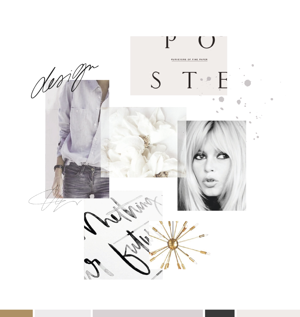
{Logo – Floral – Outfit – Sputnik}
THE LOGO DESIGN
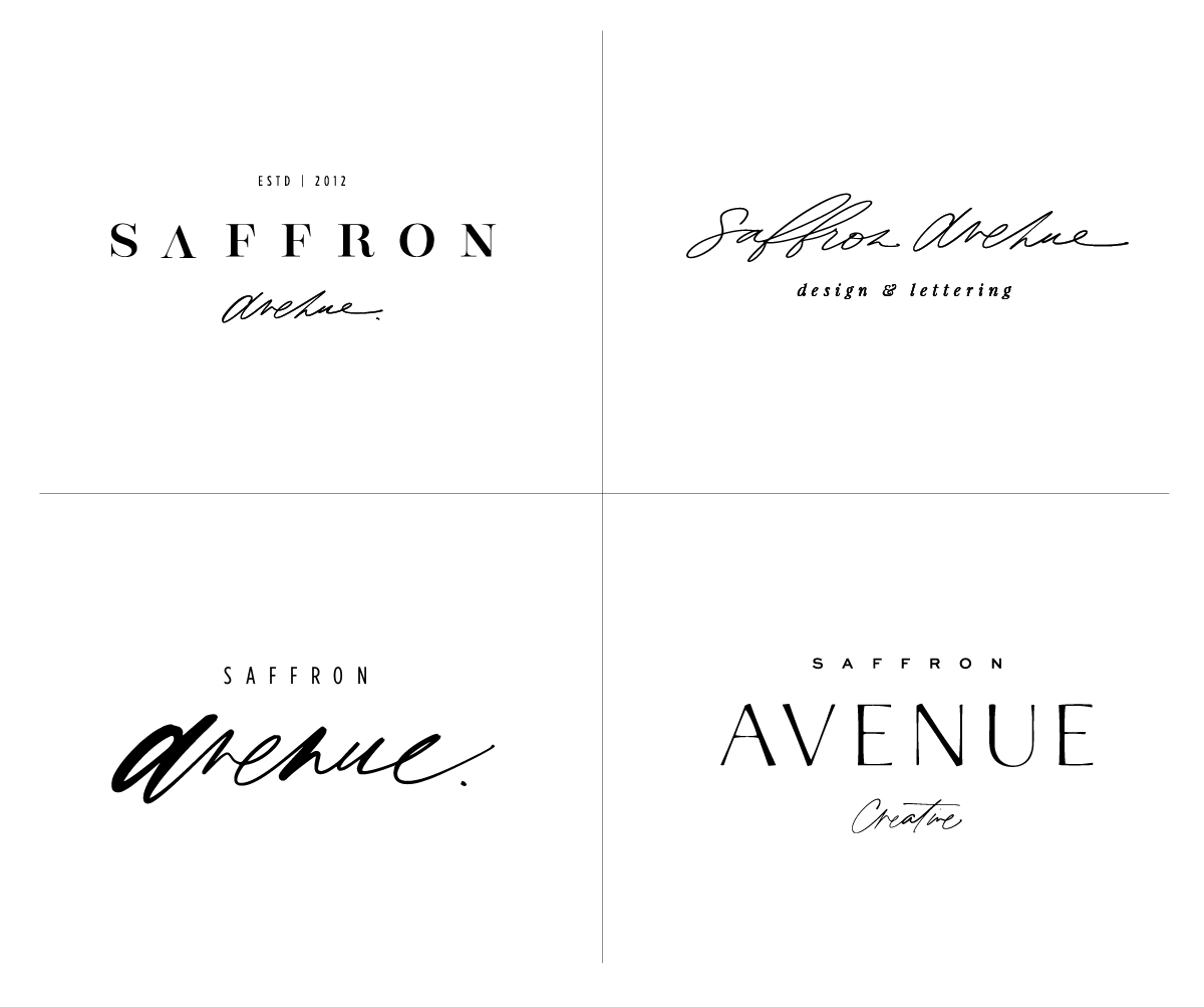
Well, like above, you know this changed about 10,0000 times. But here’s a small peek at a few I was going back and forth on. The two on the left were thrown out a bit quicker as they both gave off slightly different vibes that didn’t really represent me as well.
That top right one is actually still a part of my brand, just a bit messier (and used as a secondary piece). And that bottom left was ALMOST my logo..and, to be honest, I’m still super obsessed with it. But, the difference in font and size between ‘saffron’ and ‘avenue’ just didn’t quite make it. I want people to easily read my logo and know it’s not ‘avenue’ but ‘saffron avenue’ (if that makes sense). But she sure is pretty, and I already miss her.
The final logo design: She’s simple, timeless, a bit messy, and still creative. More than anything, I just want it to be timeless and approachable, so nothing too modern or too classic, a perfect mix of both worlds.
THE BRAND BOARD
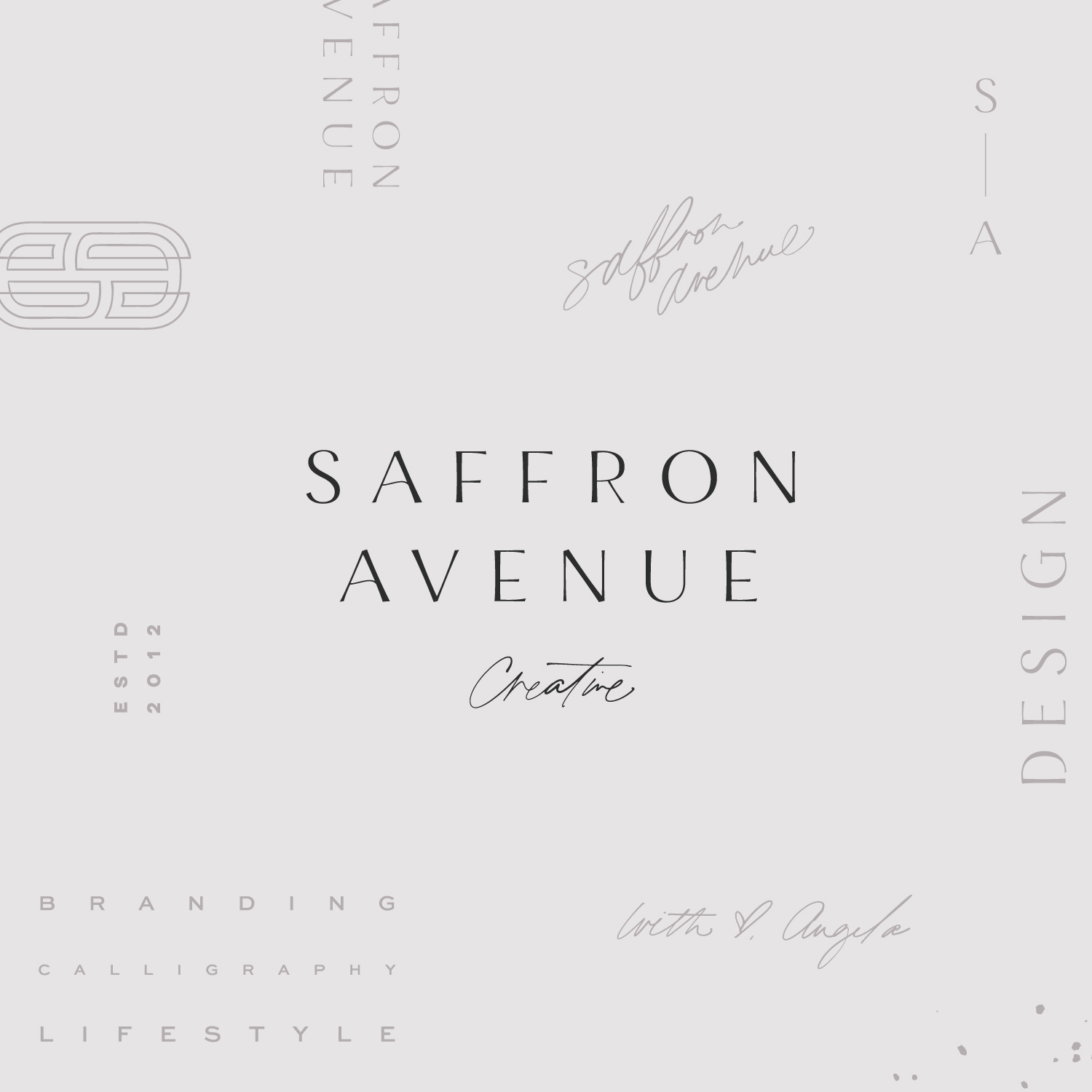
Once I FINALLY narrowed down my logo I pulled together my brand board. And here’s the thing. I made that ’s’ brand-mark for a past client who didn’t like it…and I loved it so much that I took it for myself. No, there isn’t an ‘A’ in it, but I LOVE the slight vintage-y deco vibe it has going on and think it pairs quite well :)

THE WEBSITE DESIGN
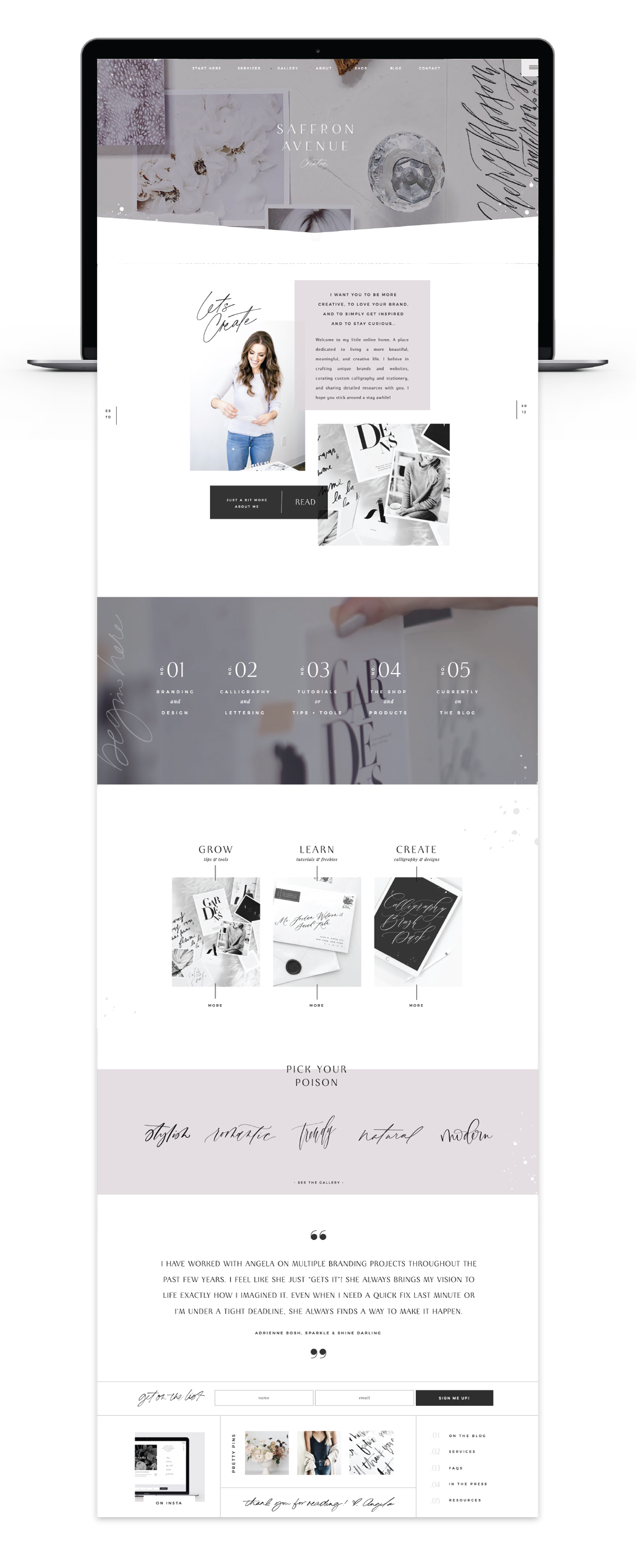
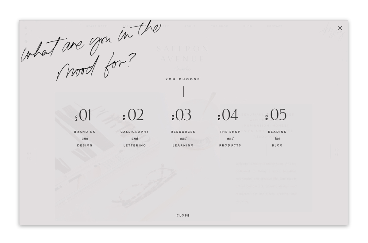
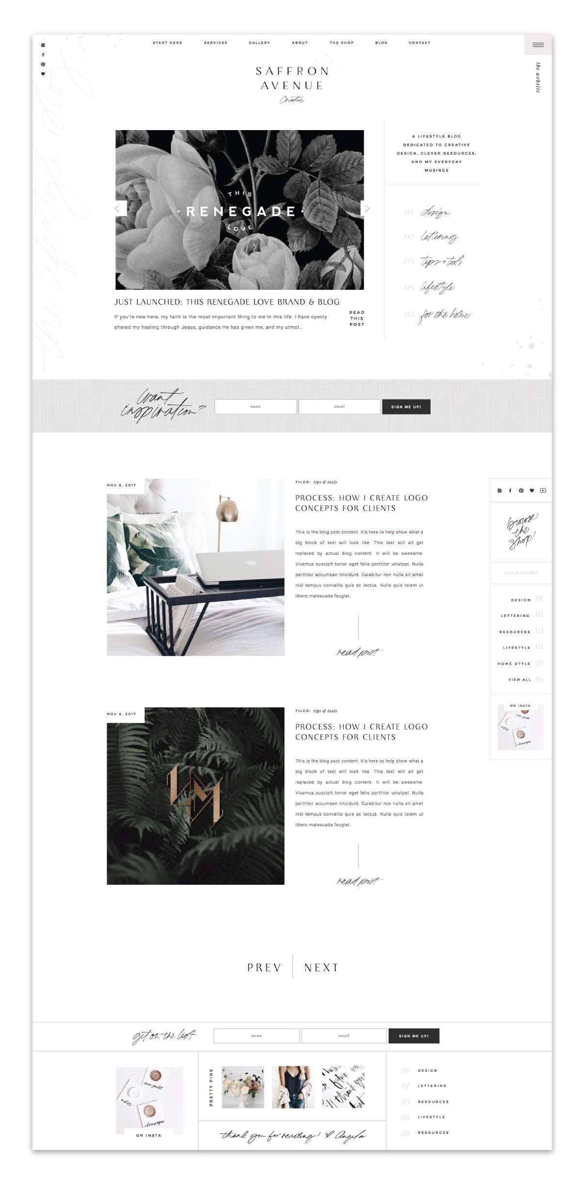
Well, besides the fact that I could write a book about all the little nooks and crannies of my site, I’ll try to keep it short and sweet. The main thing I wanted to do is highlight what I can do. From branding + website design, calligraphy + lettering, offering resources + tutorials, an online shop, and a creative lifestyle blog. So with that, I have 5 main ‘call to actions’ and then I also do 5 main ‘blog categories’.
Each page is quite a bit different than the next, so I definitely urge you to snoop around for awhile and check it all out (and of course, let me know if I missed anything).
BRAND PHOTOGRAPHY
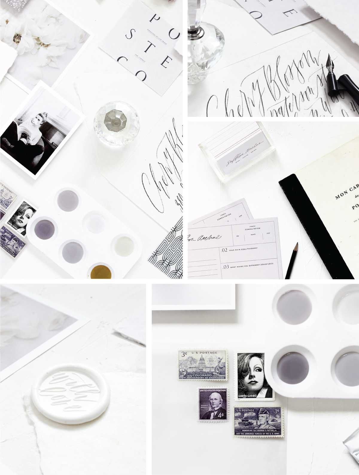
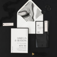
Because my color palette was a bit different, I couldn’t source many images that could work for myself. So…I did it myself (and I’m far from a photographer, but it will do). I pulled images from my Pinterest Board HERE, I took envelopes and pics that I had in my office, and I put together a few items that I simply love (you’ll see a puppy pic, a tulip, and some of my wax seals). Doing this small brand styling shoot helped me not only for my website, but also to use for my INSTAGRAM and MY SHOP!
THE ONLINE SHOP
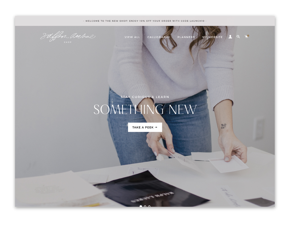
And no joke, about a week and a half prior to launching…I decided I should re-design and set up an actual online shop that is easy to navigate. So, I spent countless hours learning how to code Shopify and customize what I could with their themes. Although it doesn’t match my site completely, I’m pretty happy with the result!
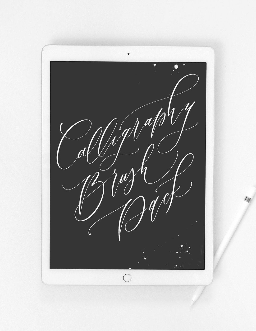
With that, you can probably tell I also updated all of my product images and even updated my PRODUCTS! I’ve included a couple more brushes within the bundles, added a bonus watercolor texture, and even created a couple new social media TEMPLATES.
. . . . .
All in all, I am soooooo beyond happy it’s finally done because I can get back to reality (aka: I”M SORRY CLIENTS)!
And before I sign off, I look forward to creating so many new blog posts, some video tutorials, online classes, and resources to keep you creative as well!
Stay tuned my friends ;)
If you click on my affiliates/products/advertisers links, I may receive a tiny commission. P.S. the products that I share are the ones I believe in.
This is the most awesome re-brand I have seen this year! You never fail to amaze me! All the best for your business and future projects. Can’t wait to see more creativity from you.
Oh my goodness, thank you so much! Seriously, that means the world to me!!
Truly stunning Angela! Congrats!
Thank you Michelle!!
Wow, the new design is so amazing! I mean your old design was beautiful but this makes me speechless.
I’ve been working on my webdesign for over half a year now but it will never have that wow effect like your site. You are inspiring me over and over again.
Thank you for that <3
Awe, thank you so much! It was quite the experience this past year..and you probably know exactly what I’m talking about it! i’m so glad it’s done!!
This is truly lovely! Love all the little details on your website, you can tell it has been lovingly crafted! I hope that you were able to enjoy redesigning it all 😊 Well done!
Awe, that means the world to me, seriously!! thank you!
This is what they mean by drool-worthy design! I love everything about it, the flow, the call-to-action sprinkled all over… Your visitors will never want to leave! Great job! LOVE LOVE LOVE!
Awe, that literally just made my week to read! THank you so much!!
Your rebrand and website is stunning, You can really see all the time and effort spent on it!
Can I ask is your website created in Showit?
Awe, thank you so much…because you know I spent far too much time on it! And yes, it’s my 3rd or 4th showit site and I’m obsessed!
Absolutely love this! amazing work!! a little detail, I think the Brand Photography section is missing a link on “Pinterest Board HERE”
Awe, thank you so much! And I just added the link, thank you for letting me know!!
The site is beautiful and a true inspiration!
Oh my goodness, thank you so, so much!