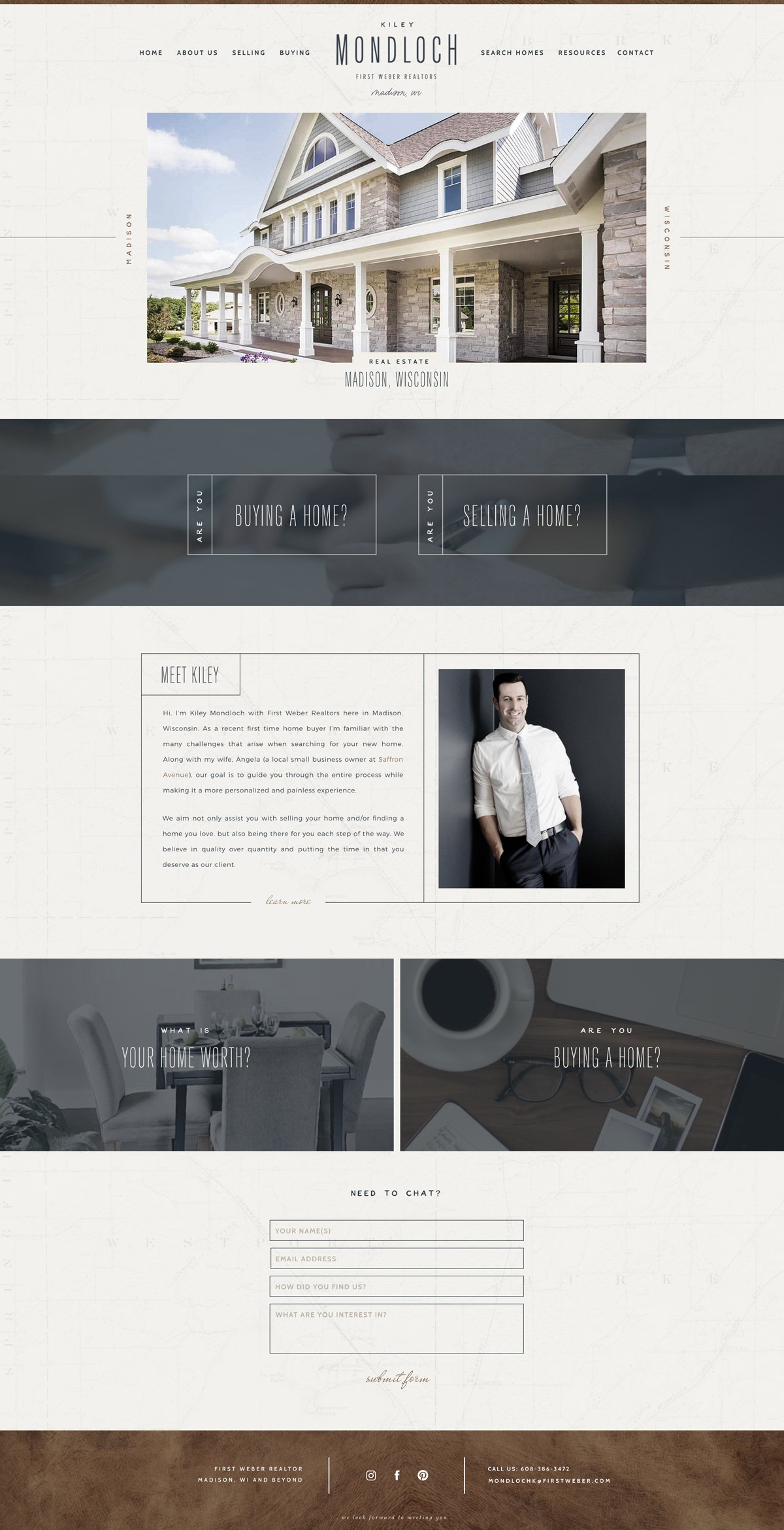
So happy to get to share the branding and website launch for my husband and his business, Kiley Mondloch Realtor! This isn’t a typical realtor website..I don’t think anyway, but one that is meant to be welcoming and relatable. I’m helping him quite a bit with the branding and social media in hopes to attract the type of clients that care about detail, relationships, and overall want to have a personalized experience. It’s all about quality over quantity and not trying to get every sale and every listing out there. So, take a peek at his design below!

Of course I had to create a brand board for him, simply because it helps the rest of the brand and design process way easier. I have to say, he has been the easiest ‘client’ I’ve ever had..not one change on anything ;)
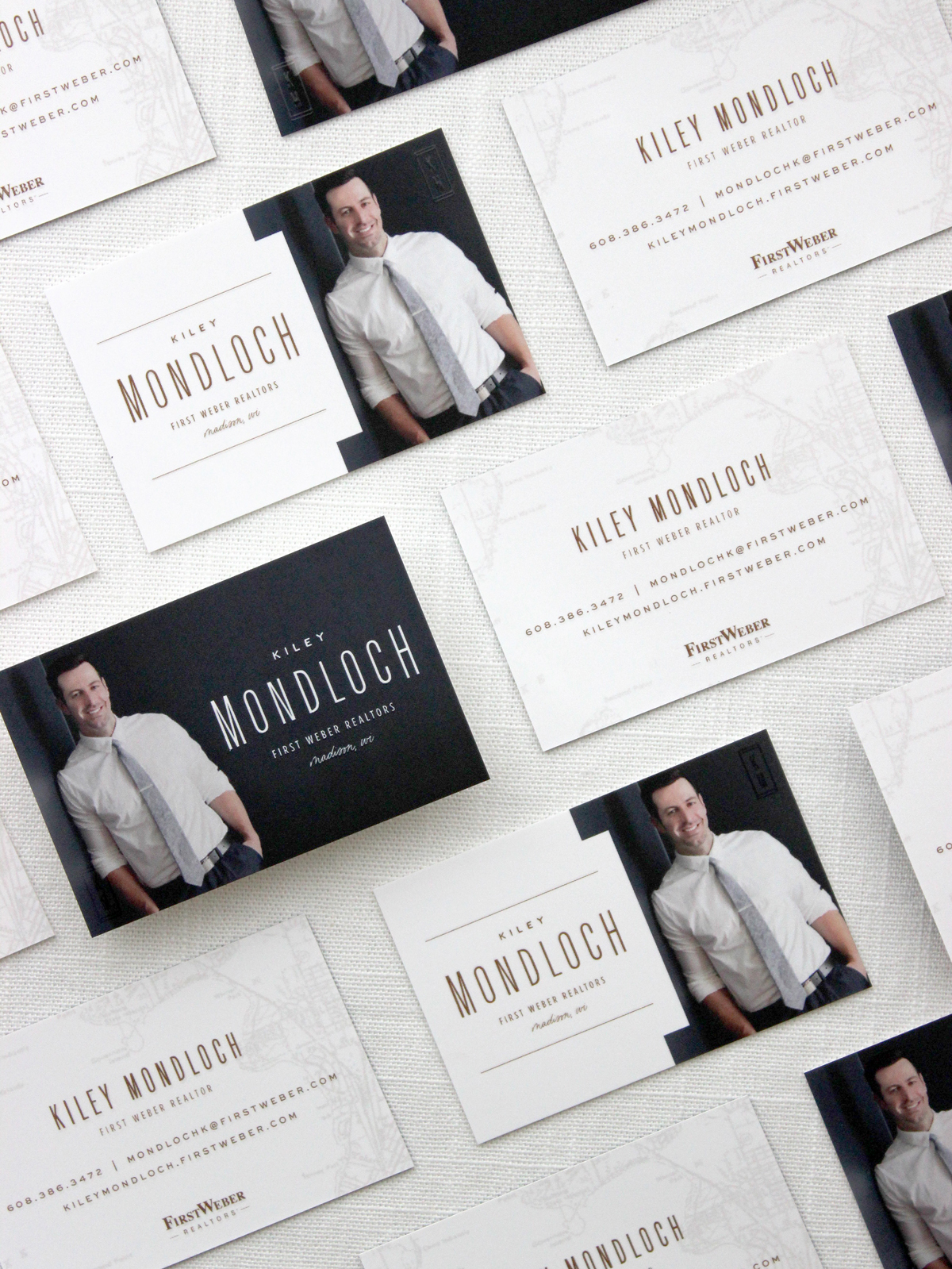
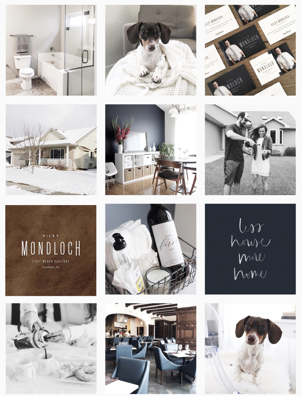
Of course we had to get some soft touch business cards from moo.com, which have been a huge hit!
They even have a spot gloss on certain text elements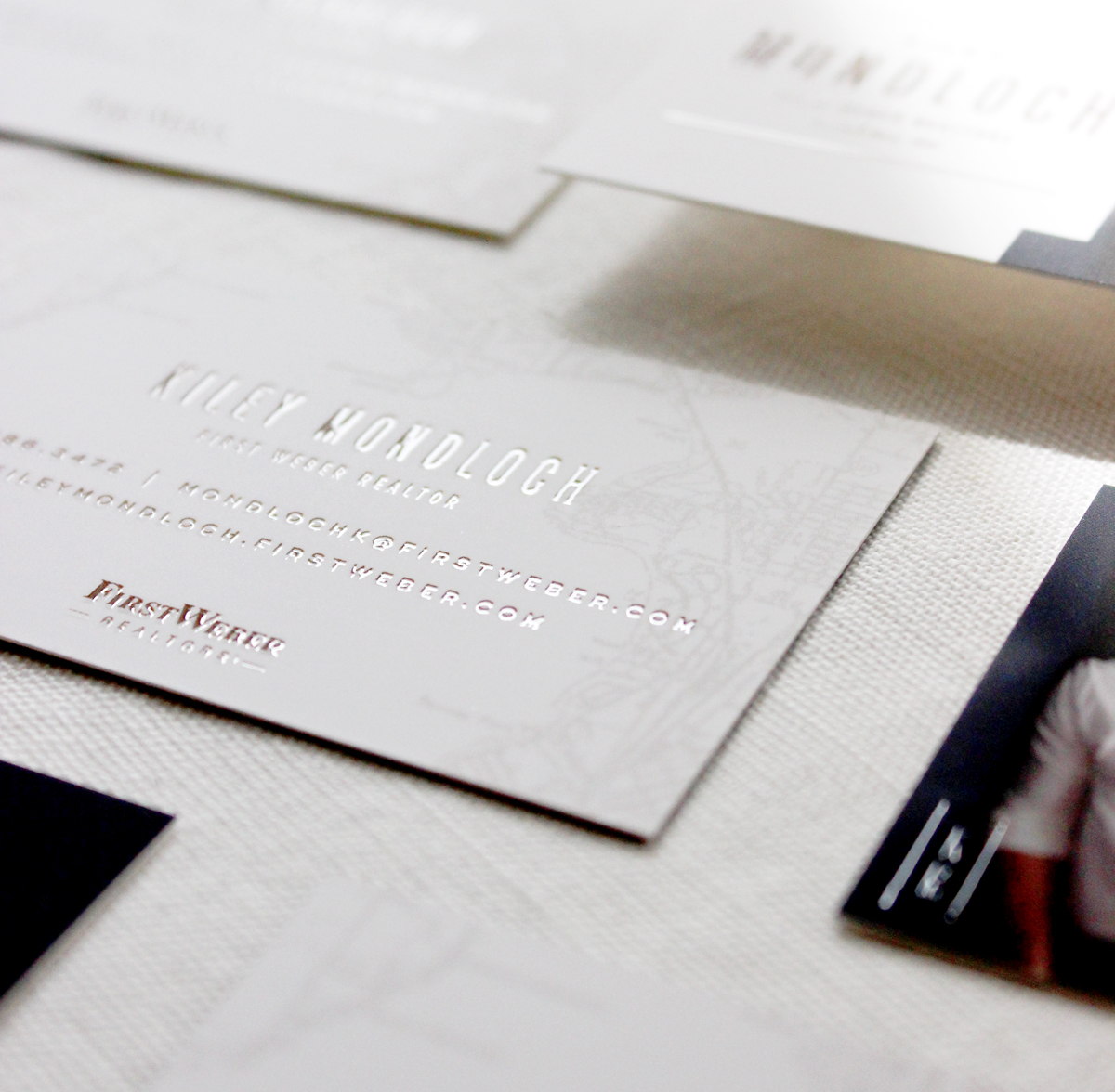
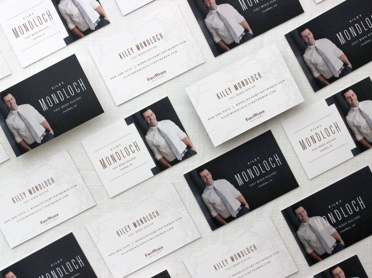
For his website I used Showit 5, which was my first time trying..and I’m digging it! There were a few things I really could not figure out to do, but overall only having to spend about a week off and on playing with it before launching, really isn’t bad!
And of course if you check out his FACEBOOK page or INSTAGRAM I’m trying to make it all branded ;)
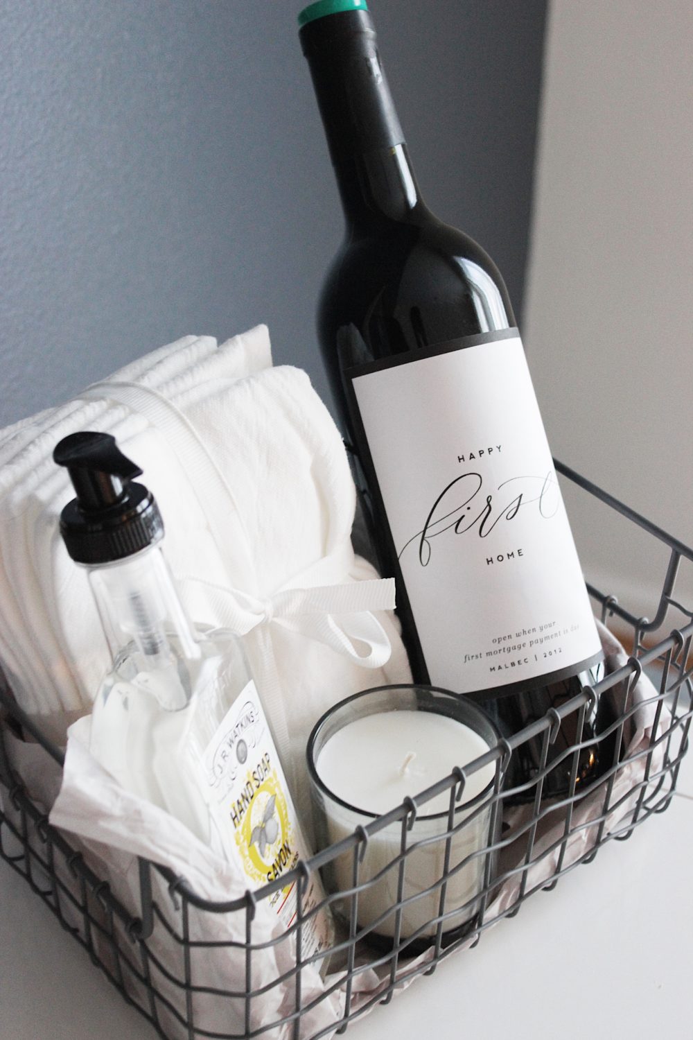
And last, but not least..a cute little client gift. P.S. I put those bottle labels in my shop HERE!
If you click on my affiliates/products/advertisers links, I may receive a tiny commission. P.S. the products that I share are the ones I believe in.




On Showit, what design is it? I really like that visual look!
It is, and my first time learning it. They have a ton of templates to choose from, but I made this one myself based on his branding and style!
This domain is up for renew and not showing up. :(
Just expired yesterday, decided to take a different route!