I wanted to write a post that would benefit those who are new to their business (on a budget) and in that “DIY” stage. When thinking about it, I realized there’s a moment in every Brand Audit when I can pinpoint exactly what needs tweaking.. and it’s rarely about budget.Subscribe
The thing is, some of the most expensive-looking brands I’ve seen were built on constraints, guidance, and clear direction.
Because constraints provide clear paths and are trust in disguise.
After 15 years of designing brands for businesses (photographers, florists, planners, designers) I’ve noticed the same patterns over and over.. and want to share the 5 things that separate “this looks DIY” from “this looks like hired design.”
The 5 Things that Matter Most
1. Too many fonts (I bet you saw that coming ;)
The fastest way to make a brand look amateur is to mix too many fonts without a plan. As a designer, I understand the urge to scroll Pinterest and save all the various fonts you want to use.. but, again.. constraint ;)
Expensive-looking brands pick a lane and stick with it.
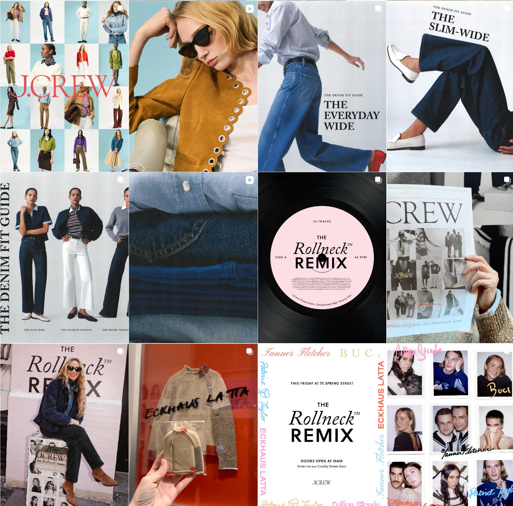
J.Crew:
They will rarely stray from their classic all-caps serif font, and they never should. When I received their Fall Catalog a few years ago, they did a throwback of all their old tags, and as you can see, they really maintained their brand throughout the years.
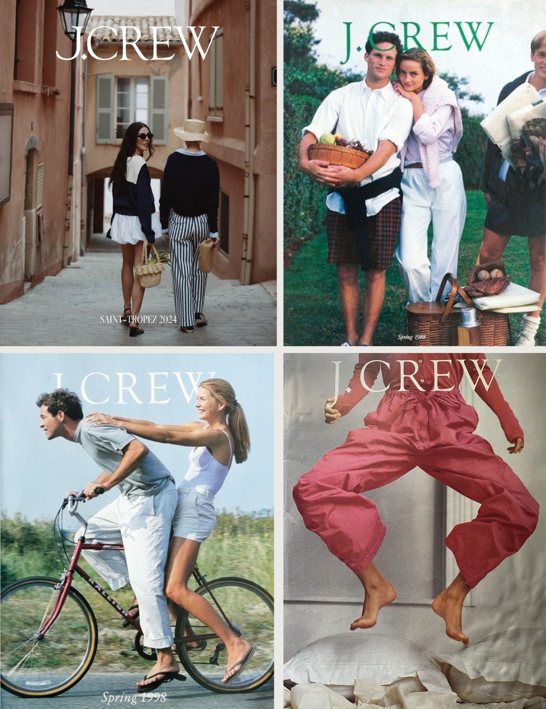
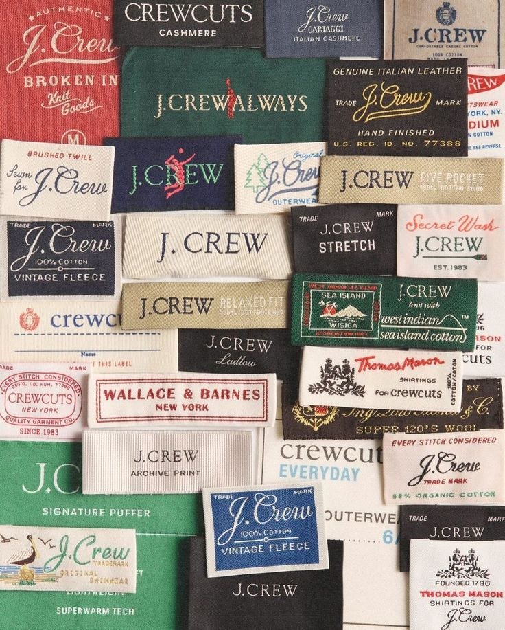
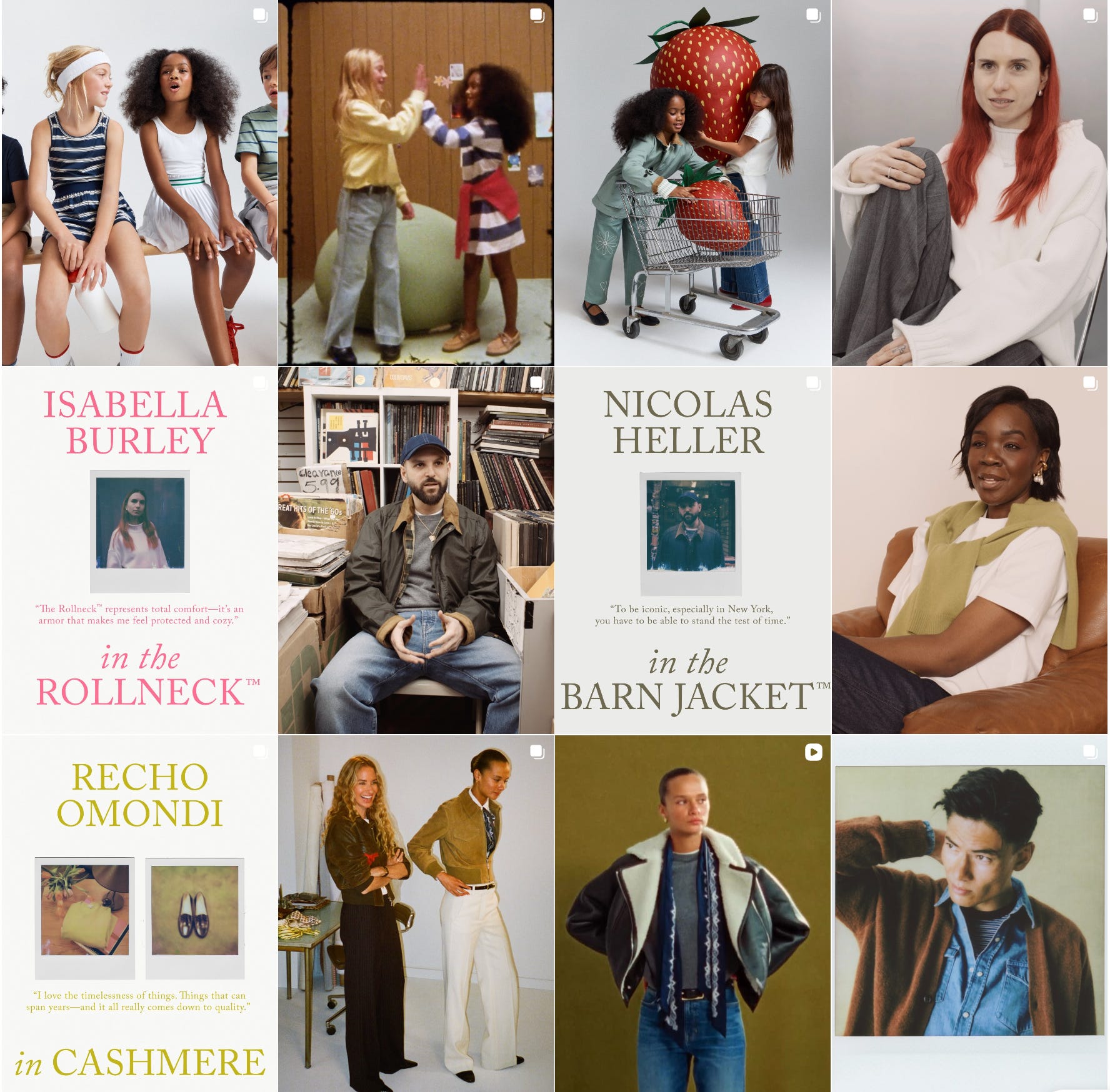
What I do like is that their brand fonts still allow them to create collections that feel ‘on brand’, allowing them to play a little.
As an established brand, they’ve built years of trust, so they definitely mix things up when it comes to marketing.
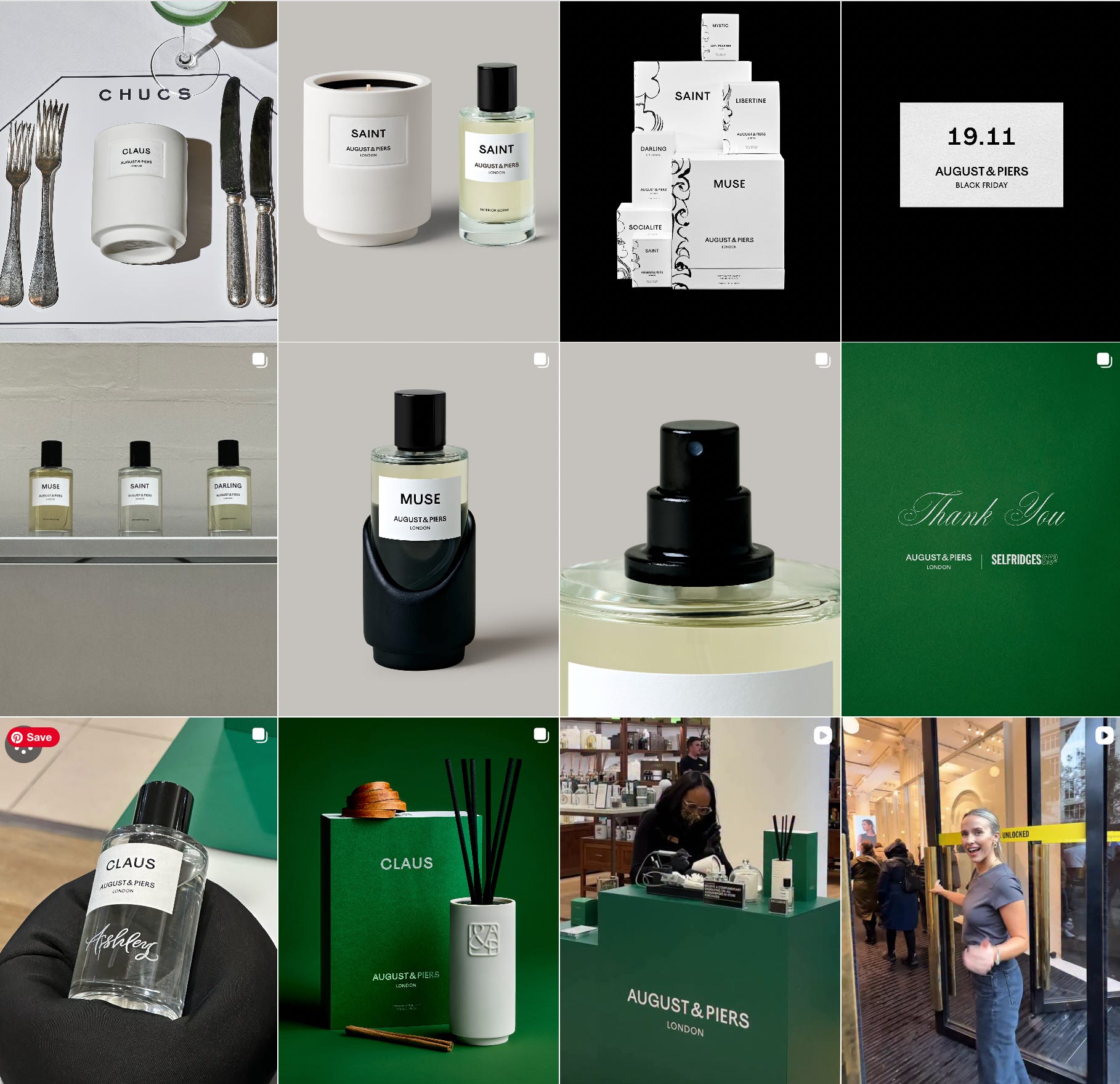
August & Piers:
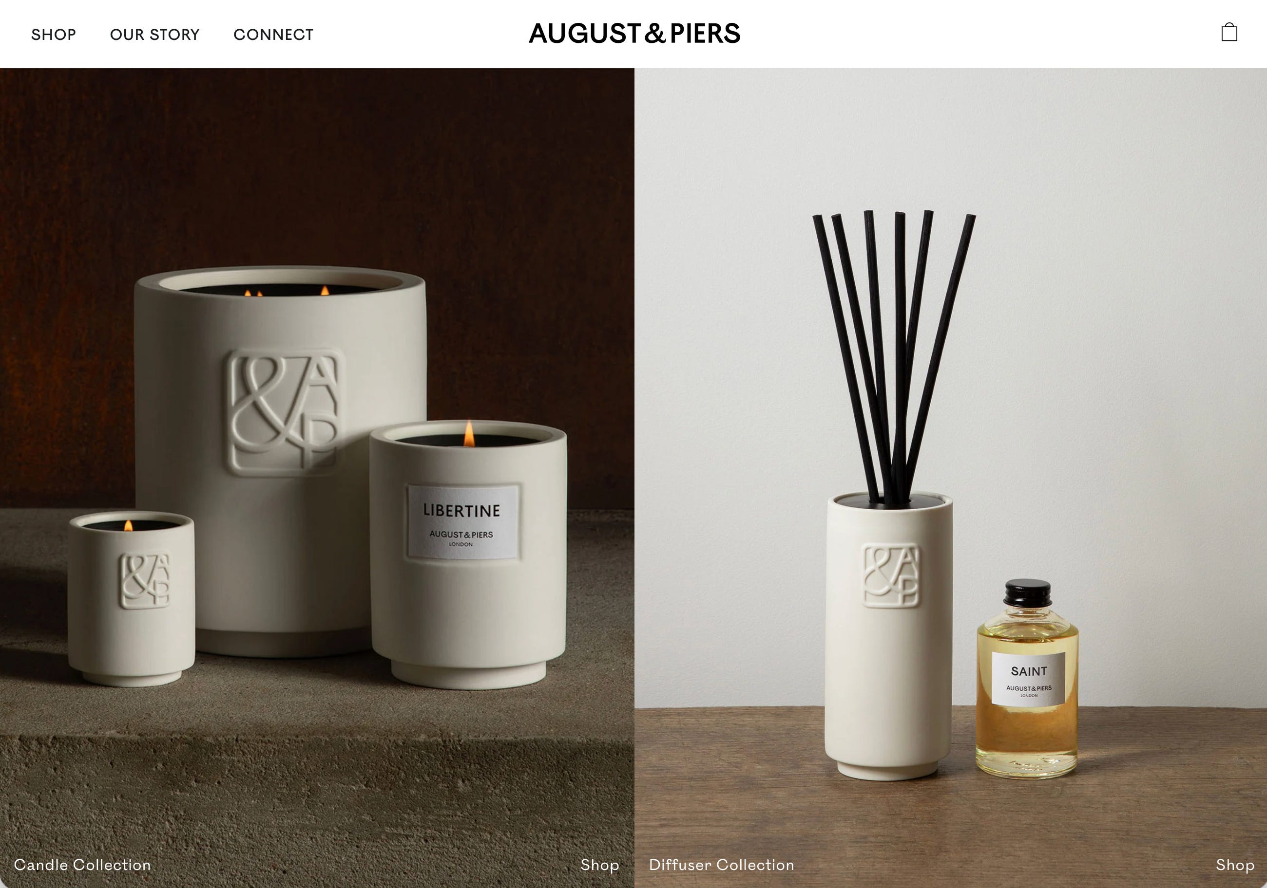
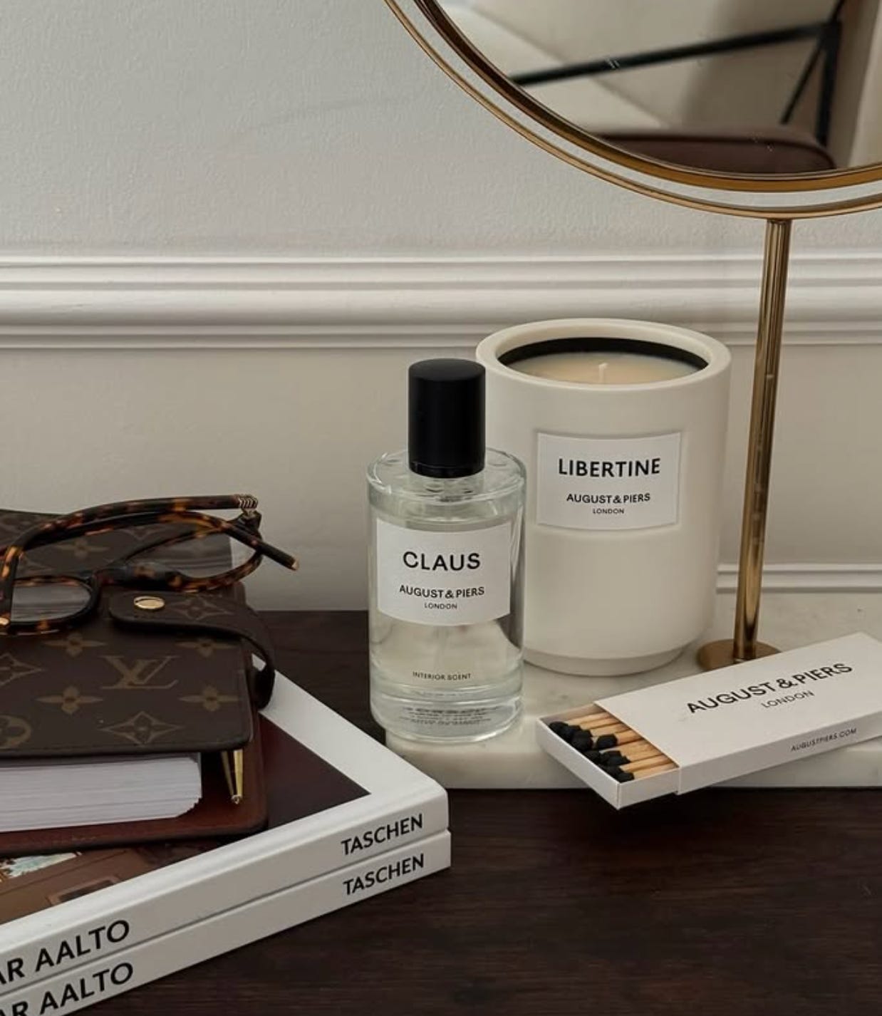
When you look at this brand, the font system is obvious and they do a great job sticking to it. All you really see is their modern sans-serif. It’s very clean and minimal and allows them to really focus on adding in moments of color (and custom illustration) in their marketing, without making it feel too busy.
**Your quick fix:**
Look at your current brand. If you’re using more than two fonts, ask yourself: which one is doing the heavy lifting? Does it align with your brand/logo? Do you feel a disconnect between your website and socials?
2. Fewer colors, used more intentionally.
This is huge for newer businesses. More colors don’t necessarily mean more personality. It might result in more chaos and more difficulty making it all work together. I’ve designed plenty of colorful brands, and the more color, the quicker it can feel messy, to lean into a different style direction, and to get lost.
EXAMPLES:
Ralph Lauren, you probably think of that rich emerald green & navy. Ghia’s red/pink/maroon mix. Hermes and the bright orange. The Colony Hotel’s peachy pink and green. Glossiers millenial pinks. SoulCycle yellow. Rhode’s cool neutrals.
The brands that look expensive tend to work with constraints: one dominant color, one accent, and a neutral. Maybe a fourth for special occasions.. that’s it.
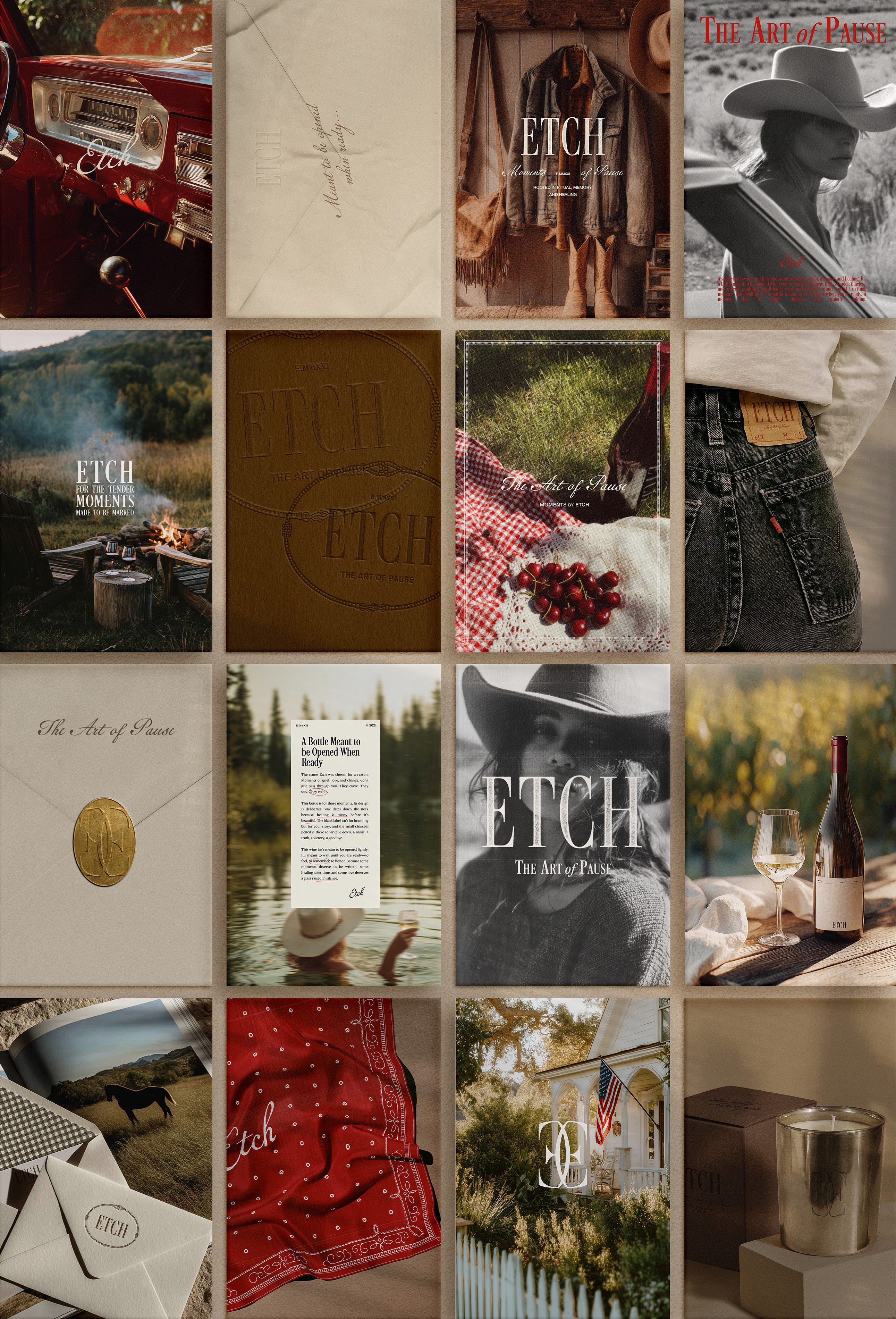
What makes them feel “rich” isn’t the number of colors.. it’s that every color has a job. The dominant shows up everywhere and creates recognition (from images, background on graphics, font colors). The accent draws the eye to important things (buttons, accent text, etc). The neutral gives everything room to breathe
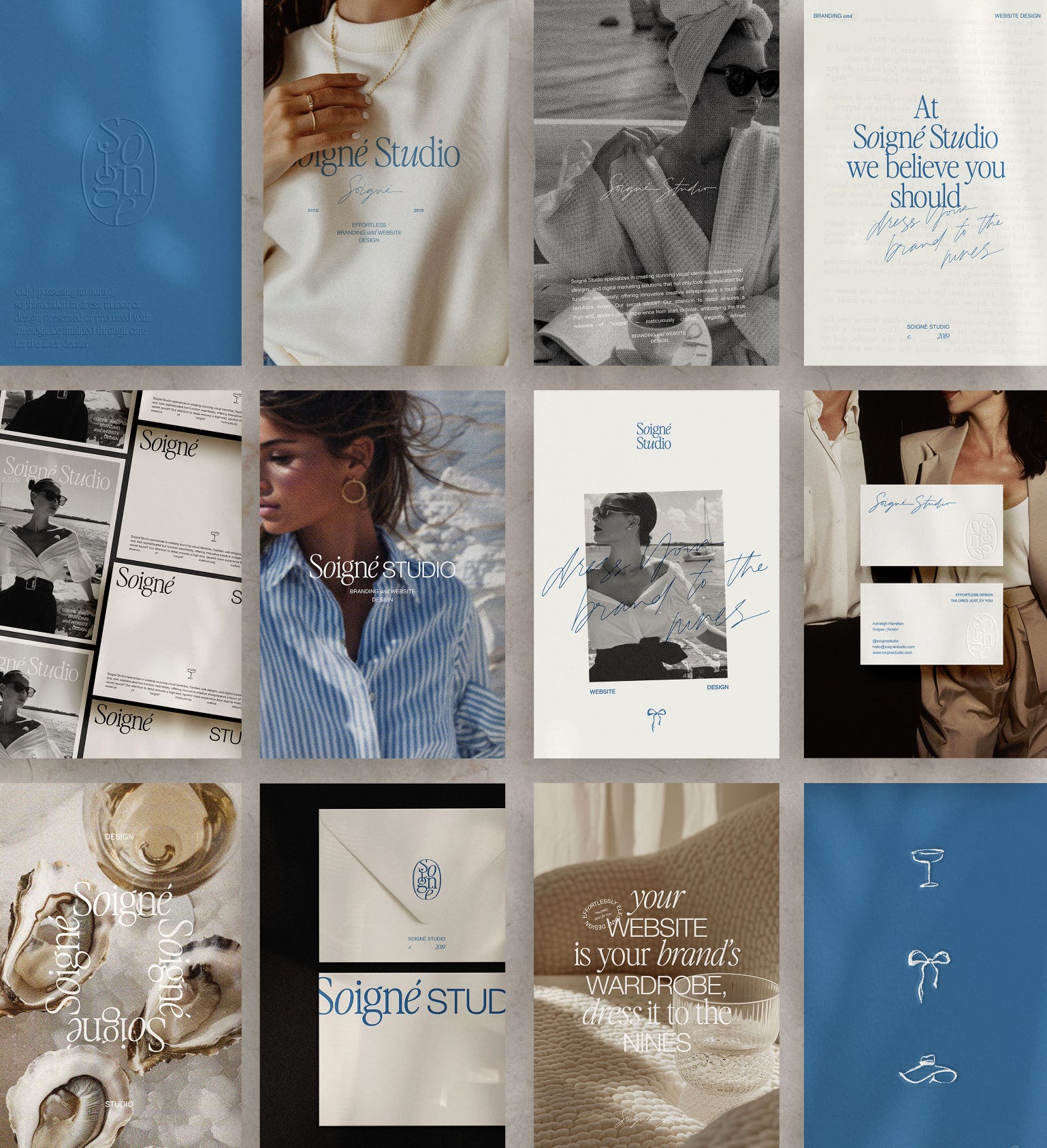
When I audit brands, I often see 4 – 6 colors with no clear hierarchy or “job”. They were all chosen because they’re “pretty together,” but nobody decided which one matters most.
**Your quick fix:**
Open your brand assets and see how many colors you’re actually using. If it’s more than four, pick the one that feels most like your brand and build everything around it. The others can become supporting players or just retire them ;)
3. SPACING (the thing nobody notices but everyone feels).
This is the invisible one and one of the main things I have to adjust when working with a rebrand or website redesign.
Spacing.. the distance between elements, the margins, the padding, the breathing room. THIS is what separates “professional” from “DIY’d”. When spacing is inconsistent, everything feels slightly off.
Like art on the wall arranged by someone who didn’t measure. You can’t point to the problem itself, but you can tell something is off.
An example below: the before is crowded and the after feels lighter, easier to read, and more elevated.
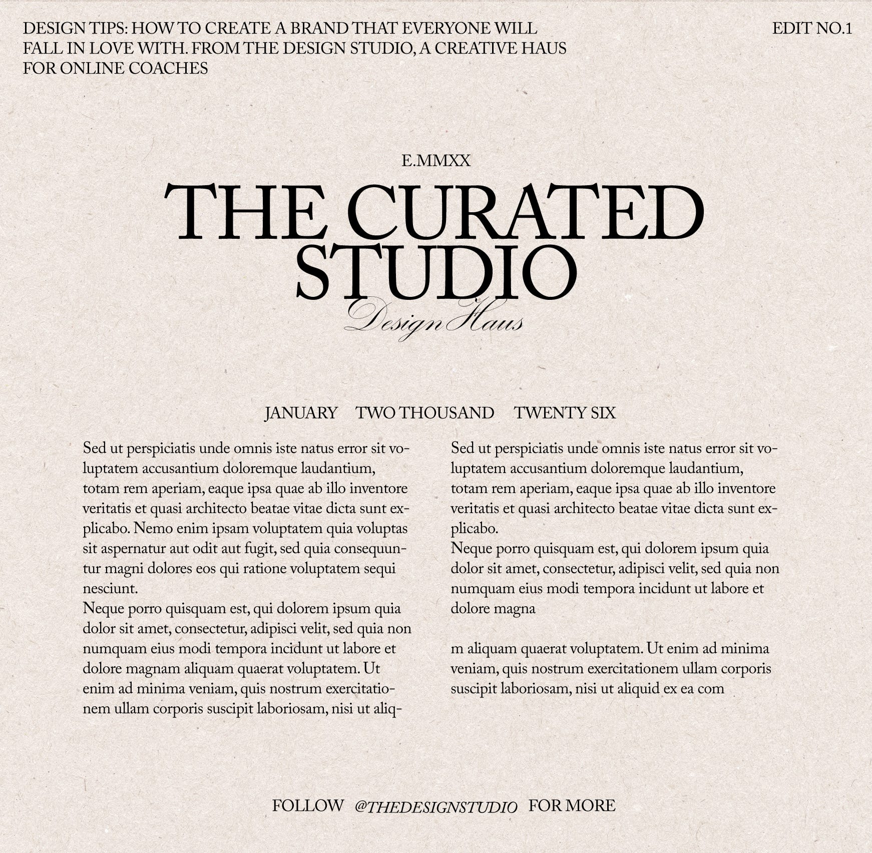
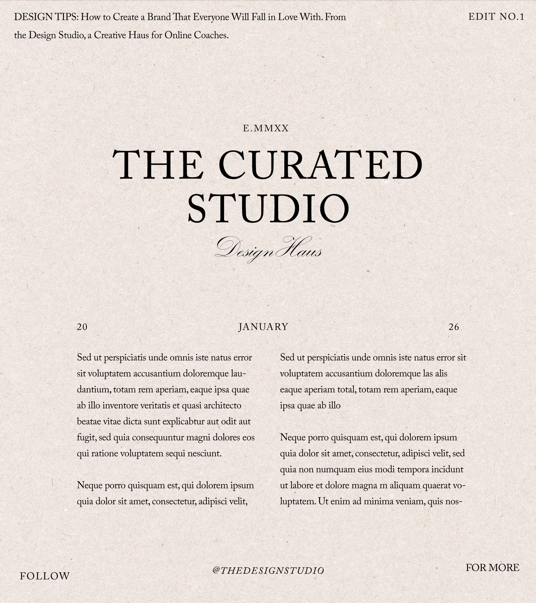
Expensive-looking brands are aware of that breathing room. The space between a headline and body copy is always the same. The margins are consistent across every page. The logo always has the same amount of breathing room around it. The letter-spacing is consistent, etc.
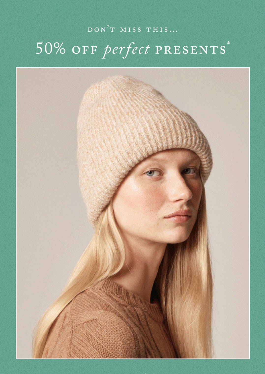
P.S. you’ll see that even J.Crew tries to keep their letter-spacing consistent with their marketing
**Your quick fix:**
Zoom out on your brand or website, are their area’s that ‘feel’ too busy? My motto: When in doubt, just add a little more space.
4. Restraint in the details.
This is the hardest one for DIYers and new businesses. When you’re building your own brand, every element feels important (I get that). The pattern you spent hours trying to find or create, the illustration set you bought, the texture you found on Creative Market. You want to use all of it…
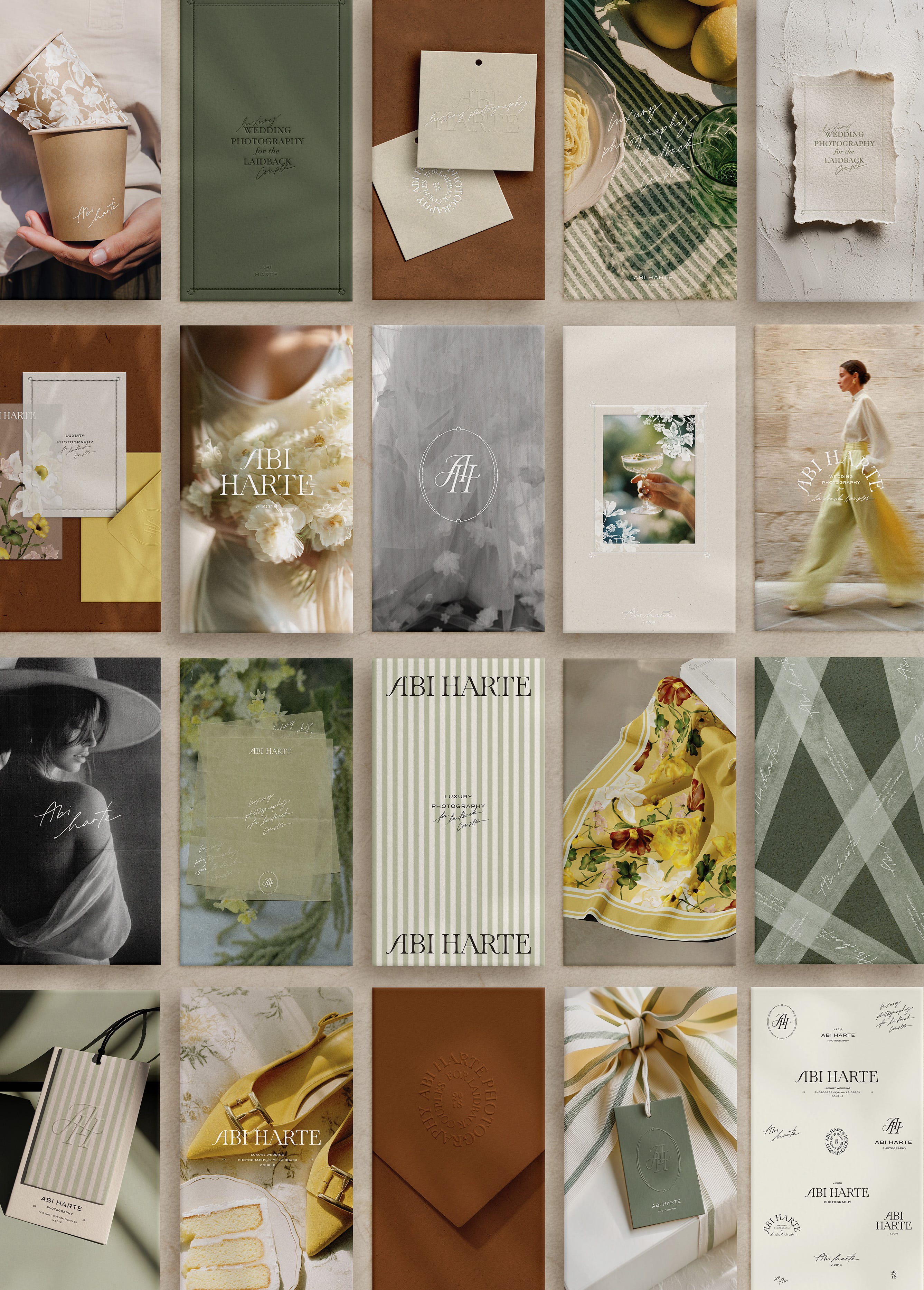
Most luxury brands use fewer elements more carefully and intentionally.
One consistent pattern, not five. One illustration style, used sparingly. *I’ll note that candy/chocolate brands tend to have more wiggle room with this ;)
Option 1: If you have a lot of color or bold fonts, try sticking to a specific pattern style.
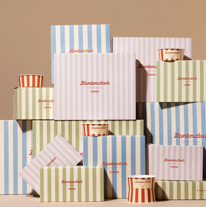
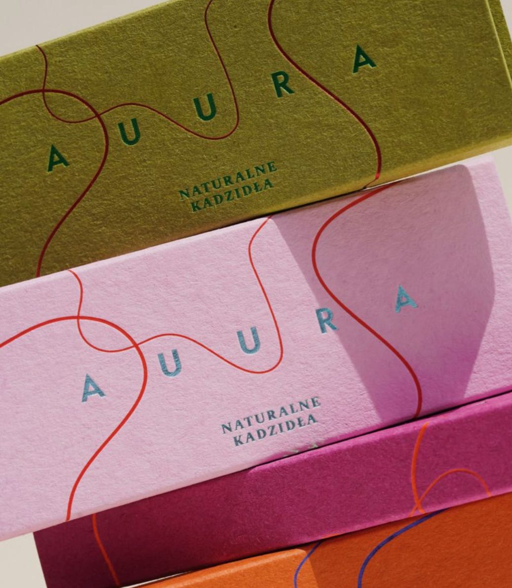
Option 2: If you are mixing up the pattern/illustrations, try to keep the brand neutral or the palette consistent.
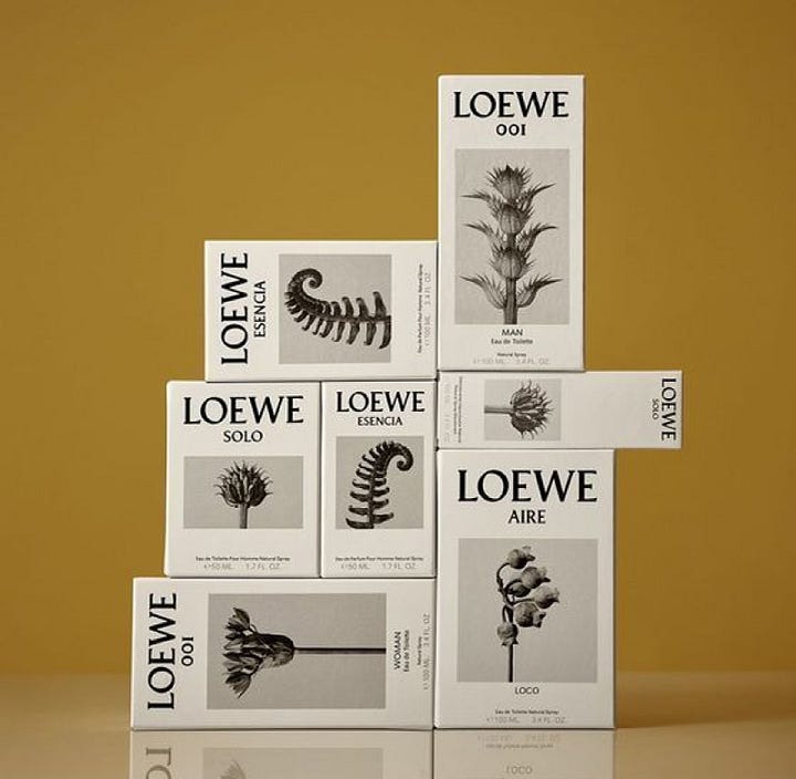
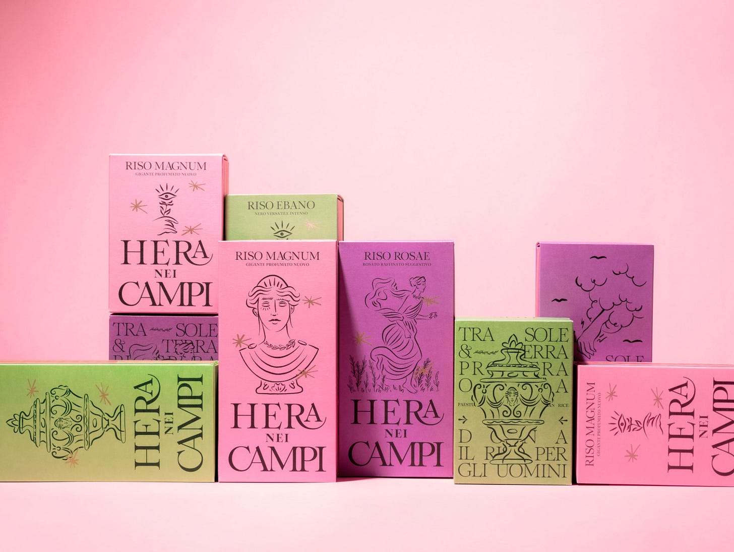
Just keep in mind, the restraint is the design.
As I said above, we live in the world of quick trends, Pinterest scroll, and endless inspiration. So I understand the “urge” to want to use it all. However, with brand refreshes I’ve done in the past, I’ve removed more elements from brands than I’ve added. The “before” often has too much happening, and the “after” (with removal) feels so much calmer, intentional, and timeless.
**Your quick fix:**
Look at your website or a recent Instagram post. What could you remove without losing the message? Do you need all the various textures? Do you need that extra illustration or border style?
5. A clear visual hierarchy & flow
If you click on my affiliates/products/advertisers links, I may receive a tiny commission. P.S. the products that I share are the ones I believe in.