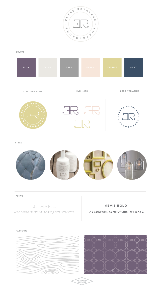
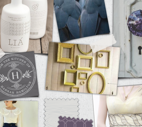
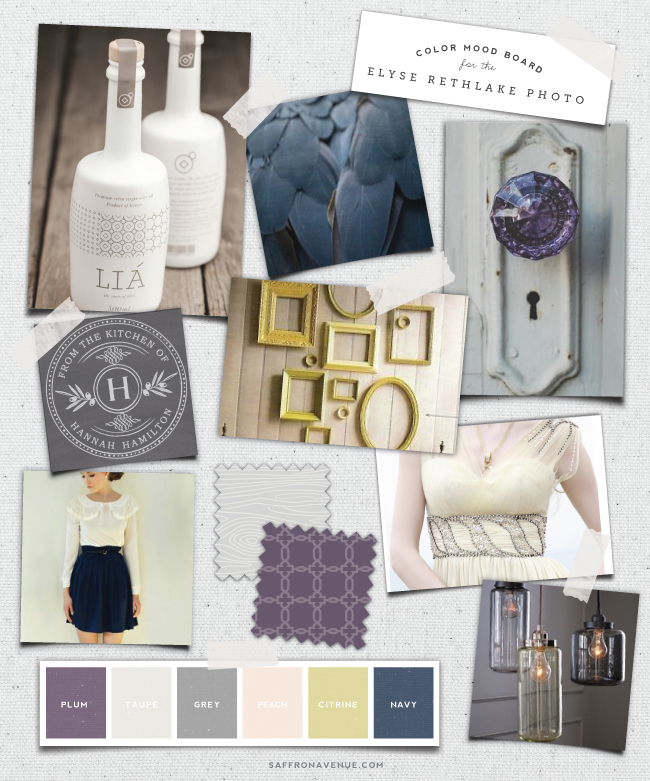
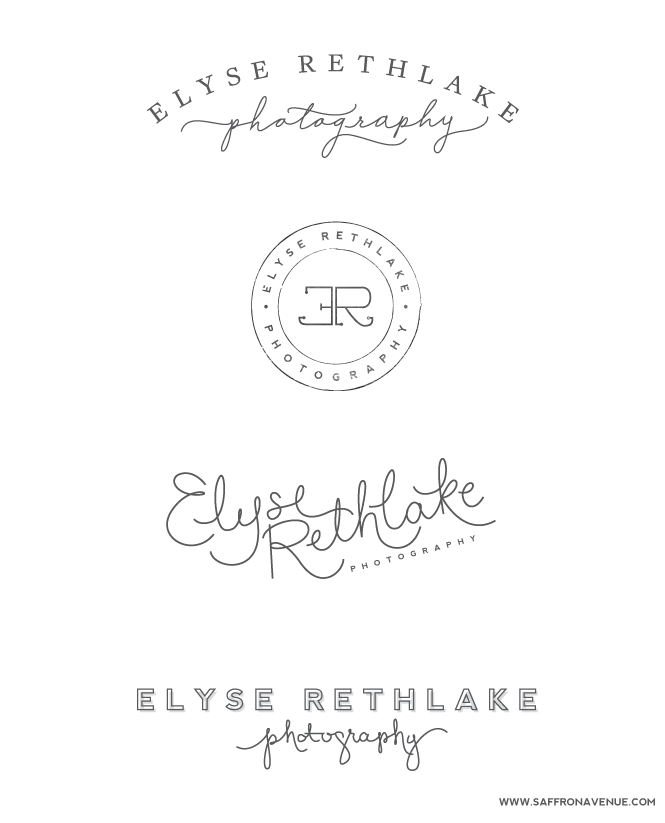
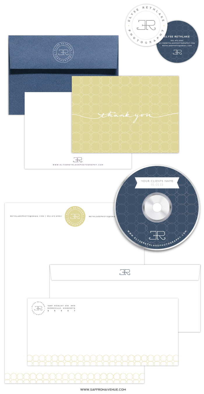
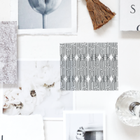
Happy Monday everybody! I feel like I haven’t posted in forever, sorry about that! Today I am brining you a simple, natural, and rustic logo designed for Elyse Rethlake Photography. I was referred to Elyse by her sister Merritt who actually interviewed me at the beginning of the year for one of her school projects, so thank you Merritt! Elyse has been great to work with and also has the eye for design, which was helpful to have a more collaborative design. Before starting the brand design we discussed her design style, she said ‘classic, not too feminine, clean, somewhat eclectic, and distressed. I first sent her a mood board to help nail down the style and the color palette, which included a soft peach, light citrine, navy, plum, and a couple warm greys. From there we moved to the logo variations, pulling in different fonts, calligraphy, and layouts.
lia bottle // feathers // door knob // stamp // frames // dress // outfit // lights
After finalizing the logo we pulled everything together and created the branding board, utilizing the color palette and the patterns, creating a sub mark as well as a colorful logo variation.
 feathers // lia bottle // frames // lights
Once we finished the branding board I moved onto the remaining pieces of her brand, business cards, stationery, letterhead, cd template, facebook, and a twitter page design. I loved creating everything and look forward to hopefully working with Elyse more in the future!
If you click on my affiliates/products/advertisers links, I may receive a tiny commission. P.S. the products that I share are the ones I believe in.
beautiful, as always!
Thank you Fran!
Love your moodboard and finished look! Great to see your design process too.
Thank you Lana!
I am in love with the font you have used in the third logo design. Can you tell me where it is from? I would love to use it for my Uni project!!
Blog is beautiful!
Emma
HI Emma, thank you so much! I’m glad you like it! I actually did that font myself, sorry that doesn’t help at all!!
in the first and last logo what are the fonts for “photography”, I love these!
Those are my own calligraphy (as is most cursive/calligraphy on my site ;)
what font did you use on the fourth logo?
Hi there, it was Nevis for the main font and my handwriting for the ‘photography’!
[…] Sources: Neil GT Elyse Rethlake Satchel Holly […]
would you mind sharing the color codes? LOVE THEM