
You know what is crazy? How much a font can change the entire look and feel of a website and brand..seriously, it’s kinda crazy and something we all need to understand when it comes to our brand. I thought it was beyond important to chat today about font psychology and how to choose fonts that reflect your brand style. I’m breaking it into two posts because there is just so much detail and important info!
First things first, do you have an idea of what your brand style is? If you’re not sure what that means or do not what yours is, you should definitely head on over to THIS POST HERE to answer some style simple questions about your business and brand. Not only that, but my free 5-Day Content course also talks about establishing your ideal client/customer and your brand style.
The typography you use on your site and in your brand will have an emotional impact with your readers and you want to make sure they are accurately representing you.
As we know, times new roman feels more traditional like an old newspaper, Impact font is bold and in-your-face, and of course comic sans feels more immature and playful (and should be removed completely from our life..in my opinion ;) – So yes, what you use in your brand really does matter.
– Follow me on Pinterest for more brand design inspo –
The Font Traits
Let’s start with font traits, as those will make a difference when choosing the style within your brand. Different traits can be used when choosing a specific font (aka: Bold vs. light), and each will have a job to do within your brand to help convey the correct emotion.
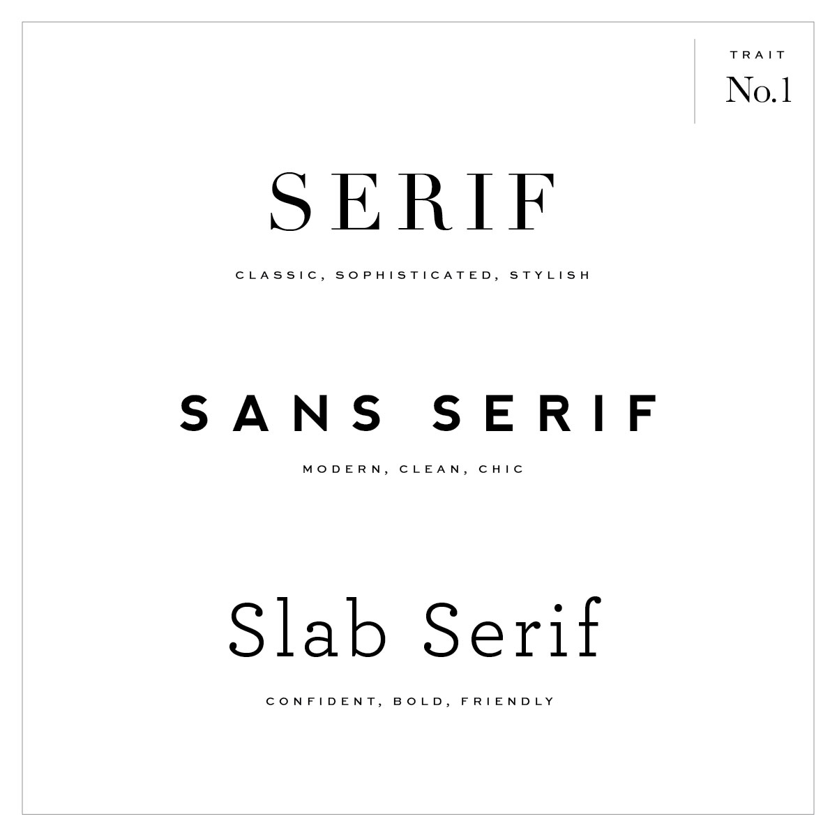
Serif vs. Sans serif vs. Slab Serif
SERIF: Most obvious to determine as one will have little ‘feet’ and varying stroke sizes. Feels more traditional, classic, and high-end.
SAN SERIF: This will have a consistent stroke thickness and no feet. It’s much more simplified and feels more modern, clean, and chic.
SLAB SERIF: This still has the little feet and almost a perfect mix between serif and san-serif (in terms of thickness). It feels more friendly, bold, and creative.

Italic VS. Oblique
ITALIC: Mostly used to highlight text and a change in ’tone’ when reading. The are slanted and represented to feel like handwriting with slight curves. Serif italics feel welcoming, pleasant and polite when being used (similar to cursive).
OBLIQUE: Similar to italic but much more geometric and modern in shape and often used with sans-serif fonts. All letterform create the same slant and is used to communicate the feeling of speed and urgency (or attention).
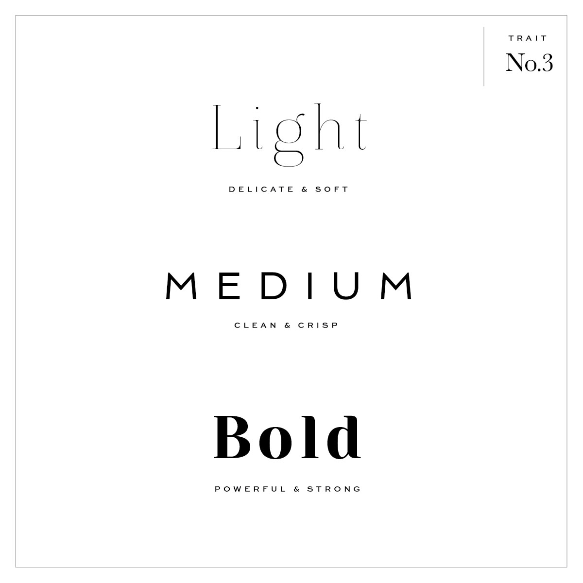
Light vs. Regular vs. Bold
LIGHT: These are often very thin overall and not recommended to use for attention-grabbing headings (too delicate). Can be used as paragraph text if conveying a more modern/light overall feel especially if pairing with a bold or high contrast font as a heading.
MEDIUM: Most often used for paragraph text as they are the most readable font weight and least affected when varying in size.
BOLD: These are designed to draw attention and add emphasis to your text. Recommended to be used to highlight an action, can be used in logos, and overall it will feel much more powerful and bold.

High Contrast vs Low Contrast
This is the variation between the thick and thin strokes in each letterform.
HIGH CONTRAST: These vary much more in the actual stroke thickness in each letterform. The higher the contrast the harder it will be to read when decreasing the size, so it’s recommended they should be used as ‘Display’ fonts (fonts used as headings and to call actions). They often feel bold, creative, and unique.
LOW CONTRAST: These are solid and uniform (like most sans-serif) and great to be used for bold headings and depending on weight can be easier to read when used as a smaller size. Note: If you have a bold low contrast font as a small size, it can start to look ‘blocky’ and lose definition, AKA: a very heavy/bold sans serif. These are more neutral, modern, and simplistic.

Font Character Widths
The width of the characters within a font and the spacing (or tracking) between the letters plays a large part in readability and overall feel.
REGULAR: Always recommended for paragraph text as it is the easiest to read and flows the best.
CONDENSED: These are very tightly spaced and oftentimes narrow fonts that are used when trying to fit more text into a small area. They feel more modern and funky (playful) and are recommended to be used sparingly for headings with fewer letters because they can be difficult to read for the eye. They also tend to pair well with more vintage / retro style designs.
EXTENDED: These can be characters that are wider in shape or even spaced further apart and feel much more horizontal (than the vertical condensed). Not only that, but they tend to be read slowly and can be more memorable and feel more mature, lighter and cleaner.
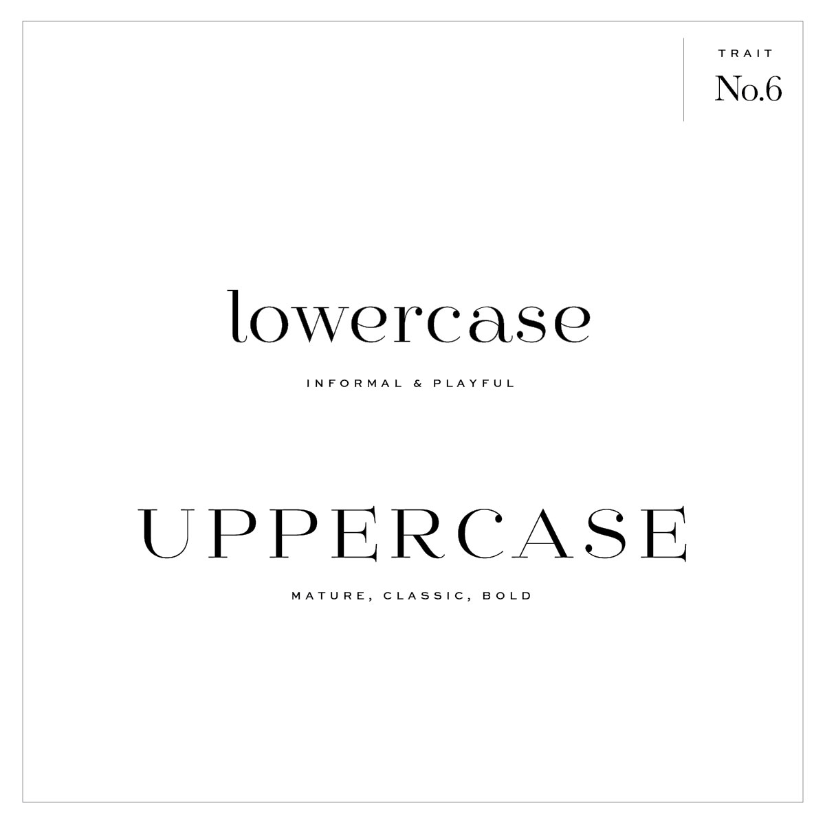
Lowercase vs. Uppercase
Okay, so this isn’t really a ‘trait’ but a styling characteristic to show how different one font can look and feel when using lowercase vs. uppercase. Something to keep in mind when deciding on a font style.
LOWERCASE: This feels a bit less intimidating and even more playful. This is can be used to add warmth to a brand or website and even feel a bit more informal.
UPPERCASE: In comparison, using all-caps on a word is stronger and more mature feeling. Not only that, but it stands out more and even feels more classic.
THE FONT STYLES
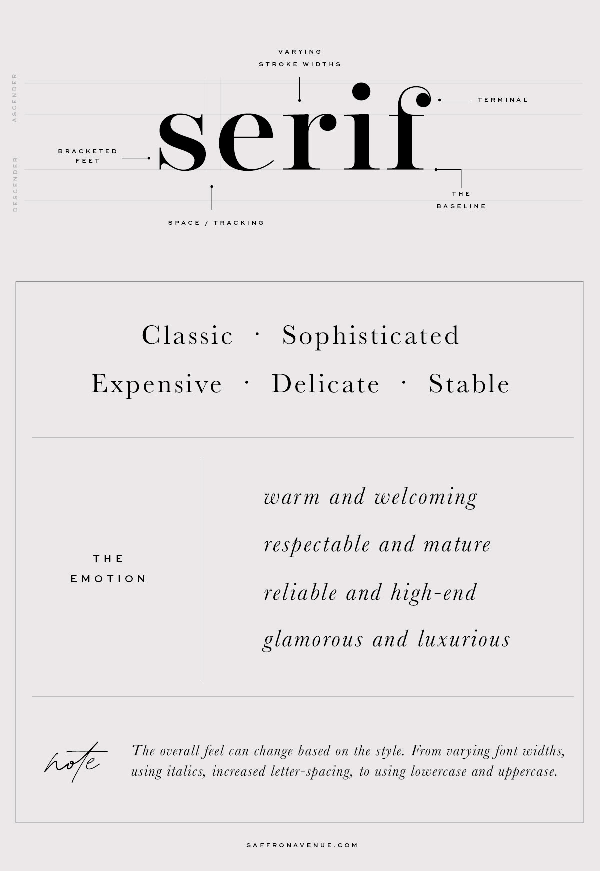
1. Serif Fonts
As you can below, serif fonts have little-bracketed feet on the end of them (compared to sans serif) and they can vary in stroke thickness, ligature styles, and typeface families (bold, italic, etc). They tend to be a bit more interesting in shape and style especially when it comes to the littlest of details (like the ‘terminals’ you can see below).
Serifs are largely used in magazines, fashion companies, and newspapers as they say they are ‘easier to read’ (which has become debatable recently). But they are often used to feel more sophisticated, classic, and high-end.
Serifs are often paired with their other typeface styles (bold, italic, etc) but can feel more modern when paired with sans-serif or more feminine and warm when paired with a script. It’s NOT recommended to pair it with slab-serif or other fonts that are too similar to them.
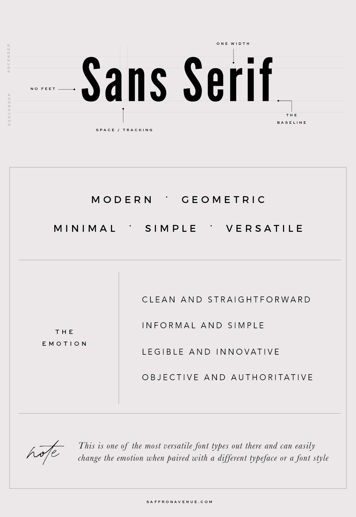
2. Sans-Serif
When comparing these to other fonts, they are the easiest to read especially when viewing on a screen (aka: look at most mobile apps, facebook, etc). They can be used as both body/paragraph text and headings if creating enough contrast between them (aka: Bold, condensed, etc).
They are much more modern feeling and can easily make a difference in a brand when using all sans-serif fonts vs. mixing them with others. This family is the easiest to pair with as it can quickly go from a super modern/clean site to a creative and classic site (pairing with serif). By far the easiest to work with.
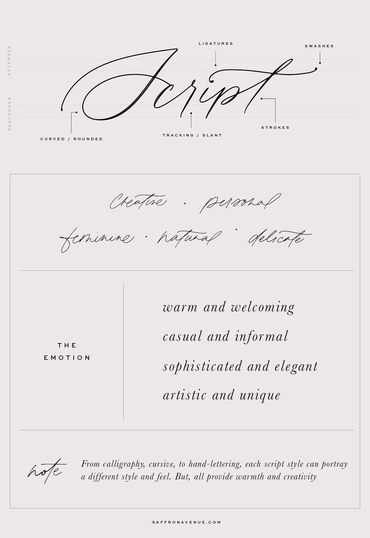
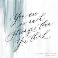
3. Script
Good ol’ popular script fonts. Keep in mind this category itself is quite large as it can include cursive, calligraphy, handwriting, brush script, to hand-lettering. The idea of script is that the letters are connected and flow together in a fluid motion.
With that, they tend to feel a bit more feminine, delicate, relaxed, informal (depending on style), and artistic. When introducing script into a brand it’s normally to add warmth overall and a sense of personality. To feel more modern it can be paired with sans-serif and to feel more luxurious it can be paired with serif.
PLEASE NOTE: Please don’t use script fonts for body copy or long sentences as they are much more difficult to read and best when using it as a call-out or short heading.
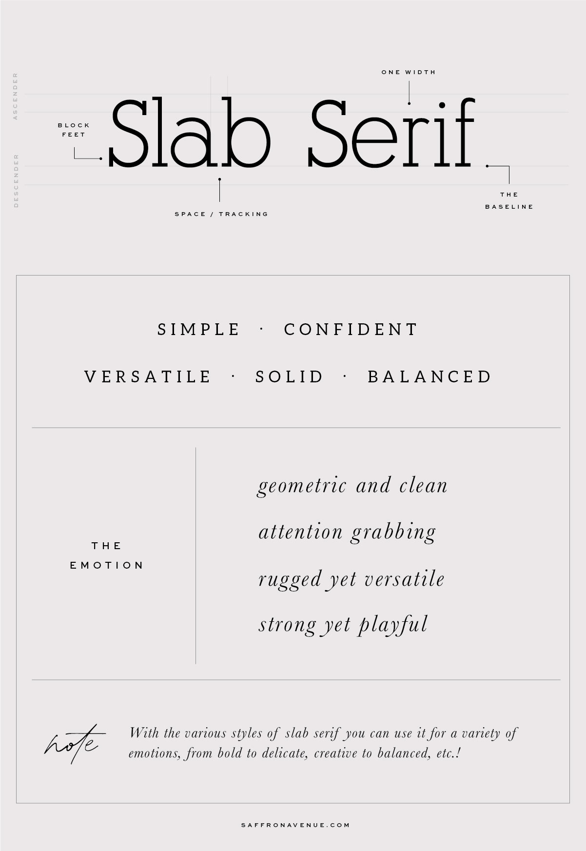
4. Slab Serif:
These little guys look like similar to a serif with more square or blocked feet but have the body of sans-serif (consistent thickness of each letterform). In font history, they are represented and classified more like a ‘stamp’ font and were used on factory floors, on hand tools and steakhouses. With that, they do feel a bit more natural, bold, to the point, and made to grab your attention.
P.S. there are more rounded slab serifs that feel more natural and warm and provide a great mix between the worlds of serif and sans serif. They often work well when increased and decreased in size (and not lose readability).
HOMEWORK
Now that we’ve gone through the different font traits, emotions, and various typography styles I want to recommend that you take some time to understand what ‘descriptive’ words align with your brand. Go through that blog post below to understand your colors, your adjectives, your season, etc. so you can start to compile a list of fonts that align with your overall style.
In Part 2 of this blog post, I’ll be sharing actual examples of how they can easily change the look and feel of a brand, as well as some additional font pairing options that you can use!
You can also check out THIS POST HERE which dives into the different types of fonts, the styles, and some pairing examples.
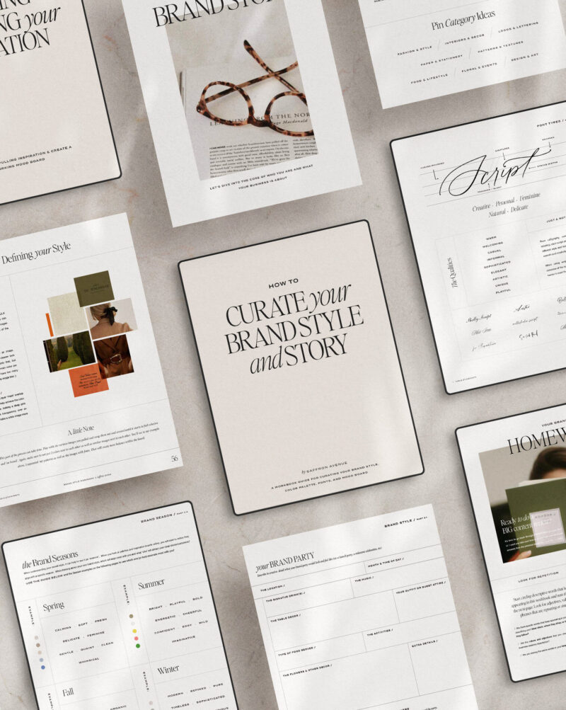
TRY THE BRAND WORKBOOK!
What’s Next…
Are you launching a new business or a rebrand? I cannot recommend Showit highly enough! So much so, that I use it myself AND I’ve even created some stylish templates for you too! Completely customize and make edits with your own brand colors and images. (yup, no developer needed!) And since I love a cohesive brand across all platforms, I’ve created matching social media templates and stationery too!


Ehat a beatiful script font. What is the name of the one that entitles de frame? Thanks.
The one script is my own lettering ;)
This is amazing! Thank you so much for posting this!
Awe, of course!!
Hi,
I am loving it…
Thank you for this! What is the “Trait” font?
Thats Sweetsans medium ;)
BEAUTIFUL! What is the font used where you describe the font under each word?