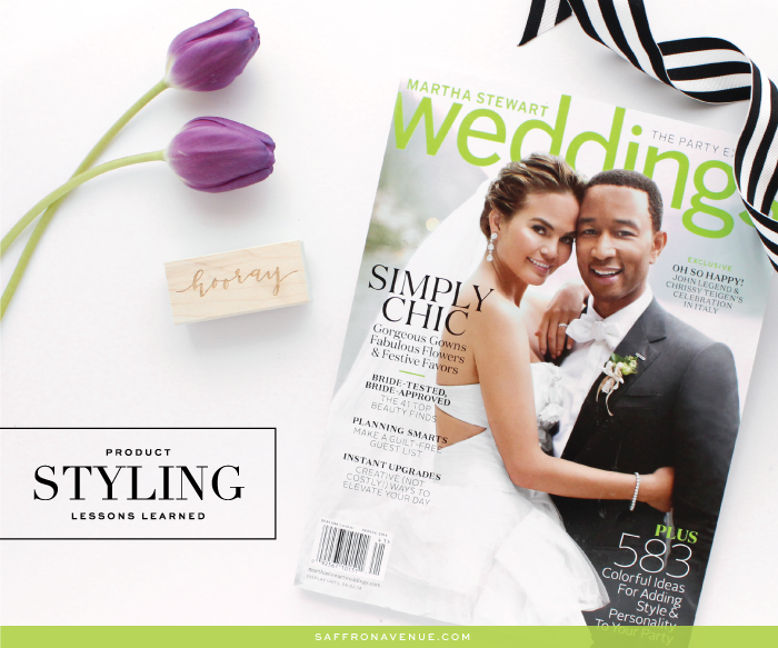
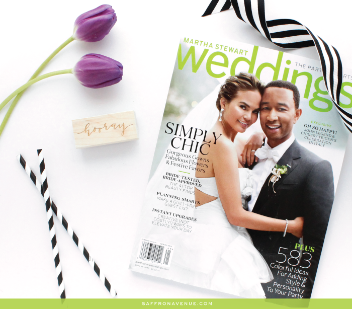
Hi friends, so in between being completely swamped trying to design and launch a ton of different projects I took a break to take a stab at product styling! I just recently bought the Martha Stewart Magazine (loved the cover) and thought it would look great paired with some tulips from my birthday..and of course one of my custom wood stamps. I’m beyond new to this whole photography thing and trying to perfect my product styling skills and wanted to share some of lessons I learned.
To start I created a lightbbox (tutorial on this blog), and put in some foam core on the bottom (but didn’t cut it large enough so I have limited space to work with). Now for my photo settings..this is the hard part! Since it has been rainy and beyond cloudy I pushed my lightbox up to the patio doors to get as much natural light as possible and set my camera to the below.
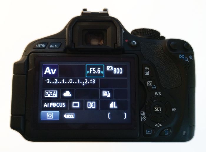
Now..this is the setting that seemed to work for me (not sure if it’s the absolute correct way).
APERTURE – F5.6 :: Let’s more or less light in (requires more light and creates a more focused foreground/background)
ISO SPEED – 800 or 1600 :: Indoors/less natural light (also tends to have more noise or grain)
EXPOSURE – Between 1 – 2 :: This brightened up my photos and made it pop more
WHITE BALANCE – Cloudy :: Since I pushed my lightbox near the window to get natural light this setting was much better than tungsten (light) or any other setting.
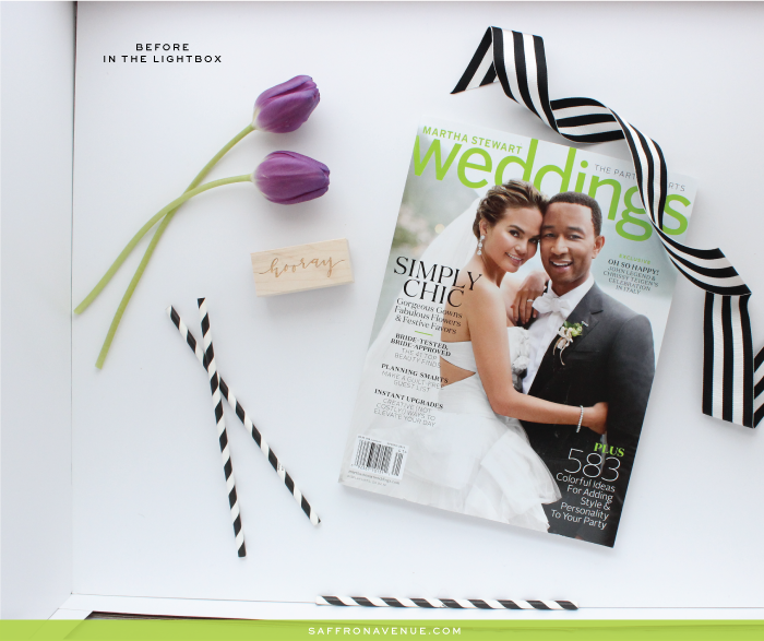
(here is a before editing photo)
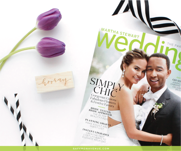
And here is the after!
Once I got it into photoshop I didn’t have to do too much to it. I played with ‘Levels’ a bit, slightly changed the ‘brightness/contrast’, and to get a more white/bright background I ‘Replaced Color’ by eye dropping the current background and lightening it a bit.
All in all, I’m getting there and just wanted to share it with all of you! Hopefully I’ll be able to do more and more!


Loved the before/after comparison Angela! That is an awesome diy lightbox link, reminds me of this recent Kickstarter concept that just got funded (and I bought one off them, yet to arrive though!): https://www.kickstarter.com/projects/640799395/lightcase?ref=discovery
That is so neat! That would be even better if they made different sizes!
Hi Angela,
thank you for sharing your experience and especially the camera settings. I find photo styling quite difficult, too, and I think you did a great job. I loved seeing the actual picture in the light box and how it was arranged. I’m curious to see more …
Cheers,
Katja
Hi there, I hope it helped! I’m going to be styling some more photos soon and posting on instagram for some behind the scenes, so feel free to follow that!